Font Psychology: How Letter Forms Affect Brand Perception
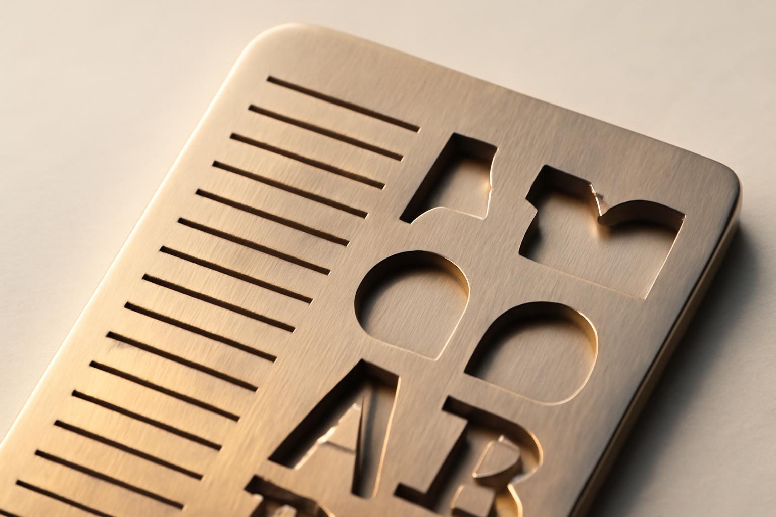
What happens in the brain within 0,05 seconds
The first impression of visual identity is formed within 50 milliseconds — faster than a person can blink. At this stage, the brain does not read — it scans the form: sharp angles, stroke thickness, degree of letter closure, presence of serifs. This is the perceptual level of perception, and it is on this level that the font either gains a trust credit or loses it forever — it will be hard to convince the user later, no matter how many arguments are presented to them.
Studies show that font affects the perception of company reliability. Different fonts demonstrate different characteristics when read: sans serif fonts (such as Arial) provide good functionality, serif fonts (Times New Roman) create visual anchors through serifs. Comic Sans causes difficulties due to the unconventional shape of its letters. Font choice depends on readability goals and context: different fonts are suitable for different purposes — reading speed, memorability, and perception vary depending on the design.
Bouba-Kiki effect: a font has taste and character
In a classical experiment, people were shown two abstract shapes—one round, the other with sharp teeth—and asked to guess which one is called 'buba' and which 'kiki'. 95% of participants, regardless of language and culture, associated the round shape with 'buba' and the angular one with 'kiki'. The brain links smooth lines with softness and safety, and sharp angles with potential danger: this is an ancient, almost reflexive mechanism inherited from the perception of physical objects—sharp can cut, round cannot.
From this stems a secondary, but no less indicative effect: round letters are subconsciously associated with a sweet taste. In experiments, participants rated products packaged in round typography as sweeter—even when the composition was identical to the non-sweet analog. Angular fonts are read as 'bitter', sharp, requiring serious attention. Confectionery brands almost never use geometric Gothic typefaces, and premium alcohol and legal companies almost never choose round 'bubbly' fonts. This is not fashion, but a direct consequence of how the shape of a letter is converted into a sensation of taste and weight.
Four levels of font perception
The shape of a letter works not in one plane, but simultaneously in four layers, and each solves its own task.
- Perceptual. Reaction in fractions of a second to the bare form—sharp/round, dense/light. Works before any reading.
- Associative. The font activates ready-made cultural templates: serifs—'tradition and status', geometric grotesque—'technology and precision', script—'personal and informal'.
- Semantic. Here the brain compares the font shape with the text content. If the mismatch is too sharp — for example, the word 'reliability' set in a game font — cognitive dissonance occurs, and trust declines faster than it would from poor nomenclature.
- Functional. The level of practical readability: speed, legibility at small font sizes, behavior on the web and on smartphone screens. A beautiful font that is poorly readable in an interface devalues all the other brand work.
The problem of most brands is that designers and clients get stuck at the first level — 'like / dislike' — and do not test the font on the remaining three levels.
What font says what: practical table
Below is not an aesthetic classification, but a comparison of font type with the signal it conveys and in which business categories this is confirmed by practice.
| Font type | Signal for the brain | Where it works | Where it creates dissonance |
|---|---|---|---|
| Slab serif | Tradition, status, intellectual weight | Legal services, publishing, premium alcohol | Startups, children's products, mobile applications |
| Geometric grotesque | Technological, neutrality, precision | IT, fintech, B2B-services | Craft and local brands with a 'human' history |
| Humanistic grotesque (rounded forms) | Friendliness, accessibility, sweetness | Food delivery, children's brands, social projects | Banks, insurance, jurisprudence |
| Handwritten and script | Personal, exclusive, artisanal | Confectionery, craft brands, wedding industry | Medicine, large B2B, technical documentation |
| Angular decorative | Sharpness, challenge, brutality | Sports brands, street culture, energy drinks | Financial and medical services |
Typical mistakes when choosing a font for a brand
- Choosing 'by eye' without checking for semantic correspondence. The font pleases the designer, but contradicts the brand's promise — reliability, typed in a playful script, reads as irony.
- Ignoring the functional level. The typeface looks great on a poster, but falls apart on a 12px line in the mobile interface — and that's exactly where it's seen most often.
- Copying the leader's font in the category. If all banks in the niche have the same safe grotesque, differentiation is lost — the brand is physically indistinguishable from the competitor at the level of first impression.
- Abandoning audience testing. 72% of people associate font with company reliability—but different audience segments have different thresholds for perceiving 'seriousness' and 'friendliness,' and this should be tested rather than guessed.
Conclusion: how to apply these findings in practice
Before making the final choice of font for the brand, it is necessary to test the typeface through all four levels of perception, not just through the designer's taste. First — a quick test on shape: sharp or rounded, heavy or light, and whether this matches the brand's promise. Then — checking associations: which cultural template the font activates in the target audience, not the project team. Next — semantic check with key positioning keywords: if the brand speaks of reliability, the font should convey weight, not lightness. And the final step — an obligatory functional test: how the typeface behaves in real media, from business card to mobile screen, at different sizes and on different backgrounds.
The shape of the letter decides faster than the text can convey meaning. To skimp on font selection is the same as to skimp on naming: the result passes by the client's consciousness only once and remains in their first impression forever.
Recent articles








MegaFon, BMW, VTB and more 240+ companies. See how it looks in the showcase reel:


Our branding agency is approached to order:
Branding agency services












