Heraldry and the historical origin of corporate symbols
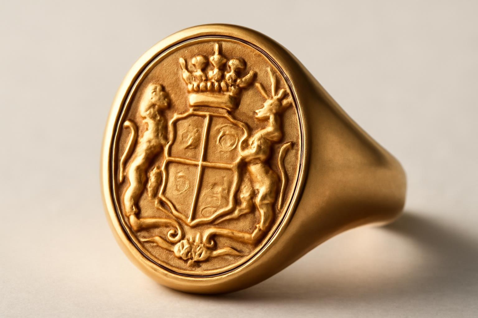
Why the coat of arms appeared exactly in the Middle Ages
Heraldry was not the caprice of the nobility — it solved a technical problem. By the end of the XII century, knightly armor had become complicated: a closed helmet with a visor completely hid the face, and on the battlefield or at tournaments it was impossible to tell who was standing before you — friend or foe. The shield became the only surface by which one could distinguish the rider from afar, in the smoke and chaos. One of the earliest known coats of arms is associated with Godfrey of Bouillon (Geoffrey V Plantagenet): according to chronicles compiled in 1175–1180 centuries, Henry I allegedly gave him a shield with golden lions for his marriage to Matilda in 1128 year, although this date remains a subject of scholarly debate. By the XIII century, a system had emerged from scattered personal signs: strict rules regarding color, division of the shield and inheritance of figures, understandable to all European classes equally.
In Russia, this path was taken later and in a different way. A native heraldic tradition only formed in the second half of the XVII century under Alexei Mikhailovich, at the intersection of Polish and Western European models. Peter I established the Heraldic Office and the position of heraldmaster in 1722 year for the official compilation of coats of arms, which initiated the systematization of state heraldry, and a large-scale reform — with clear systematization — was carried out by the heraldmaster B. V. Köne under Nicholas I.
What literally works from heraldry in modern branding
The main thing that migrated from medieval rules to design guidelines is not the shape of the shield, but the logic of contrast. In heraldry, there are only seven colors: two metals — gold and silver, and five enamels — azure, gules, vert, sable, and purpure. The rule, which originated in the thirteenth century, is simple: metal should not be placed on metal, and color — on color. This is purely visual physics: without contrast, the figure sinks into the background and loses readability at a distance.
Today, the same rule governs why a brand guideline forbids a white logo on a light gray background or a golden icon on a beige substrate in an interface. The medium has changed — instead of spears and shields, there are now smartphones and favicon 16×16 pixels from afar — but the requirement remains the same: the element must be readable without effort. The hierarchy of figures on the shield (the main figure is larger and centered, supporting figures are on the edges) has become a modern typographic and compositional hierarchy of the logo.
The coat of arms and the logo are not competitors, but tools for different tasks
Confusion often arises here: companies think they must choose one of the two. In practice, the coat of arms and the logo solve different tasks and peacefully coexist in one identity side by side.
| Criterion | Coat of arms | Logo |
|---|---|---|
| Audience | Narrow, status-oriented (partners, VIP, official persons) | Mass, broad |
| Media | Documents, awards, VIP souvenirs, representative events | Packaging, advertising, digital, signage |
| Speed of perception | Below — a complex composition, many details | Above — studies show a difference of up to 23% |
| Task | To confirm status, history, legitimacy | To quickly recognize the brand among competitors |
The difference in perception speed is understandable: a logo is built on the principle of minimalism, which became a norm after Bauhaus (1919 year) and ultimately prevailed with the growth of print, television and the Internet, where recognition speed is crucial. A coat of arms, by contrast, was originally designed for static, contemplative viewing — on parchment, tapestry or armor.
Who actually uses heraldry today and why
Appeal to heraldic symbolism is almost always a signal: 'we have a history, and we want to monetize it through trust.' A telling example from the history of trademarks is the company Bass & Co, which registered a red triangle as UK Trade Mark № 1 on 1876 January 1 year, the first officially registered trademark in the world. According to legend, a company employee stayed overnight at the doors of the patent office to be first in line — such was the value placed on this registration.
- Tinkoff — uses a stylized family coat of arms of the founder as an element of premium positioning.
- Russia Post — a two-headed eagle, a direct reference to the state heraldic tradition.
- Bayer — the historical coat of arms of the city of Elberfeld has been transformed into a recognizable cross on tablet packaging.
- Air Astana and Allur — the Kazakh ornament "қошқар мүйіз" ("ram’s horns"), a symbol of protection and movement, integrated into the corporate identity without directly copying the heraldic form.
The pattern is simple: premium cars, banks, wineries, and airlines gravitate toward heraldry because their product sells trust and status, not the speed of purchase. A mass FMCG brand would be better off without a shield and crown—consumers expect simplicity from such a brand, not pedigrees.
How to Apply Heraldic Principles in Practice
If the decision is made to use heraldic elements, it is advisable to follow the classical logic of coat of arms construction, rather than inventing it anew:
- Define one main figure — a symbol of the company's value, not a set of five meanings at once.
- Select no more than two or three colors from the classical heraldic palette and immediately check them against the contrast rule 'metal on color, color on metal'.
- Establish a clear hierarchy: the main element should be larger and centered, with auxiliary elements subordinate to it in scale.
- Separate usage: the heraldic symbol — for documents, awards, and representative materials; the logo — for mass media.
- Test the symbol at different sizes and on different backgrounds — just as the readability of the shield was checked from the distance of a copse strike.
Mistakes that companies make when trying to 'create their own coat of arms'
Most failed attempts resemble one another — authors try to cram the entire company history into the shield at once, instead of using one precise symbol. From heraldic practice, there is a clear list of what must not be done:
- overloading the coat of arms with all significant events of the company's history at once;
- inserting attributes of the newest era — airplanes, cars, smartphones;
- depicting specific buildings or portraits of people;
- using geographic outlines of countries and cities;
- placing inscriptions inside the shield itself;
- using state symbols of power without official permission.
This is not a formality from an archive — these are the same readability rules as in digital design: the more details and meanings you try to fit into one sign, the worse it is perceived and the faster it becomes outdated. A medieval herald and a modern art director solve the same task in this sense.
Recent articles








MegaFon, BMW, VTB and more 240+ companies. See how it looks in the showcase reel:


Our branding agency is approached to order:
Branding agency services












