Corporate typography: font selection and combination
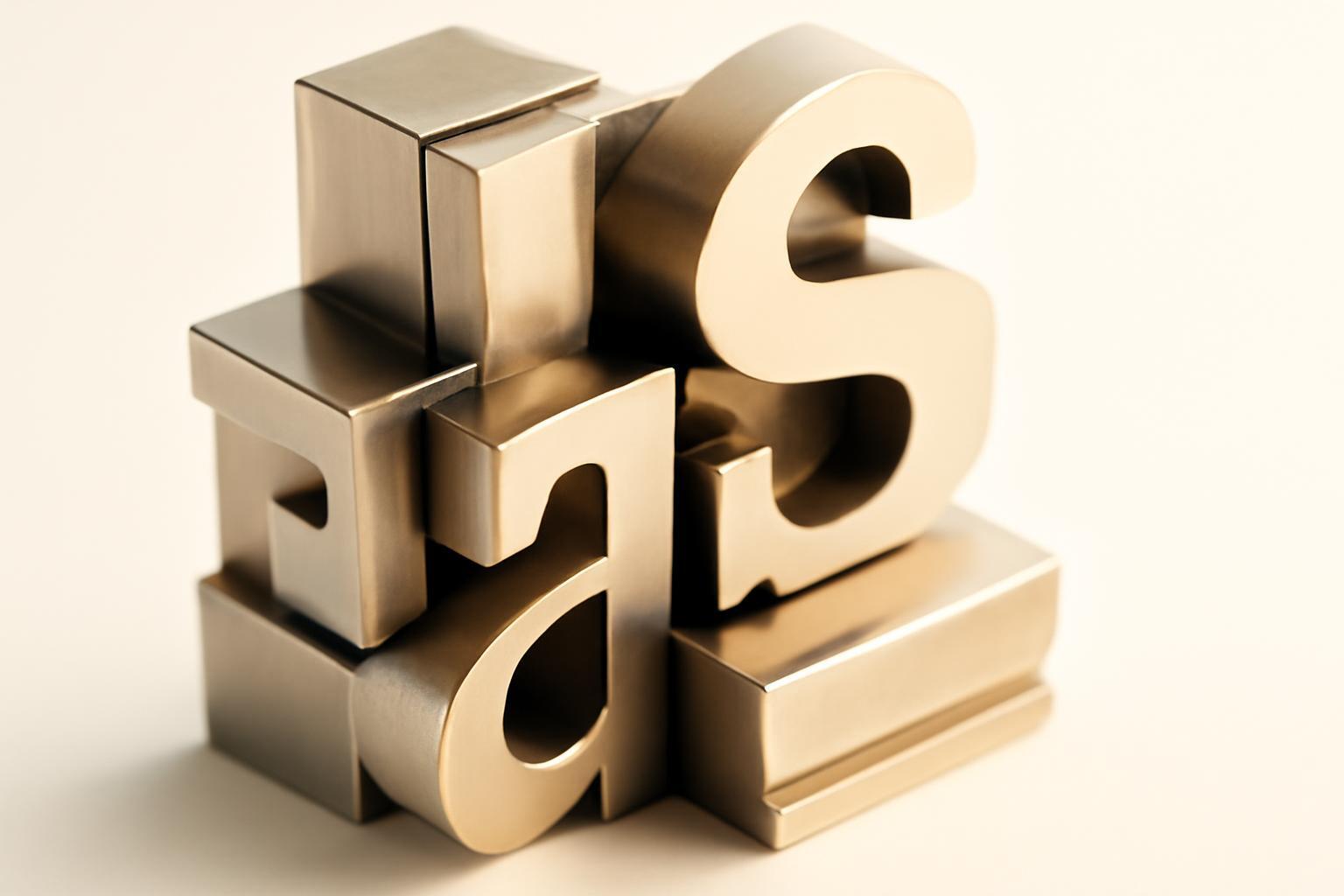
Mistakes in combination that reveal randomness
There are three typical mistakes that an experienced eye instantly recognizes, while an inexperienced one only feels discomfort, not understanding the reason.
Two similar grotesks
This is the most common and most unnoticed mistake for beginners. If you place Helvetica and Arial side by side, or Roboto and some unnamed humanist grotesk with similar proportions, the eye perceives this not as a conscious duet, but as a technical malfunction — as if the font did not load and was replaced by a system one. The difference must be either stylistic (grotesk + antiqua, grotesk + slab), or very pronounced in contrast within the same class — for example, a narrow geometric grotesk versus a wide humanist one with distinctly different saturation.
Two 'loud' decorative fonts
A decorative header font and an expressive script in one composition compete for attention, and in this competition the brand loses — the message gets lost. A working model here is always hierarchical: one font leads, the second — background, neutral, auxiliary. If both elements shout simultaneously, the viewer does not understand what is more important.
Mismatch in x-height and optical weight
Even stylistically harmonious fonts — for example, classical antiqua and modern humanist grotesque — can look incompatible if their lowercase height differs significantly from uppercase. This is hardly written about in typography articles, yet this detail often ruins a pair that theoretically 'should' work.
| Error | Why this looks accidental | How to avoid |
|---|---|---|
| Two similar grotesques without contrast | Reads as a technical font replacement, not a choice | Change the font class or take contrast by saturation at least in 2 gradation |
| Two decorative/accent fonts | Both contend for the role of leader, no hierarchy | One font — accent, the other — strictly neutral text font |
| Different x-heights with a similar style | Letters visually 'float' on one line | Compare x-height and aperture before final choice, not after |
| More than three typefaces in the system | Destroys recognizability, looks unprofessional | Hard limit: main + auxiliary + optional accent font |
One font, two or three: how to decide objectively
No universal answer, but there are three criteria by which this is decided without disputes about taste.
- Volume of brand communications. If the brand has only a logo and packaging — one font with several weights is sufficient. If there are long texts, interface, presentations — a minimum of a second, text font is needed.
- Is emotional distance needed between headline and body text. One font with a wide range of weights (from Thin to Black) can create hierarchy without a second typeface — this works for brands with a minimalist position.
- Resources for system support. Every additional font is licenses, kerning pairs, testing on different media. Three fonts entail three times more checks.
Practical maximum is three typefaces: one main (logo, large headings), one auxiliary (main text), and optionally one accent (quotes, labels, decorative inserts). Exceeding this limit is almost always perceived as a brand's disarray, not as palette richness.
X-height and other parameters that determine compatibility
X-height — the height of the lowercase letter 'x' relative to the height of the uppercase — determines how convincing two fonts will look together on one page. If the x-height of the heading font is noticeably lower than that of the text font, when used together in an interface, the lowercase letters of the heading visually 'sink' next to the main text, and the entire composition loses its balance.
Besides x-height, when selecting a pair, it's also important to check three more parameters:
- Aperture — the degree of openness of letters such as 'c', 'e', 's'. Different aperture in fonts of the same class creates the impression that the letters 'argue' with each other in terms of mood.
- Width proportions — a narrow and wide font work in a pair only if the difference is used consciously as a contrast tool, not randomly.
- Stroke saturation (contrast) — for screens with low resolution, the optimal ratio of the thickness of horizontal and vertical strokes for grotesques is about 1:1, for antiques — around 1:2. More contrast antiques at small sizes in interfaces lose readability.
Super-families and variable fonts — a workaround around the compatibility problem
There is a solution that solves half the compatibility problems right away: a super-family — a set of fonts designed by one author simultaneously in several classes with a unified metric and identical x-height. A classic example is the pair Roboto and Roboto Slab: a grotesque and a slab font built on a common proportion grid, so they are guaranteed to be compatible without manual adjustment. PT Sans / PT Serif work similarly — they are also designed as a coordinated pair for parallel use.
The second tool that rarely appears in articles about corporate typography is variable fonts (font-variation). One file contains a range of styles along several axes: weight, width, slant, sometimes optical size. This allows a brand to formally keep 'one font' but get from it as many visual states as might otherwise require a second typeface — plus it significantly lightens the web file compared to loading five static styles.
A system for print, web, and social networks — where it usually breaks down
A font that looks great in a brochure on thick paper can become illegible in Instagram Stories when scaled down to a small size. To ensure the system works consistently across all media, you need to check three things in advance, not afterward.
- The presence of a web version of the font with hinting for low resolution — not all print typefaces have a quality adaptation for screens.
- Readability at small sizes — especially thin variants: what looks elegant on a poster may disappear on a mobile screen.
- A license covering all channels — print, web embedding, applications, and social media — often requires different types of licenses for the same font.
A reasonable practice is to include in the brand book not just 'font X,' but 'font X with a fallback stack': a systemic analog in case the main font fails to load in the browser or is unavailable in a specific social network application.
Having your own font or using a ready-made one is a matter of economics, not ambition.
Developing a custom font is not about aesthetic superiority, but about long-term licensing economics. Netflix Sans cost the company several million dollars to develop, but it freed the brand from constant payments for licensing third-party fonts across millions of devices and all products at once — at such a scale of usage, a custom font pays for itself within a few years.
| Criterion | A ready-made font | A custom font |
|---|---|---|
| Entry cost | Low, from free licenses to several thousand dollars | From hundreds of thousands to several million |
| Uniqueness | Risk of similarity with competitors | Full control over identity |
| Implementation timeframe | Instantly | From 6 months to 2 years |
| Break-even point | Not applicable | Justified at a scale of usage across millions of devices/views |
For most brands up to a medium scale, developing a custom font is an excessive luxury. It is much more reasonable to choose a quality ready-made pair and configure custom ligatures or one or two unique characters (for example, in the logo) to achieve a degree of originality without a budget in the seven-digit range.
Font classification: minimum theory you need to know before making a choice
63% of global brands use grotesques, and nearly a third of them — variations of Helvetica. This is not a matter of taste, but a consequence of the fact that grotesque is read neutrally and universally at any scale. But precisely because of this massiveness, choosing Helvetica or a similar font without modification almost guarantees that the brand will dissolve among competitors — originality here is not a decorative whim, but a question of distinguishability.
Basic classes that must be distinguished when building a pair:
- Serif (antiqua) — with serifs, associated with tradition, reliability, publishing culture.
- Sans-serif (grotesque) — without serifs, neutral, technological, better scales on small screens.
- Slab-serif (block serif) — straight thick serifs, combines the weight of antiqua with the modernity of grotesque.
- Script — handwritten and calligraphic forms, almost always used as an accent, not as a text font.
- Decorative — independent nature, minimal functionality, only for spot tasks.
The most reliable combination is serif and grotesque, because class contrast is immediately readable and does not require fine-tuning. But this is not the only working option: two grotesques with a strong weight gap (thin text and black headline) or two serif fonts from different epochs — for example, a narrow elegant serif of the Art Nouveau period with a massive blocky font — also provide a convincing contrast if the difference is expressed clearly, not timidly.
Recent articles








MegaFon, BMW, VTB and more 240+ companies. See how it looks in the showcase reel:


Our branding agency is approached to order:
Branding agency services












