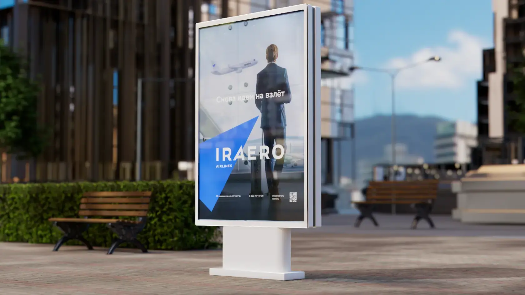
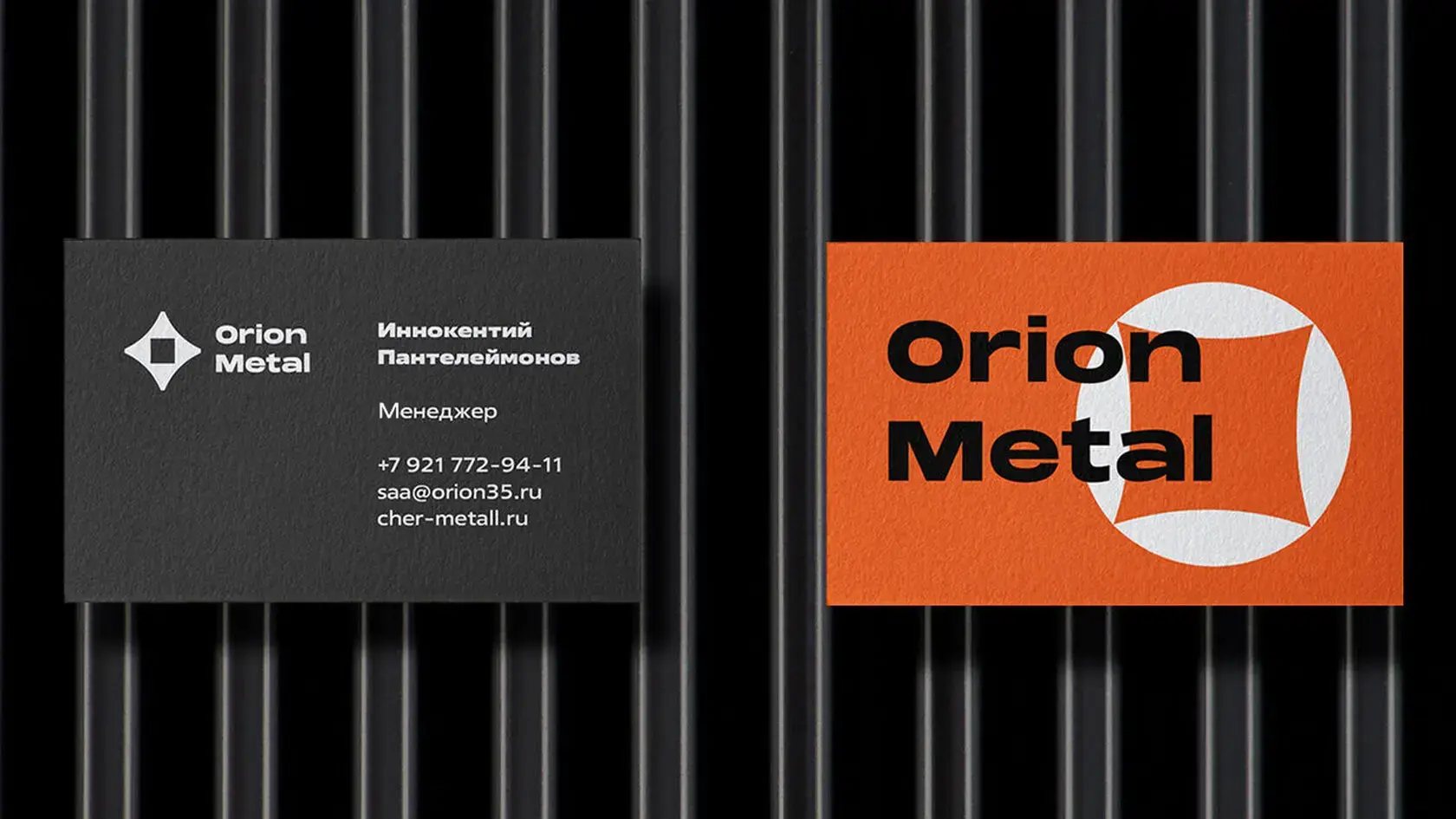
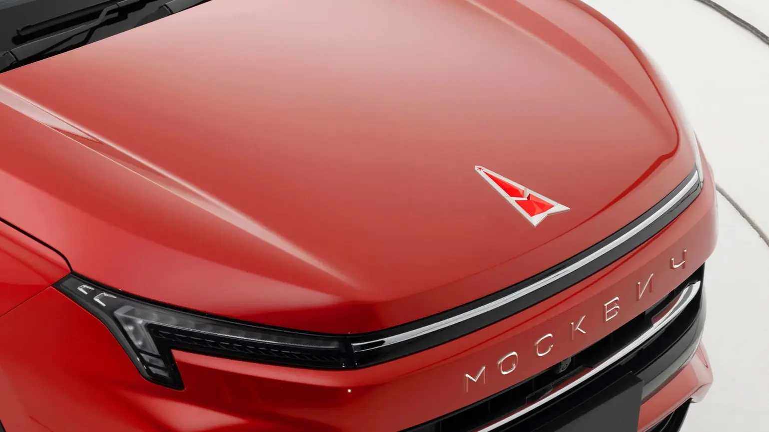
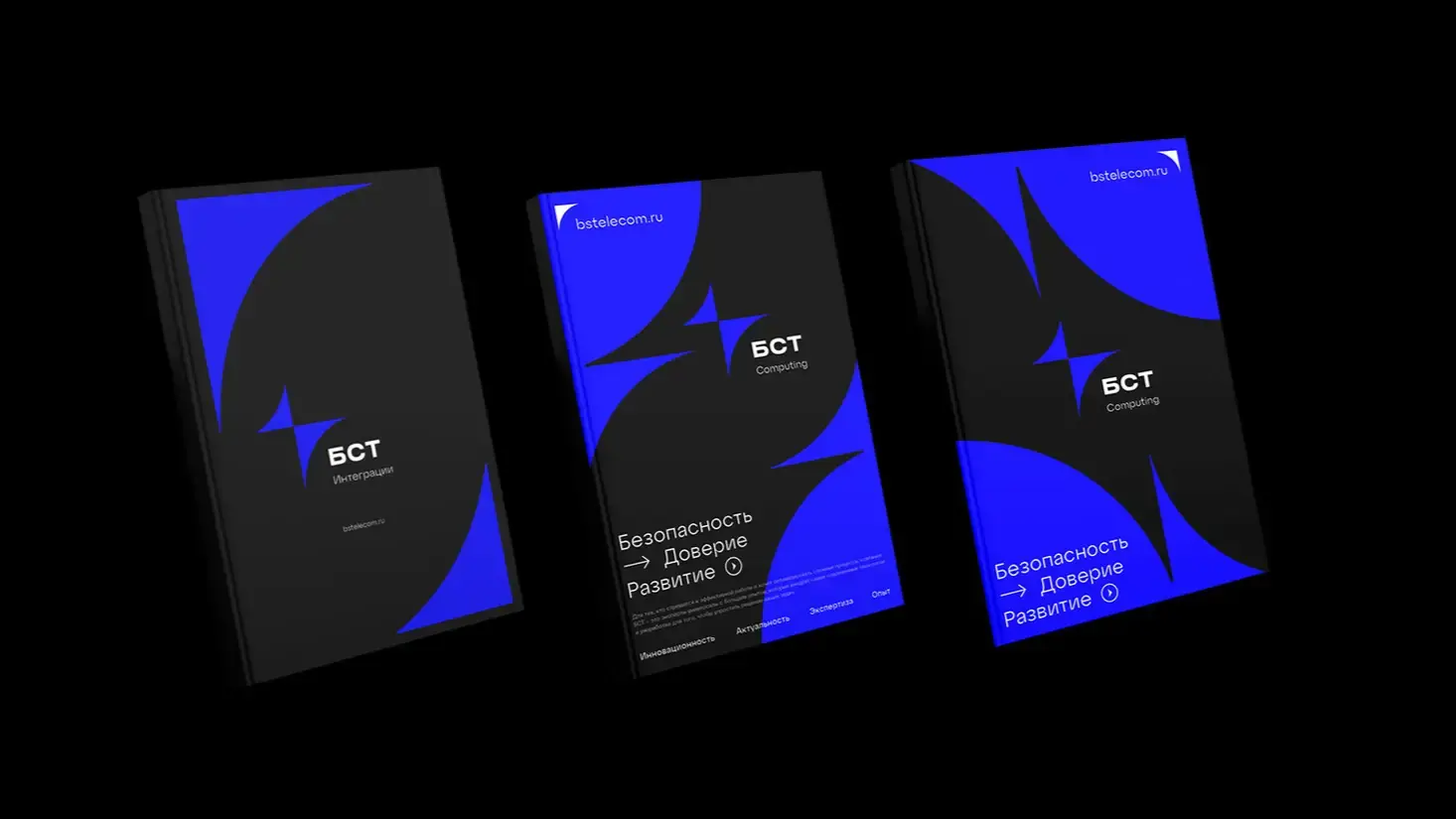
Adaptive (responsive) identity: a logo that changes depending on the medium

Responsive and dynamic are not synonyms
A responsive logo reacts to the medium and size: it adapts to a favicon, app icon, website header, signage — but remains the same visual sign, just in different levels of detail. A dynamic logo reacts to context, event, audience: its form or content changes depending on the occasion — a New Year's version, a Google Doodle for an anniversary, a MTV logo that looks different each month. The first is about the technical and visual stability of the sign across different scales. The second is about conscious variability as part of a communication strategy.
The problem is that top articles on the topic almost always separate these two layers: some write about CSS media queries and SVG, while others write about Google Doodles and holiday logos, as if they were different worlds. In practice, strong identity is built as a unified system: it has a responsive layer (scaling without losing meaning) and a dynamic layer (meaningful transformations), and both grow from a single core—so-called Brand DNA.
What can be changed and what cannot be changed in a logo
The core of a logo is not the form as a whole, but a set of two to three elements that encode the brand in the viewer's mind. Everything else is variables that can be sacrificed depending on the medium.
- The immutable core: key geometric shape or proportion (circle, monogram, distinctive line curvature), signature color or color pair, recognizable rhythm of composition.
- Variables that can be adapted: presence or absence of a text block (naming), the level of detail of the mark, line thickness, volumetricity (2D/3D), the number of elements in the composition, the method of animation.
- What disappears first when shrinking: slogan, decorative ticks, thin gradients, small details inside the mark.
A telling example is the redesign of the Mastercard logo in 2016 year: the company removed the brand name from the logo, leaving only two overlapping circles, and retained 81% brand recognition. This proves that text is almost always a variable, not a core element. The core element turned out to be the composition of two shapes.
How to design a logo from 16 pixels to a billboard
A classic mistake is drawing a full, detailed version of the logo and then 'shrinking' it to smaller formats. The correct order is the reverse: start with a favicon 16×16 pixels. This strict limitation forces the designer to immediately separate the core from the decoration — there simply isn't room for anything extra.
- Design a minimal version 16×16 px — a symbol without text, without fine details, with the simplest possible form. If the mark is readable at this size, the core has been found correctly.
- Scale the core to medium formats: app icon (around 80 px), avatar in social networks (around 400 px) — here it is acceptable to add a bit more detail or a short monogram.
- Assemble the full version with a text block for the website, documents, presentations — a context where space is not limited.
- Design a version for large formats (exterior, billboard, stands) — here the key is not detail, but contrast and readability from a distance, so sometimes the line thickness is increased or the composition is simplified even further.
- Determine which elements move identically across all digital media — that is, to define the 'grammar of motion' for the logo if the brand uses motion graphics.
This is exactly how Netflix and Airbnb are designed: their logos are animated according to a distinctive, recognizable pattern on any platform — this is not merely a matter of size adaptation, but a unique visual language of movement that is also part of Brand DNA.
Three ways of implementation — and when to choose which
Technically, logo adaptation can be implemented in three ways, and the choice between them is a matter of brand scale and the number of contact points, not taste.
| Approach | Essence | When it fits |
|---|---|---|
| Multiversion logo | Several ready-made files for different media (favicon, social networks, print) | A small brand with a limited number of channels |
| One SVG with media queries | A single vector file that changes its level of detail based on conditions specified in the code | Digital-first brand, primarily web and applications |
| Flexible rule system (generative platform) | A set of algorithmic rules from which any variant of a sign is constructed for any context | A large brand with dozens of media and subunits |
It makes sense to view this as a spectrum of four maturity levels: static mark (one file for everything) → responsive (multiple versions) → adaptive (a system with generation rules) → generative (options created by an algorithm or AI on the fly). Most brands only need to reach the adaptive level — that is the point when the logo transforms from an image into a set of constructive rules. It only makes sense to proceed to the generative level for very large institutions with an enormous volume of communications.
Container CSS queries (container queries), which received wide support by 2025 year, have significantly expanded the technical capabilities of this level: the logo can now respond not to the device screen size, but to the actual size of the container it is placed in — a widget, a card, a block in the interface. This makes the adaptive approach practically feasible not only for giants, but also for the average digital product.
Real examples and what they teach
MIT Media Lab pushed the concept of a flexible system to its limit: the institute's logo consists of three colored squares that can be assembled into 40 000 different compositions — while the core (three squares, palette, principle of intersection) remains unchanged. This is a benchmark of the architecture of 'one core — multiple expressions'.
Russian example — Yandex Multitrack: the system is built on modular lines that can be flexibly reconfigured for the medium and can exist both in 2D and in 3D, but retain a single geometric principle of element connection. Designer Joe Harrison in his series of adaptive logo versions for Disney showed that even a historically detailed sign overloaded with elements can be radically simplified to a minimal core — and it will still remain recognizable. The lesson from all these cases is one: adaptivity works not when the logo 'knows how to compress,' but when it was originally designed with a core capable of existing at any scale without losing meaning.
Typical mistakes in design
- Starting with the full version of the logo and trying to squeeze it into a favicon — instead of designing the core from scratch starting with the minimum size.
- To consider responsive adaptation purely as a technical task for a web developer, rather than as part of a brand's design strategy.
- Confusing dynamic identity with chaotic 'a new logo every month' — without a single core, this works against recognizability, not in favor of it.
- Trying to keep a slogan or text block 'because it is important' in small versions — the importance for a marketer does not equal readability on screen.
- Designing logo animation for each platform separately, without a single grammar of movement — as a result, the brand looks different on the website and in the application.
Recent articles






MegaFon, BMW, VTB and more 240+ companies. See how it looks in the showcase reel:


Our branding agency is approached to order:
Branding agency services