
BRANDING
Branding
for Nedelska
Custom development
Brand Platform
Logo
Corporate Identity
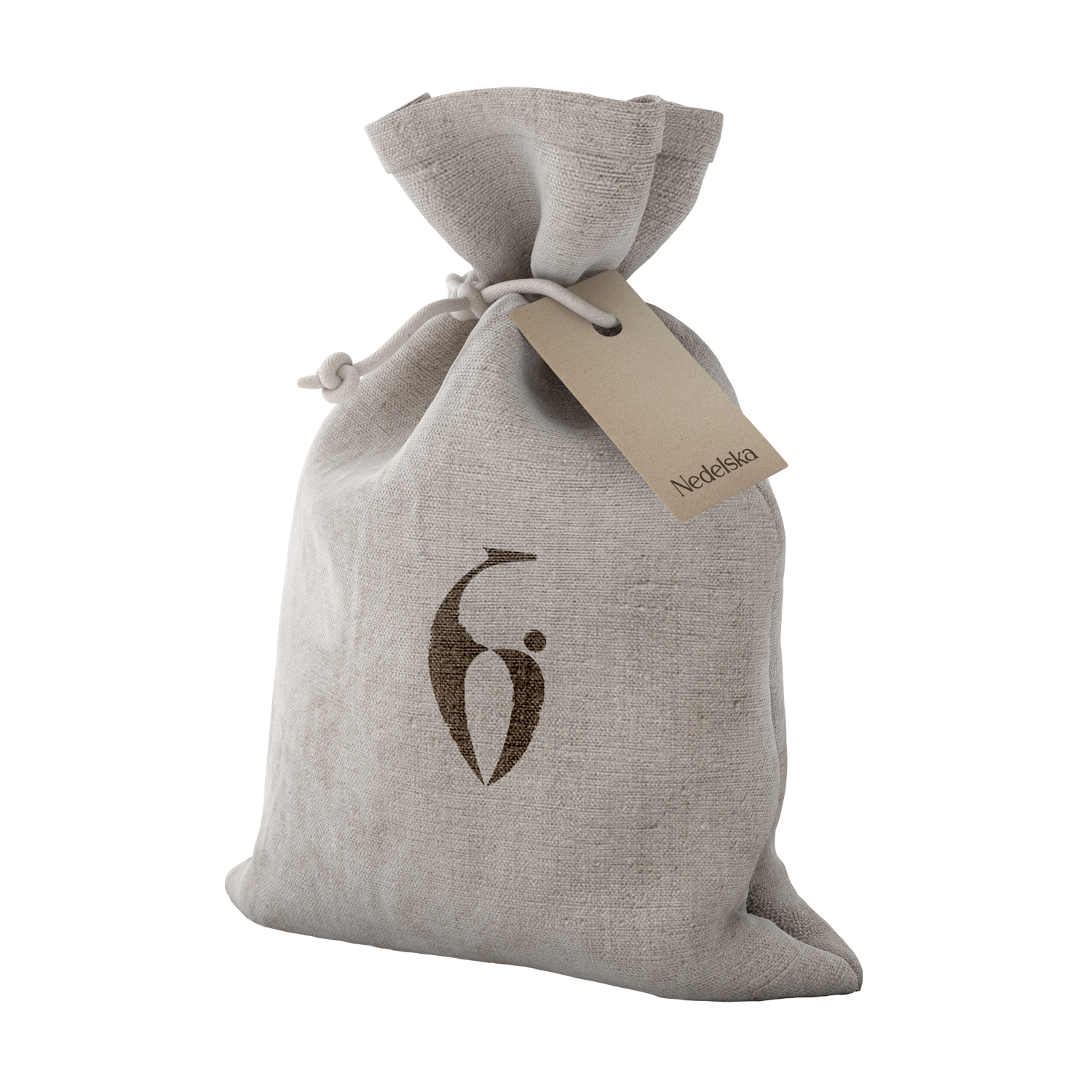
Packaging
Identity
The Nedelska brand specializes in the production of natural cosmetics using family recipes passed down through generations and offers comprehensive skin care treatments
Our task was to develop a modern, effective identity and sign that would make a serious statement about a strong brand.


The sign is based on the recognizable silhouette of a fawn, but at the same time the sign refers to graceful outlines reminiscent of
about the natural basis of the brand’s cosmetics
about the natural basis of the brand’s cosmetics


An elegant style was chosen for the font part
with serifs and expressive symbols
with serifs and expressive symbols
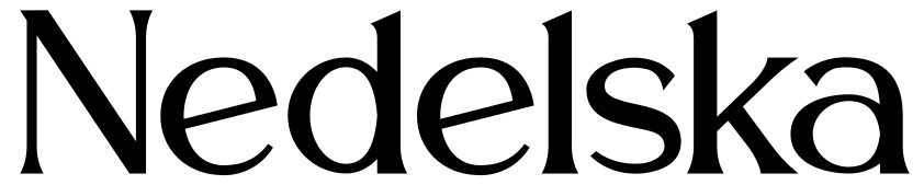
The identity was based on pure colors taken from natural motifs and emphasizing the environmental friendliness of the ingredients used by the brand

Business documentation and promotional printing of the brand maintain a consistent style and convey a common message
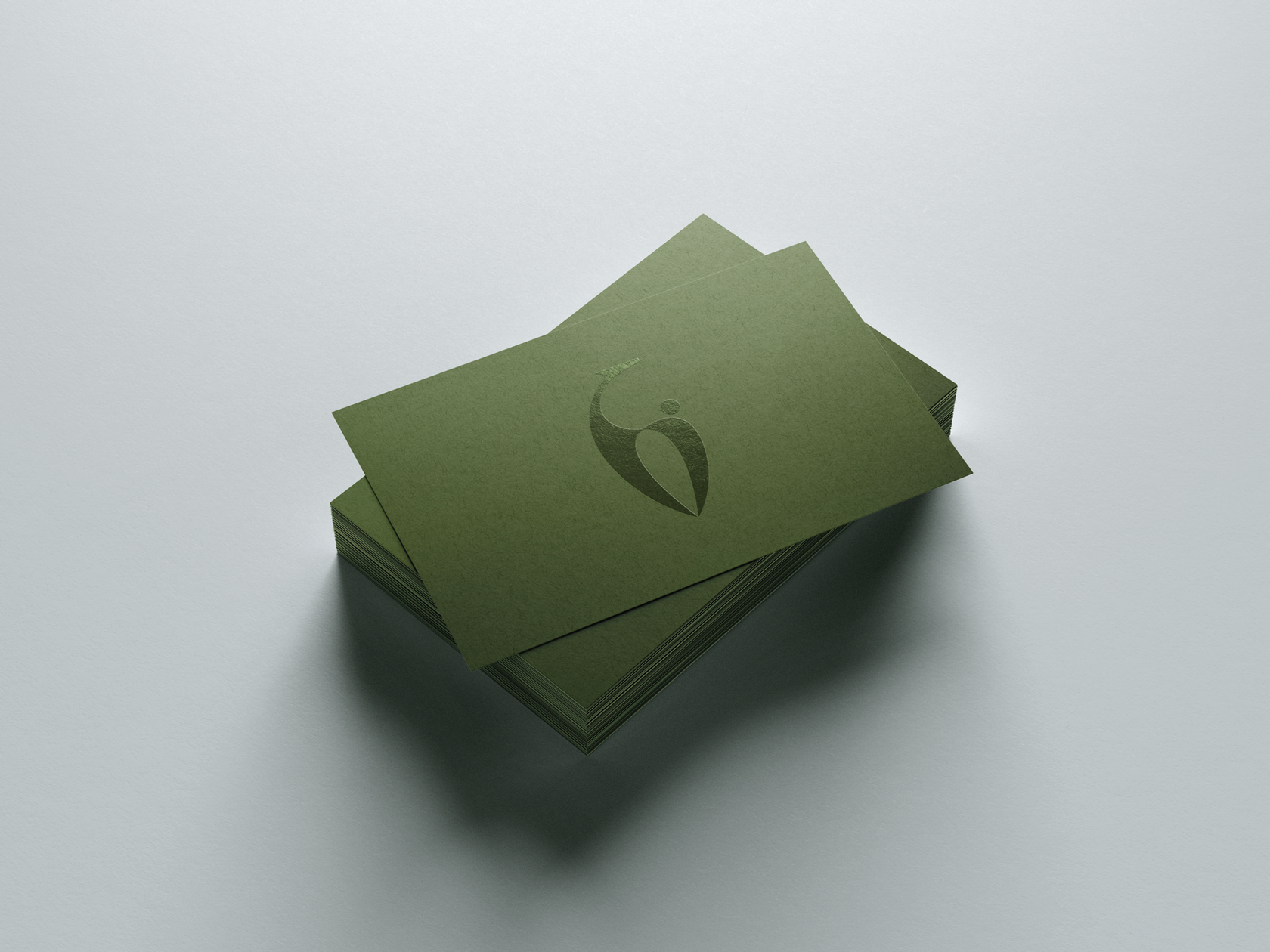
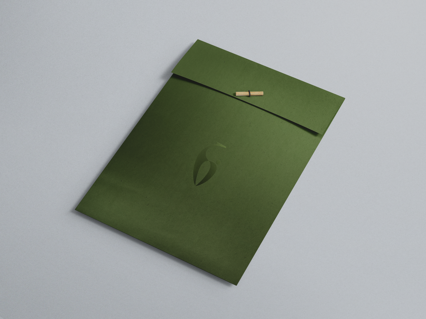
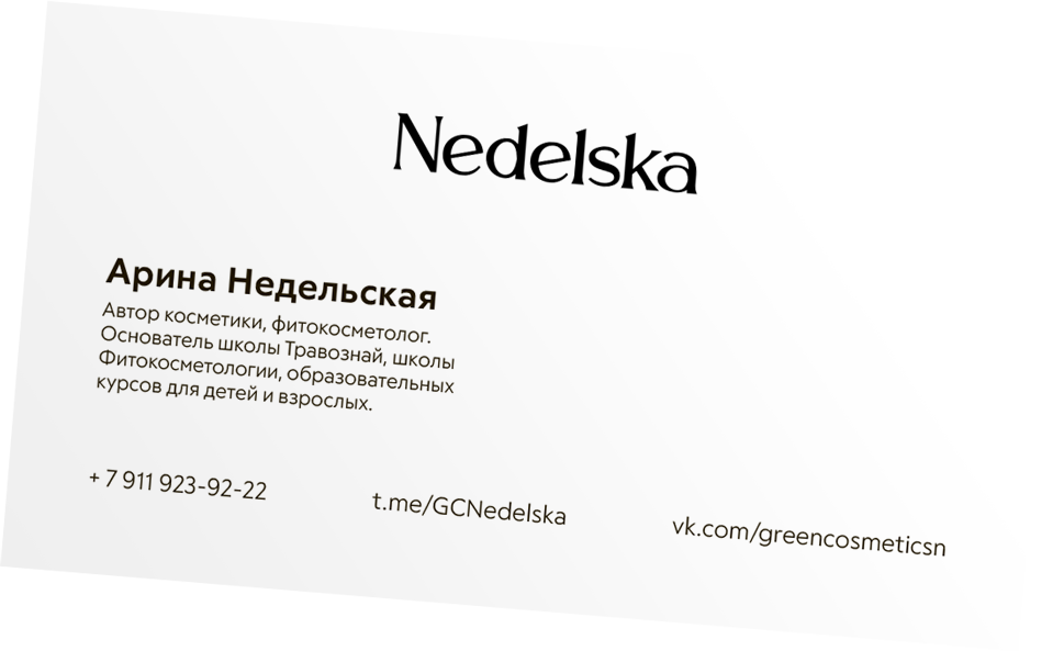
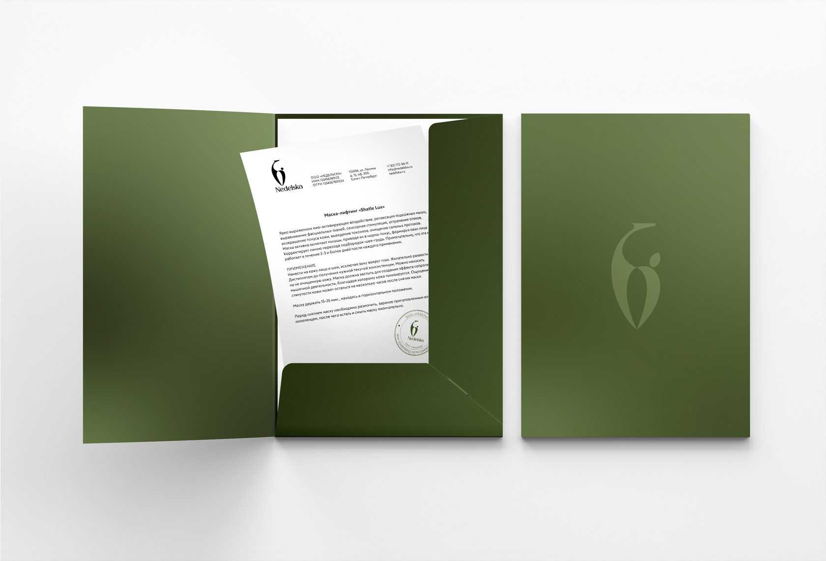

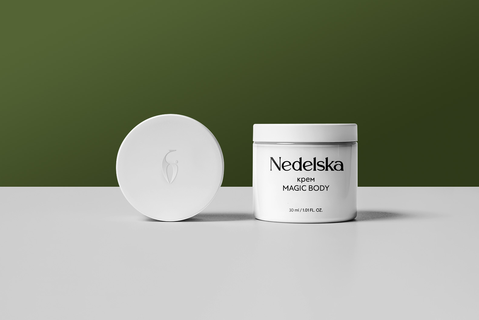
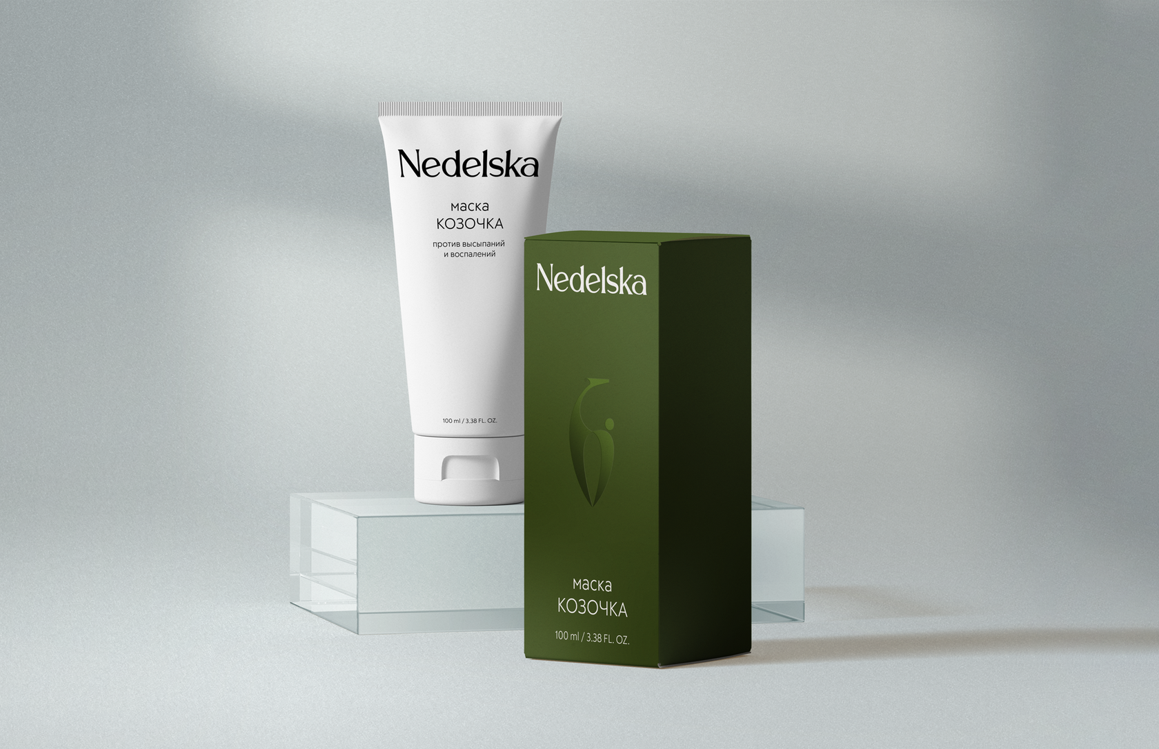
Branded product packaging allows you to confidently distinguish your brand’s products from competitors, while maintaining recognition of the very specifics of the brand.


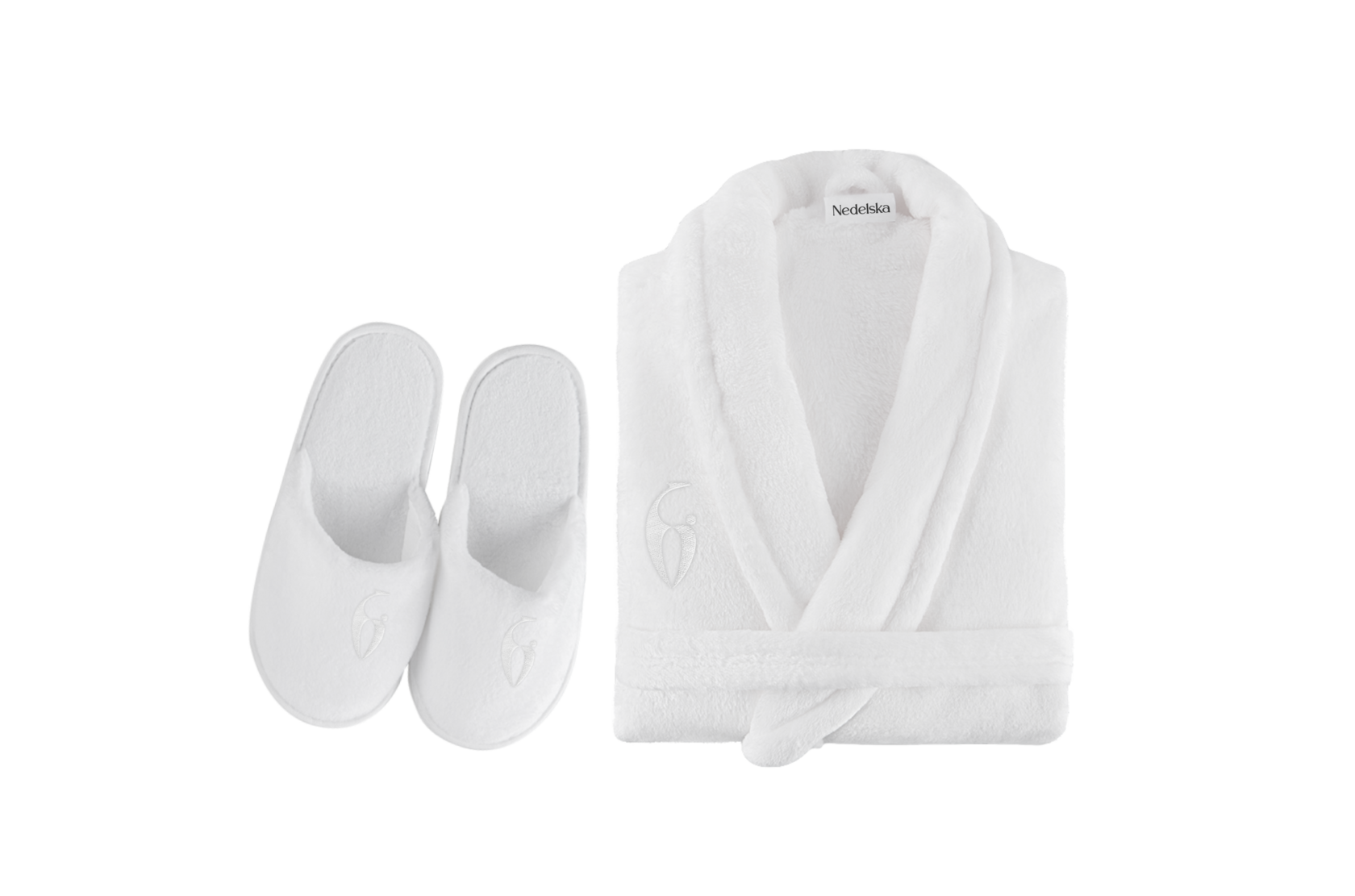
The company also has its own cosmetology center,
in spaces where the identity continues to develop organically, creating a single, recognizable brand image
in spaces where the identity continues to develop organically, creating a single, recognizable brand image
Working with the Nedelska company, we managed to implement a spectacular idea, create a modern, recognizable symbol that will be associated with the new wave of cosmetology, and at the same time maintain a careful attitude to the genre


Project team
Vladimir Simply
Alisa Yasnaya
Vlada Gaganova
Art director
Designer
Project Manager