Packaging as a branding tool
What decides the purchase within 0,2 seconds at the shelf
Ipsos reports: 72% of consumers admit that packaging design directly influences their choice in the store. FFI Shopper cites an even stiffer figure — 68% of decisions are made right at the shelf, without any prior plan to buy a specific brand. According to emoMeter data, emotional triggers in packaging account for 66% of impulse purchases — shape, color, associations, and only 33% rational arguments: composition, price, label content. The practical conclusion is simple and harsh: if packaging does not hook emotionally within the first second, it has almost no chance of being rationally perceived.
Here several levels of recognition work simultaneously, and they activate not sequentially but in parallel:
- Silhouette — the contour bottle of Coca-Cola is recognizable in the dark by touch because the shape has been patented since 1915 and has not fundamentally changed;
- Color — violet Milka, turquoise Tiffany (Pantone 1837, registered trademark), red Coca-Cola work as a brand signature without a single letter of text;
- Contrast with the category — packaging that breaks the shelf's color code is noticed faster, but this works only if competitors themselves are stuck in one palette;
- Typography — the name and key advantage must be readable from a meter away, otherwise the buyer will walk past it, even noticing the packaging.
A less obvious but confirmed fact: color works oppositely depending on the product category. A study in Frontiers in Nutrition shows that for 'vice foods' (harmful products), warm tones—orange, red—enhance the intention to purchase, whereas for 'virtue foods' (beneficial products) cold tones—blue, green, light neutrals—work. An orange packet for Lay's chips makes sense, but the same orange on a yogurt package will trigger subconscious distrust of the claimed benefits. This is not an aesthetic rule but a psychophysiological effect, and violating it costs sales.
Premium and mass market: different perception physics
A common mistake in projects is transferring mass-market logic to premium products. On an open supermarket shelf, the packaging that wins the battle for attention within 0,2 seconds prevails. In the premium segment, the buyer has already come for a specific brand or stands before a display without visual noise from competitors—and the packaging's task is different there: to justify the price through weight, tactility, and the feeling of ritual upon opening.
| Parameter | Mass market | Premium segment |
|---|---|---|
| Packaging task | Win visual shelf noise within 0,2 seconds | Justify the price through tactility, not attention competition |
| Materials | Light cardboard, cheap printing, minimal layering | Thick cardboard, embossing, matte lamination—weight as a physical argument for quality |
| Color and graphics | Vibrant colors, lots of text and promises on the packaging | Subtle palette, empty space, minimal text |
| Point of contact | Open shelf, direct competition | Display, boutique, online unboxing—less visual conflict |
| What determines the choice | Speed of recognition and price | Feeling of status and ritual upon opening |
A separate logic: packaging for special audiences
The Ducray brand designed packaging for elderly consumers not for aesthetic, but for functional criteria: a stable form that does not fall and does not slide on a wet shelf in the bathroom, a matte non-slip surface, Braille font for the visually impaired. Here design is completely subordinated to function, and this is not a compromise — this is also part of the brand strategy, because care for accessibility is perceived by the audience as a real, not declarative, corporate value.
How much does a packaging redesign cost in real figures
Redesign is not a creative experiment, but a financial risk with a specific price of error. The McGill University study shows: 70% of brands lose, on average, 3,2% of sales after packaging changes in the first months, because the recognizable silhouette on the shelf works as a navigational lighthouse for the buyer choosing on autopilot, and the new form breaks this autopilot.
Real cases are harsher than average figures. Tropicana in January 2009 replaced its trademark packaging with an orange from which a straw protrudes, with a minimalist design featuring a glass of juice — and lost approximately 20% of sales over two months, which in dollars exceeded 30 million. The company reverted to the old packaging by February. Pepsi in the 2008–2009 years paid the agency Arnell Group around one million dollars for a logo redesign justified through the 'golden ratio' and received a wave of mockery rather than sales growth. Gap in 2010 unveiled a new logo and rolled back the decision within six days after public outrage in social networks — before even spending the budget on packaging print.
General pattern: premium brands and category leaders recover faster from declines, but only if the new packaging provides a real functional advantage—easier to open, better product preservation, more compact storage. If only the 'picture' changes without benefit to the consumer, the risk is rarely worth it. Hence, the rule for any redesign: test it not as a creative project, but as a product change—with a hypothesis, tracking metrics, and a backup plan in case of decline in the first quarter after launch.
Packaging as a vehicle for brand values
The discrepancy between the design and the stated brand values is perceived by the buyer almost instantly, and it works more destructively than silence on the same topic. If a company talks about ecology but the product lies in a blister with three layers of plastic and a separate cardboard insert with instructions, trust suffers more than if the brand had not raised the issue of sustainability at all. Nutella has received waves of criticism several times precisely for the discrepancy between the 'natural' brand image and the composition with palm oil—and this is a lesson not specifically about ecology, but about how any declared value positioning is checked literally, right down to the composition.
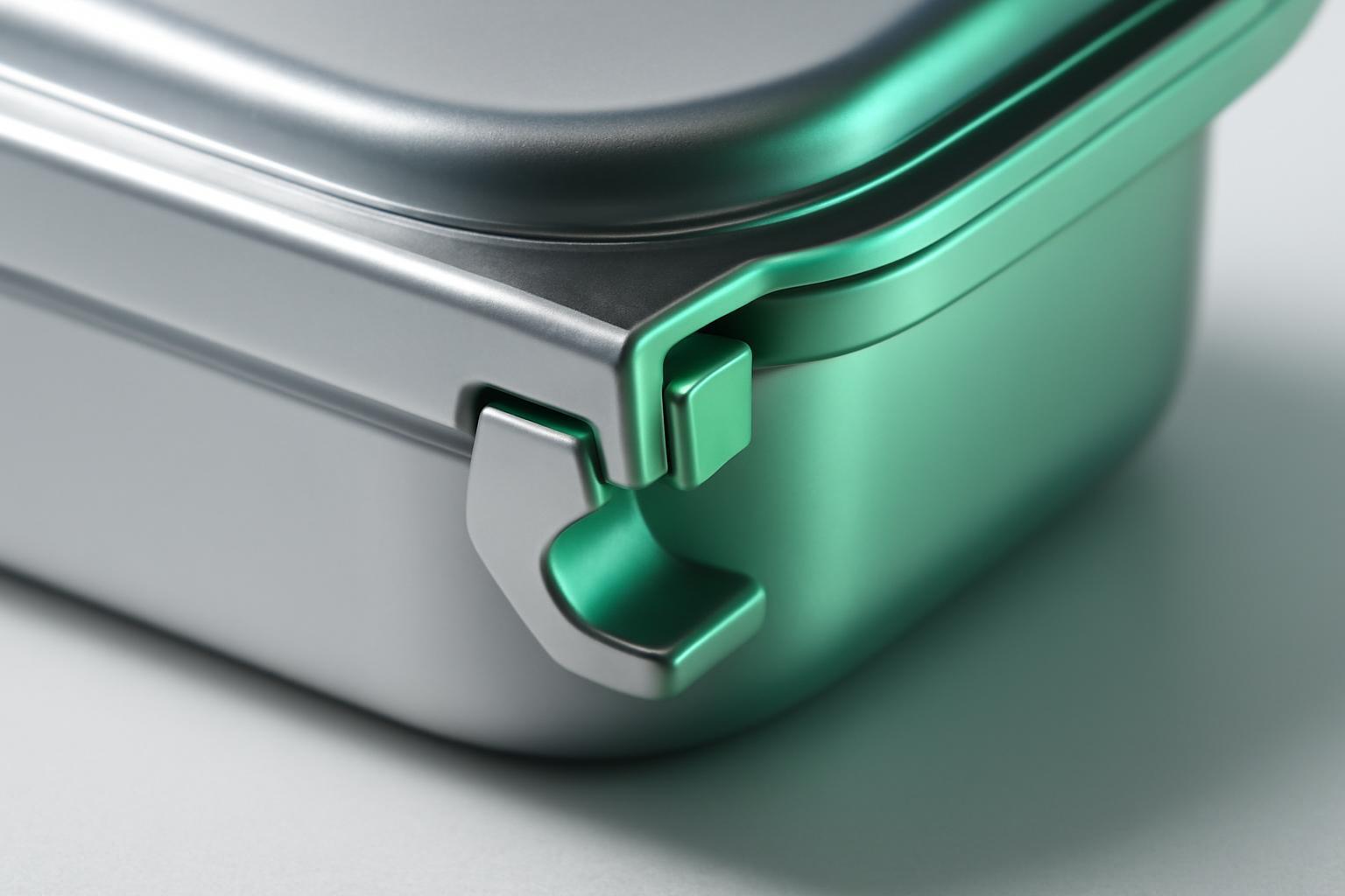
Eco-packaging is often perceived as a technical task: replace plastic with cardboard, remove one layer. But as a branding tool, it only works when it becomes part of the visual language, not a footnote in small print on the back:
- The material and its origin should be a visible part of the design—Lush prints 'no packaging' directly on solid shampoos as the main visual argument, not as a technical detail;
- Simplifying the construction should be read as a conscious decision, not a cost-saving measure—the difference in presentation is immediately apparent;
- Ecological friendliness must be embedded in the storytelling of a specific product, not declared abstractly—'why exactly for this product and this audience,' not 'we use recycled cardboard';
- Packaging material should correspond to actual production — any discrepancy is quickly exposed on social networks, as happened with several cosmetic brands that claimed to be eco-friendly while using plastic primary packaging.
Packaging in three environments: shelf, courier, smartphone screen
The packaging journey long ago does not end at the checkout. It is captured on video during unpacking, discussed in comments, lives on static photos in social networks — and the brand does not directly control this second life. Glossier built a significant part of its brand recognition precisely on the pink bubbly film inside the box — a detail that is useless on a supermarket shelf but became the main visual element in thousands of unpacking videos on Instagram.
This changes the requirements for design: packaging must work simultaneously in three different environments — in the hands of a customer in a store, in the frame of a smartphone during delivery, and in static photo content in social networks. Tactile details — the density of the lid, the sound of opening, the layers inside the box — are almost not read from the shelf, but become the main content of unpacking videos. Therefore, for brands focused on online sales, the priority shifts from 'noticeability within 0,2 seconds' to a thoughtfully designed opening scenario that is pleasant to unbox and that one wants to show to others.
How to align packaging with brand strategy: step by step
Packaging that truly works for the brand, rather than existing separately from the strategy, requires a consistent set of decisions, not a creative brief like 'make it look nice'.
- Formulate one emotion or association that the packaging should evoke within the first few seconds of contact — before text and logo.
- Define the main scenario of product contact: supermarket shelf, courier delivery, boutique window display, marketplace listing — and design the form and materials specifically for this scenario.
- Check the color scheme for alignment with the category (warm for vice foods, cool for virtue foods) and for conflict with colors already occupied by competitors in this product group.
- Build in a functional advantage, not just a visual update — this directly reduces the risk of sales decline, as noted in a study by McGill University.
- Align the physical properties of the material — weight, tactility, durability — with the stated positioning: premium, care, eco-friendliness.
- To test the usability for a real target audience, including vision, motor skills, and age limitations — according to the Ducray model.
Packaging designed according to this logic maintains its shape both on the shelf, in the hands of a courier, and in someone else's video frame. That is why the final decision on the redesign cannot be delegated to just one designer without the involvement of a strategist — the cost of an error is measured not in aesthetics, but in sales percentages, as shown by Tropicana, Pepsi, and Gap.
Recent articles



MegaFon, BMW, VTB and more 240+ companies. See how it looks in the showcase reel:


Our branding agency is approached to order:
Branding agency services












