Tactile sensations from packaging and their role in perceiving quality
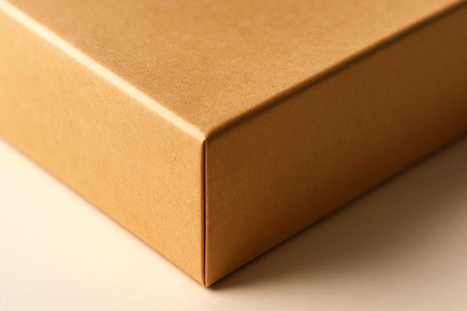
Why the hand decides faster than the eye
Tactile signals do not work as decoration, but as an information channel that the brain processes in parallel with vision and taste — and often faster. This is called sensory dominance hierarchy: in a situation of uncertainty (and purchase decisions are made precisely in such situations) touch gets priority, because physical contact is perceived as a more reliable source of data than a visual image.
From this, two interconnected mechanisms follow. Cross-modal correspondence is the transfer of characteristics from one sensory modality to another: the weight of a box 'transforms' into taste, the texture of packaging — into the texture of the product. Haptic priming is an effect in which tactile contact before using a product primes expectations and literally changes perception afterward. A telling example from the study Food Quality and Preference: identical cookies in packaging with a rough texture were rated as crispier and harder than the same cookies in smooth packaging. The product did not change — only the hand that held the box did.
Weight: the most underrated branding tool
Packaging weight is arguably the most direct lever of influence on the perception of quality, because it requires no interpretation: weight is read instantly and unambiguously. The study PLOS ONE recorded this with chocolate: participants eating the product from a heavy box rated the intensity of taste on average 5,46 points on a 7-point scale, whereas the same bar from a light box received 4,74 points. The difference is nearly a full point — with an absolutely identical product inside.
In the wine category, the effect is confirmed by statistics: in the analysis of 275 bottles from five countries, bottle weight positively correlated with price — the heavier the glass, the higher consumers are willing to rate the wine and the higher the actual price. Practical conclusion: if a brand wants to justify premium positioning, increasing package weight is one of the few physical parameters that directly converts into willingness to pay. The only question is the balance with sustainability — luxury category audiences are ready to forgive an extra gram of plastic, but are not ready to forgive ecological weight if positioning is built on 'purity'.
Gloss versus matte: different promises, different categories
Here confusion most often occurs in briefs: designers choose coating by taste, not by the function it should perform. Gloss and matte have different tasks, and mixing them without understanding the effect is a mistake.
| Parameter | Gloss coating | Matte soft-touch |
|---|---|---|
| Visual effect | Enhances color brightness, creates a lightness effect | Dulls the color, adds a sense of density |
| Impact on purchase intention | Increases | Increases |
| Impact on willingness to pay | Does not increase | Increases |
| Association | Moderation, freshness, accessibility | Luxury, premium, reliability |
| Effect on sense of safety | Neutral | +42% in the categories of children's goods and premium food products |
The difference is explained by the same haptic priming: gloss signals "new, light, for quick consumption", while matte finish signals "substantial, well-thought-out, for long-term use". Therefore, gloss works well in the mass market and impulse purchases, while soft-touch matte works in categories where decisions are made more slowly and prices are higher: cosmetics, alcohol, children's products.
Texture and material: signals that are read intuitively
A smooth surface is intuitively perceived as more "healthy"—this is confirmed by the implicit associative test (BIAT), where consumers faster and more confidently associate smoothness with product usefulness, even without being aware of this connection. A rough, textured surface works in the opposite direction—it is read as "natural", "craftsman-made", "authentic", which is advantageous for categories that position themselves based on authenticity, but disadvantageous if the brand sells diet or medical products.
- Smooth plastic or matte cardboard — for categories «cleanliness, health, technicity»: milk products, pharma, gadgets;
- Craft, rough texture — for categories «naturalness, craftsmanship, locality»: farm products, craft alcohol, eco cosmetics;
- Glass and heavy metal — for categories «status, durability»: perfumery, alcoholic beverages, premium segment equipment;
- Soft-touch plastic — for categories «care, safety»: children's products, health products.
An important nuance often overlooked: any quality marker on packaging — eco-label, certification mark, even a basic composition label — enhances quality perception more than the specific content of that marker. That is, the mere fact of having a physical or graphic 'trust anchor' is more important than its semantic load. This is not a reason to deceive the consumer, but a reason not to skimp on such details when developing a layout.
How to choose tactile elements for positioning: a practical algorithm
- Determine which category of decisions the purchase belongs to: impulse (gloss, lightness, brightness) or considered (matte, weight, texture).
- Match the brand's target association with the effects table: if the task is «premium», priority goes to weight and soft-touch matte; if «dynamism and accessibility» — to gloss.
- Check the texture's compatibility with the category's expectations: smoothness for «health», roughness for «naturalness» — violating this correspondence is perceived by the consumer as a mismatch, even if they cannot explain it in words.
- Add a physical quality marker—embossing, a certification mark, or a tactile label—regardless of what exactly it signifies.
- Test the prototype not on visual mockups, but on physical samples: 73–85% of purchasing decisions are made at the point of sale, and without tactile contact, the test does not reflect real customer behavior.
Why this should be part of branding rather than post-production of packaging
The numbers show that tactile solutions are not a decorative add-on, but a tool with a direct financial impact. 72% of American consumers acknowledge that packaging design directly influences the purchase decision, and for gift categories this figure reaches up to 81%. Meanwhile, 73,1% are willing to pay more for improved packaging, and nearly 60% of them agree to a surcharge of 3% — this is a noticeable margin for a category where profitability is calculated in percentages.
The mistake of most brands is to consider the tactile properties of packaging separately from the positioning strategy: the designer chooses the coating based on aesthetics, the procurement department selects the material based on cost, and the brand manager learns of the misalignment only after the perception study results. A working approach is to incorporate the tactile scenario at the briefing stage, together with defining the target association and the purchase decision category, rather than 'adding sensations' after the mockup has already been approved.
Recent articles




MegaFon, BMW, VTB and more 240+ companies. See how it looks in the showcase reel:


Our branding agency is approached to order:
Branding agency services












