How packaging affects the purchase decision in 3 seconds

What to change in packaging design right now
Before diving into theory, I'll give a practical list of fixes that really influence the decision in the first few seconds of contact with the product. These things can be tested on any existing packaging without a complete redesign from scratch.
- Increase the contrast between the background and the key element — this adds up to 32% to the duration of gaze fixation;
- Check the font size on the ingredients and price — small text undermines trust in 25% of buyers;
- Remove the visual "gap" between the package size and the product volume — excessive packaging with a small amount of product devalues trust in 25%;
- Make the wording on the label clear and unambiguous — vague information loses 30% of potential buyers;
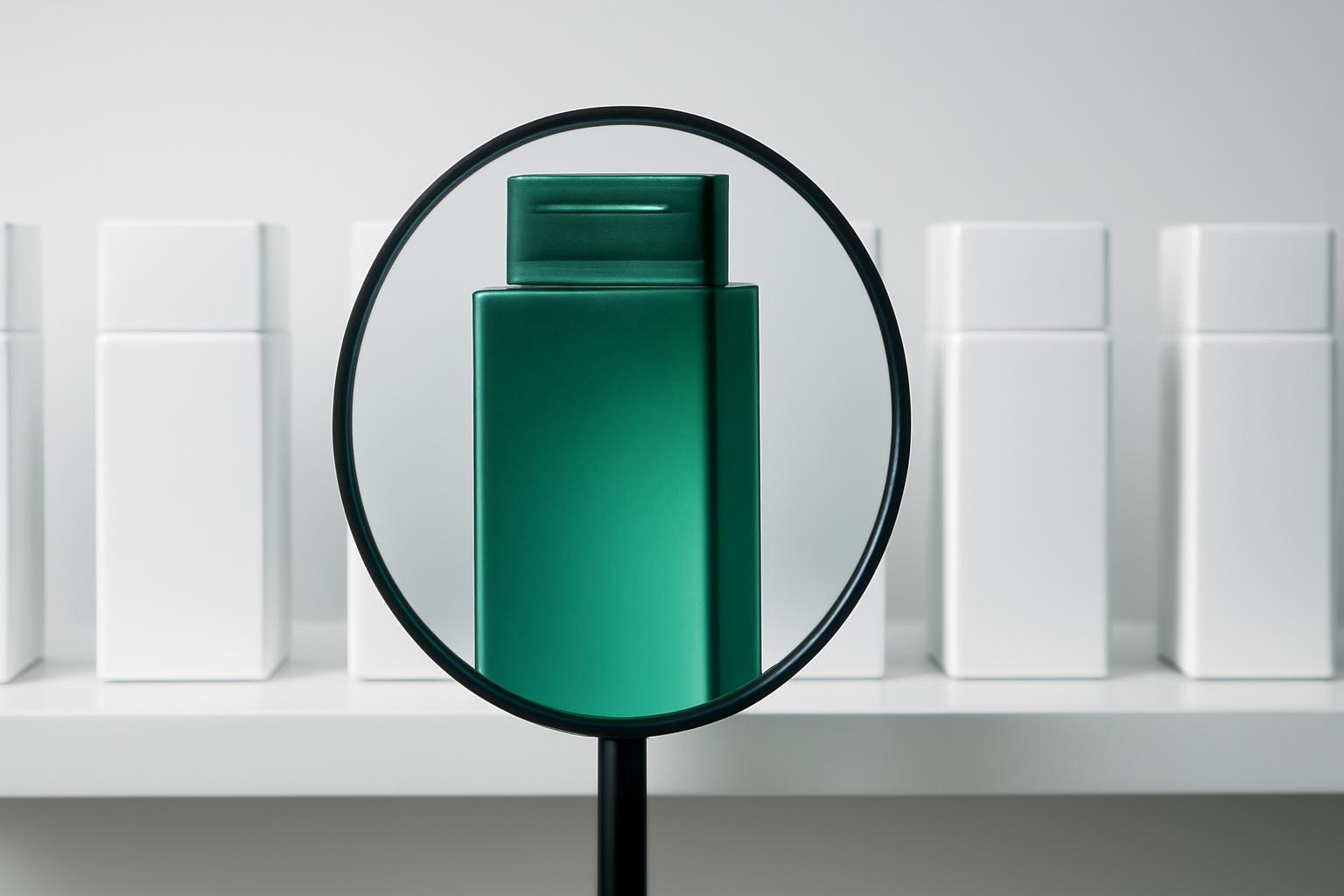
- Check whether the package shape is readable by silhouette, not details — at shelf distance, details don't work.
The order in which the buyer's brain processes these signals is not random: first color and contrast, then silhouette and package size, and only in the last instance — text. If the text is not physically read within one to two seconds, it is completely excluded from the decision, no matter how important it may seem to the marketer.
Why beautiful packaging of an unknown brand outperforms boring packaging of a well-known
There is a widespread misconception: marketers think that logo recognition compensates for weak design. In practice, the opposite occurs. The brain makes a decision before recognizing the brand — aesthetic reaction forms faster than cognitive identification. According to Kantar Ukraine, 66% of consumers are ready to try a product simply because the packaging looked beautiful, and 48% perceive attractive design as a direct signal of quality, even without a single fact about the composition.
A well-known brand in boring packaging loses not due to reputation, but because the boring form and low contrast simply do not manage to reach the processing zone within the allocated fractions of a second. The buyer physically does not 'get to' recognizing the logo — the gaze slides further down the shelf.
Color: why warm tones don't work for all categories
Warm colors reduce the time to the first glance to 420 milliseconds — this is a noticeable gain in competition for attention. But this does not mean that red or orange universally 'sell better.' What works is the correspondence of the color to the expected product category.
| Product Category | Working color type | Why |
|---|---|---|
| Snacks, beverages, impulse purchases | Warm, saturated | Accelerate gaze fixation, signal energy and taste |
| Premium cosmetics, dietary supplements | Cool, muted | Associated with cleanliness, precision, safety |
| Dairy products, water | Cool, light | Interpreted as freshness and naturalness |
| Children's products | Warm, contrasting | They attract the attention of both parent and child at the same time |
68% of consumers pay attention to the package color at the moment of choice — this is not background, but an active element of the decision that should be tested separately from the logo and text.
What physically happens with the buyer within 3 seconds
Three seconds — an averaged figure, behind which lies more precise mechanics. NIQ data shows that the first fixation of gaze on the package occurs as early as 0,67 seconds. During the remaining 2,33 seconds, the eye manages to make an average of 6,2 fixations — that is, the buyer literally scans the package with short jerks, rather than looking at it entirely.
Here lies the main gap in most articles about packaging psychology: what a consumer says in a survey and what is recorded by galvanic skin response and eye movements are different things. According to neuromarketing research estimates, up to 90% of shelf decisions are made based on physiological response rather than conscious analysis. A person may say 'the composition is important to me,' but their gaze at that moment has already reacted to color and shape, and the decision is actually made before the gaze reaches the label with the composition.
If the packaging has no transparent window showing the product itself, attention at first contact shifts to decorative graphics rather than textual information — the brain seeks a visual anchor faster than it begins to read.
Can the text on the packaging fix a bad first impression
The short answer is almost no. If color, shape, and contrast haven't worked in the first fractions of a second, textual information about composition, price, or expiration date physically doesn't have time to reach the processing zone: the buyer has already shifted their gaze to a neighboring product. Text is capable of enhancing a positive impression or confirming a decision that has already been emotionally made, but it is almost incapable of reversing a negative reaction in the same amount of contact time.
This does not mean that composition and price are unimportant — they are critical at the second stage, when the packaging has already been picked up. But counting on detailed and honest information 'saving' a weak design at the shelf stage is a strategic mistake. First, you need to win three seconds visually, and only then — convince with text.
Practical conclusion for business
Packaging should be tested not through focus groups with the question 'do you like it or not,' but through analysis of gaze movement and first fixation time — these metrics predict real shelf behavior more accurately than stated preferences. If the budget does not allow for a full eye-tracking study, at minimum — check contrast, font readability from a distance of one meter, and the package size matching the product volume. These are three fixes that do not require a complete redesign but directly affect whether consumers notice the product within 0,67 seconds or it remains unnoticed among competitors.
Recent articles


MegaFon, BMW, VTB and more 240+ companies. See how it looks in the showcase reel:


Our branding agency is approached to order:
Branding agency services












