Packaging shape as a marketing tool

Why shape is perceived faster than a logo
A person's visual system recognizes the silhouette and volume of an object in fractions of a second — long before attention focuses on the text or small details of the packaging. In a store, a brand has on average 3-7 seconds to capture a buyer's attention, and at this moment the shape works as the first filter: a rounded bottle or angular box triggers an associative reaction before the brand name is even read. The logo and color reinforce the impression, but do not create it — the foundation is laid by the silhouette.
This explains why brands with unique packaging shapes are recognized even in the dark or from a distance, when the text is physically unreadable. The contour bottle of Coca-Cola, the hexagonal prism of Toblerone, the conical bottle of Absolut Vodka — all three have existed for decades precisely because the shape has become a standalone identifier, independent of the label.
What associations are embedded in geometry
The psychology of form perception has been studied quite well, and the results are consistently reproducible across different cultures. Rounded forms are perceived as safer, softer, and 'friendly'—therefore, child nutrition, cosmetics for sensitive skin, and products for a healthy lifestyle more often feature rounded contours. Angular forms, on the other hand, convey strictness, technicity, and premium quality—this technique is actively used by luxury perfume and high-end alcohol brands.
| Shape | Consumer associations | Where it is more often applied |
|---|---|---|
| Round, streamlined | Softness, safety, accessibility | Children's products, cosmetics, snacks |
| Angular, faceted | Premium quality, technicity, strictness | Perfumery, alcohol, electronics |
| Extended, narrow | Lightness, elegance, dietetic nature | Sugar-free drinks, unisex perfumery |
| Massive, wide | Substance, richness, volume | Strong alcohol, cream products, oils |
A common mistake of many novice brands is choosing a form 'by eye,' guided by the personal taste of the designer rather than by what message the form conveys to the target audience. A form that pleases the design team may contradict the product's positioning: a angular bottle for children's juice looks aggressive, whereas a rounded package for premium whiskey looks unserious.
Form as part of positioning strategy
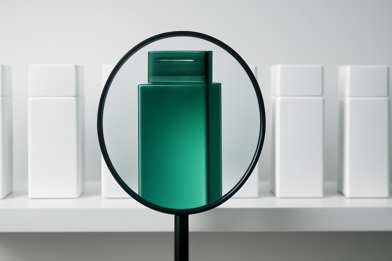
Packaging form should answer the question of where the brand wants to be relative to competitors — not next to them, copying the category standard, but either strictly within buyer expectations or demonstratively outside them. Tic Tac chose a flat transparent box instead of the customary round can for lollipops — and this became part of the brand on par with the name. Pringles moved away from a flexible pouch to a rigid tube, solving two tasks at once: protecting the fragile product from crumbling and creating a visual code that stands out among dozens of competitors on the snack shelf.
It is important to distinguish between two strategic paths here: to follow category convention so that the buyer recognizes the product instantly (a kefir package is almost always cylindrical), or deliberately violate the convention in order to stand out, at the cost of the risk of being unrecognized. The second path only works with strong marketing support—new forms must be 'explained' to the market through advertising and distribution, otherwise the buyer simply will not understand that the product in front of them belongs to the correct category.
Technical and economic constraints of form
A beautiful idea for a form is broken by the realities of production faster than it appears at the sketch stage. An individual mold for a plastic bottle can cost from several hundred thousand to millions of rubles depending on the complexity of the geometry, and the production time is from 6 to 12 weeks. This makes an unconventional form a risky investment for a startup: if the production run is small, the cost of the mold per unit of product consumes the entire margin.
- Non-standard form complicates palletizing and increases logistics costs — manufacturers consciously avoid it for transportation savings.
- Complex geometry limits material selection: not every plastic or glass can be molded under sharp angles or thin edges without risk of defects.
- Shape affects shelf stability and hand feel — asymmetric solutions require additional drop and tip-over testing.
- Changing the standard form after launch requires re-coordination with retailers, whose shelf space parameters are often fixed.
How to choose a form for a specific brand
The correct process of working with form starts not with sketches, but with analyzing the context in which the product will exist.
- Determine the shelf environment: photograph competitor shelves and understand which geometry dominates there — to repeat it or deliberately break from it.
- Formulate the emotion that the package should evoke in hand — this directly translates into geometry through the principles described above.
- Test the form for functionality: ease of grip, dosing, storage after opening — a form that doesn't feel good in hand loses trust even with a strong visual.
- Evaluate production feasibility and cost of the mold relative to the planned run — a new form is justified only at a scale that will cover its cost.
- Test the prototype on target audience blind, without logo and color — if the form itself does not convey the desired image, refining color and graphics won't save it.
Common mistakes in packaging form development
The most common mistake is to consider form separately from other elements of identity, leaving it to engineers without the involvement of a brand strategist. The second most frequent error is blind copying of the form of a category leader in the hope of 'looking like a big player,' which in reality only dissolves the brand among competitors and fails to give customers a reason to choose it specifically. The third mistake is being obsessed with form originality at the expense of functionality: packaging that is hard to open with one hand or inconvenient to store in the refrigerator loses loyalty faster than it gains shelf attention. Packaging form works as a marketing tool only when it simultaneously solves the recognition task, conveys the necessary emotion, and remains practical for daily use—any one of these three conditions falling short devalues even the boldest design idea.
Recent articles



MegaFon, BMW, VTB and more 240+ companies. See how it looks in the showcase reel:


Our branding agency is approached to order:
Branding agency services












