Packaging faking: how to stand out on the store shelf

Facing in branding and facing in merchandising — not the same thing
In design, facing is the front side of packaging: logo, name, visual hierarchy, color. In merchandising, facing is the number of product units displayed face to the customer on the shelf. Confusion arises because both terms describe the 'face' of the product, but from different sides of the process.
| Parameter | Facing in branding | Facing in merchandising |
|---|---|---|
| What it regulates | Composition, color, fonts on the packaging | Number and placement of SKUs on the shelf |
| Who is responsible | Designer, brand manager | Category manager, sales representative |
| Success metric | Recognizability, speed of reading | Shelf share, turnover per unit area |
| Example of the effect | +10% sales from packaging embossing | +10-30% sales from increasing facing by 1-2 units |
Both aspects work only in combination. An ideal design with one face on the shelf will lose to an average design with five faces — simply due to the physical volume of presence. And vice versa: five faces of weak design will not save the product if the buyer cannot understand at a glance what is before him.
Eye level versus top and bottom shelves: different composition for different context
Products at 70-150 cm from the floor sell 2-3 times better than neighbors from other shelves — this is the zone where the gaze falls without effort. But most brands make one face layout for all positions, which is a mistake, because the viewing angle and reading speed change drastically.
- Eye level (1,2-1,7 m): more details can be provided — taste, composition, additional benefits, because the buyer has time to linger with their gaze.
- Bottom shelves: the buyer looks from top to bottom at an angle, so key information — the logo and name — should be shifted to the upper third of the packaging.
- Upper shelves: looking from bottom to top, a large logo and contrasting background work better than small typography.
A good example of a systemic approach is the Be Fit brand, where brand elements occupy 80% of the packaging area, but their placement is adapted: at eye level, the emphasis is shifted to the center, for lower shelves — upward. This is not cosmetics, but a direct response to the physics of perception at a specific point of sale.
What really drives sales, and what is just beautiful
Designers love to argue about fonts, but not all decisions affect the cash register equally. Below is the concrete data that can be checked in your own category.
| Facon element | Effect on sales |
|---|---|
| Soft-touch texture (tactility) | Increases the desire to pick up the product from the shelf |
| Embossing | +10% to sales |
| Contrast flavor stripe instead of a blurred color | +7% sales |
| Specific benefits instead of general words | +5-6% conversion |
| Optimizing the number of facings on the shelf (+1-2 units) | +10-30% sales |
| Recalculating the face-up composition (Nestle case) | +11 points of recognition, +10% brand perception |
At the same time, NielsenIQ honestly warns: optimized packaging on average gives +5,5% to projected sales, but 90% of redesigns do not create a significant effect at all. The difference between a successful and a failed redesign is not in the agency budget, but whether the solution was tested on a real shelf before launch.
How much information can a buyer absorb in one glance
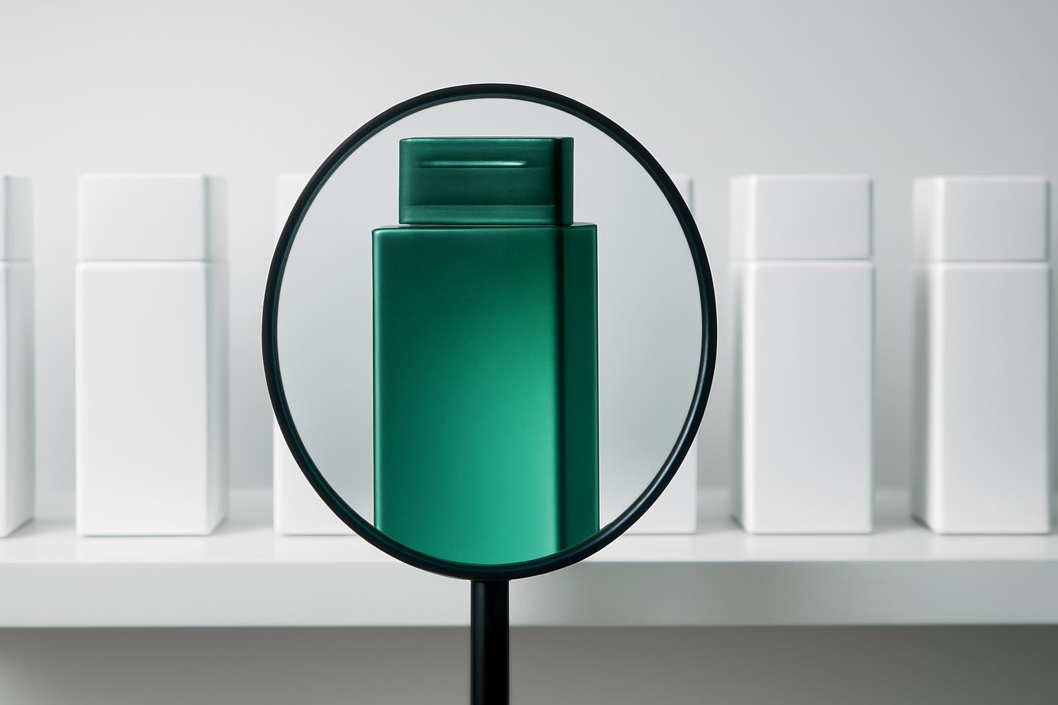
According to Metrixlab data, a person can count a maximum of 3-7 informational blocks of packaging on first contact — literally fractions of a second before the hand either reaches for the product or walks past it. More than seven blocks and the brain simply cannot process the information; the packaging merges into visual noise. Hence the rule: logo, name, taste/variant, key benefit — that's already four blocks, and there's little room left for additional elements. 72% of purchase decisions are made based on packaging design (Packaging Digest), so the battle is not for the amount of information, but for which 3-7 blocks the buyer counts as the first.
How to check competitor shelves before developing the face-up
Before opening Figma, you need to open the store door. The Store Check and Design Mapping methodology is not an abstract advice 'study the competitors', but a specific sequence of actions.
- Take a photo of the entire shelf in 3-4 retail formats: hypermarket, supermarket, home store — the composition must work everywhere, not only in ideal conditions of one network.
- Create a color coding map of the category — which colors are already 'taken' by competitors, so as not to get lost among similar shades.
- Mark who stands at eye level, and who is above or below, and understand whether you have a chance to get a display spot in this zone or you need to design for the lower shelf.
- Measure the number of facings of category leaders — this is an indirect indicator of how much shelf space a strong brand actually gets.
- Check which 3-7 informational blocks are read first by top 3 competitors, and find an unoccupied niche in presentation.
Such an audit takes one working day per category, but saves months of rework after launch — because 59% of consumers, according to Nielsen, are ready to try a new product from a known brand, which means that brand recognition cannot be sacrificed for a bold redesign.
What to check before a redesign to avoid repeating the Tropicana story
In January 2009 year, Tropicana changed its packaging — removed the recognizable image of a stick protruding from an orange, and changed the flavor color coding. Result: 20% drop in sales and losses of $27-33 million over two months. Customers on autopilot were looking for the familiar image on the shelf — and simply couldn't find the product, although it was physically standing in place.
Before any face redesign, it is essential to honestly answer three questions:
- Does the product have an 'anchor' visual element that allows the buyer to recognize the brand in a fraction of a second — and will this element be lost in the new version?
- Is the color coding of the product line preserved — if each flavor had its own color, changing the coding system will almost certainly cause confusion on the shelf.
- Has the new design been tested using eye-tracking methods alongside the current version — not in a vacuum, but in a real shelf context with competitors.
Redesign for the sake of redesign is a bad idea. If 90% of changes do not create noticeable sales growth, then any facelift update should address a specific problem: weak visibility at a specific shelf level, loss of market share to a new competitor, or outdated brand perception. Without such a goal, redesign is a risk to repeat the path of Tropicana, rather than the path of Nestle with its +11 points of recognition.
Recent articles




MegaFon, BMW, VTB and more 240+ companies. See how it looks in the showcase reel:


Our branding agency is approached to order:
Branding agency services












