Font weight and brand reliability perception
Mechanics: why font weight changes brand perception
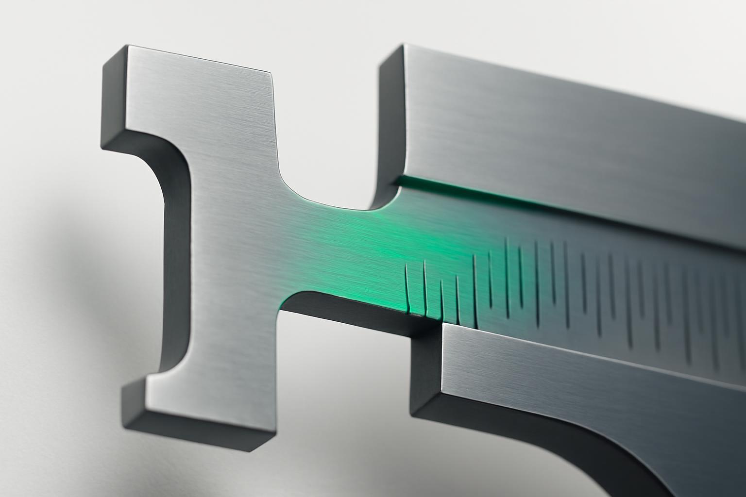
Grohmann and colleagues in their study 2012 year (published in Journal of Brand Management in 2013) documented what designers previously felt intuitively but could not justify: font weight specifically and predictably affects two brand perception parameters — competence and ruggedness. Increasing weight enhances both indicators. Decreasing weight, conversely, signals sincerity, excitement and sophistication — sincerity, energy and refinement.
Why exactly weight, and not, for example, contrast of strokes or presence of serifs? Doyle and Bottomley (2009) explain the answer: the transfer of meaning from font to brand occurs through assimilation — assimilation, not contrast. The brain does not compare the shape of a letter to an abstract prototype of 'reliability', it directly transfers the physical property of the shape to meaning. A thick line physically occupies more space, looks more stable and 'heavier' — and this is a literal, bodily sensation of mass that is directly converted into a sensation of strength and weight of the brand. Serifs work more indirectly, through cultural associations with the printing tradition, so their effect is weaker and slower to be perceived.
Bold = power, thin = delicacy: this is confirmed by the data
The associations are not abstract; they have been repeatedly reproduced in different studies with different fonts and cultures.
- Demelo and colleagues showed that bold sans-serif fonts are perceived as warm and discerning, while thin ones are perceived as calm and soft.
- Research of Japanese fonts on CiNii (2017) revealed the same pattern in another writing system: regular weight reads as delicate and feminine, bold and extrabold — as serious and masculine.
- Shaikh and colleagues (2006) added another layer: the font style itself sets the baseline for trust. In a test involving a bank, serif received a reliability rating of 6.02, sans-serif — 5.90, monospace — 3.02, script — 1.76 (p
The conclusion is simple: font weight and style do not work independently but as two overlapping layers of signal. A bold monospace will still lose to a thin serif in perceived reliability — style sets the ceiling, and weight modulates the strength within that ceiling.
Is the effect of weight universal for all industries
The effect is physiologically universal — a thick line will always be read as more 'weighty'. However, the acceptable weight range for a specific brand depends greatly on the industry, because different sectors have different balances between desired competence and desired sincerity.
| Industry | Recommended weight | Why |
|---|---|---|
| Banks, insurance, B2B-finance | Semibold — Bold | Maximum competence and ruggedness are needed; delicacy here reads as weakness |
| Healthcare, medicine, body care | Medium — Semibold | Full bold frightens with 'aggressiveness', while Regular does not provide the necessary confidence in a doctor's competence |
| Fashion, luxury, beauty | Light — Regular | Thin weight conveys sophistication and excitement, which are more important than direct authority |
| Children's products, edtech for kids | Regular, rounded forms | Sincerity and softness are needed, not forceful pressure |
| Technology, industry, automobiles | Bold — Extrabold | Ruggedness and power directly work on the image of reliable engineering |
This is not a rigid law but a starting point. Within one industry, there can be different brand positioning: a bank for startups can consciously choose a lighter weight to differ from the 'heavy' classic players and appear more human.
The conflict between trust and authority: where to find the balance
This is where the main practical trap lies. Trust requires discernment and moderation—the eye should smoothly glide over the text without effort. Authority requires weight—and a too-heavy weight on long textual blocks reduces readability and turns confidence into fatigue.
Working rule: font weight works for authority in short, accent elements — logo, headings, key numbers. Main text, where the reader needs to grasp details and believe the content, requires Regular or Medium. If the entire brand text is set in one heavy weight, the effect of authority disappears — the brain gets used to the 'shout' and stops reading it as a signal of strength, while legibility drops. Competence is conveyed through weight contrast, not total boldness.
Font weight as a tool for visual hierarchy
Changing weight within one typeface — the most underrated tool. It allows simultaneously solving both tasks: giving the reader trust (through a comfortable reading medium weight) and authority (through accents). This works better than changing font size, because it does not disrupt the composition's unity.
- Headings and key theses — Bold or Semibold, they get attention priority and are read as 'important and confident'.
- Main text — Regular or Light, to avoid straining the eyes and blurring trust.
- Micro-accents (numbers, statuses, CTA) — weight can be raised one or two steps above the base, creating pinpoint centers of authority without overloading the entire composition.
Thus, font weight begins to work as visual grammar: the reader subconsciously understands what is more important, even before reading the word.
Practice: how designers apply this and why they often make mistakes
A telling case is the rebranding of O'STIN. During the stage of graphical searches, the team worked with bold typefaces, because the heavy weight makes font solutions more expressive and noticeable during the concept testing phase. However, the final solutions shifted toward light weights — while heavy weight effectively conveys the idea during presentations, it does not always suit everyday brand use in real media.
The industry problem is broader than a single case. An overview 34 of studies covering 635 types of fonts revealed common patterns in the perception of font qualities; however, when selecting a font, many professionals rely on personal experience and taste, others also rely on personal experience and taste. This explains why in branding, either excessive bold «for solidity» or random light «because it's stylish» frequently appears — without understanding what signals they actually send to the audience. Conscious choice of font weight is not a matter of aesthetics, but a specific psychological lever that can be used to control the perception of brand competence, just as color or tone of communication can.
Recent articles




MegaFon, BMW, VTB and more 240+ companies. See how it looks in the showcase reel:


Our branding agency is approached to order:
Branding agency services












