Typography of a multilingual brand: Latin, Cyrillic, hieroglyphs
Cyrillic versus Latin: where does the size difference come from
Cyrillic is physically wider than Latin: it has more letters with straight strokes and horizontal crossbars — J, Sh, Shch, M, Y. At the same point size, Cyrillic text takes up more space and visually ‘presses’ the line. Many brands try to solve this by simply reducing tracking, but that is a mistake — the letters stick together, and readability decreases.
The working approach is to reduce the x-height of Cyrillic by 3–5% relative to Latin. That is exactly what was done in Glovo Sans: the Cyrillic lowercase was made more compact so that when read, it appears optically equal to the Latin, even though the letters are slightly smaller by numbers. At the same time, wide letters like J are not artificially compressed — they are left wide on purpose, because a Cyrillic reader expects such proportions, and trying to fit J into Latin logic looks foreign and breaks the font’s recognizability for the language’s native speaker.
Arabic script: reverse contrast and rule +10%
Uncorrected Arabic text visually appears lighter and finer, although the font size is the same. The reason is in the letter construction: connectivity, diacritical marks above and below the line, and the absence of capital letters as such. The team at 2GIS/Urbi Touch recorded a specific figure: Arabic visually loses about 10% of its size, so the text size is multiplied by 1.1, and the line spacing is also multiplied by 1.1 (formula: initial_text_size × 1.1 = arabic_text_size).
The second nuance is that the contrast of the stroke works in the opposite way. In Latin, the classical contrast is built vertically: thick vertical strokes and thin horizontal ones — such is the nature of the pen with which antiqua was written. In Arabic calligraphy, the tradition is different: thickening occurs diagonally and in curves, not in verticals. If you apply the Latin logic of contrast directly to an Arabic script, the letters lose their characteristic thickening in the right places and look foreign to an Arabic-speaking reader. The solution is to design the contrast of the Arabic script separately, starting from naskh or kufi, rather than trying to mirror the Latin modulation.
CJK ideographs: an entirely different metric system
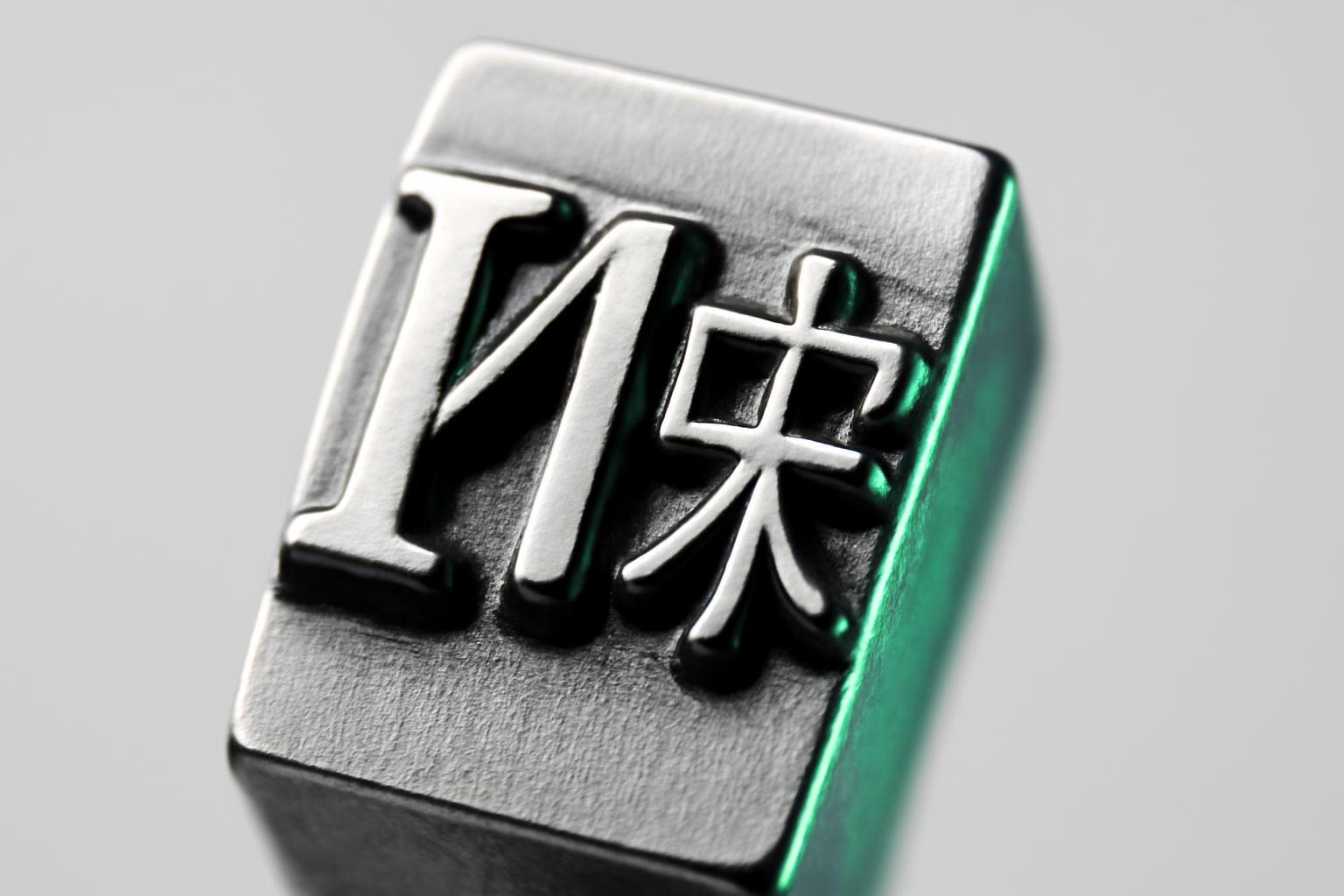
Chinese, Japanese, and Korean signs are built in a square grid — the em-box, where the ideograph occupies almost the entire square in both height and width. Latin has a completely different logic: different widths of letters, ascenders and descenders up and down, x-height lower than cap height. They cannot be directly combined — an ideograph on a Latin line will look small and 'submerged'.
Therefore, when designing a CJK + Latin pair, ideographs are usually scaled up, often by 107% relative to the base size of the Latin, the interline spacing is recalculated for the square grid, and the baseline is adjusted so that the ideograph does not 'hang' below the line. This is a separate engineering task, not a cosmetic fix.
There is also a more prosaic barrier — the number of characters. Simplified Chinese has around 7000 characters, while traditional Chinese has over 13000. Developing a full CJK font takes approximately two years — it is this, rather than aesthetics, that usually stops brands from launching in Asia with their own font instead of a system font.
One multilingual font family or a pair of several fonts
There is no universal correct answer here — there is a balance between brand control and quality of language adaptation. Below is a comparison of two approaches.
| Criterion | One multilingual font family | Several specialized fonts |
|---|---|---|
| Brand consistency | High — one visual code across all markets | Below — you have to synchronize the character separately |
| Quality tailored to a specific script | Compromising | Maximum — the font is designed specifically for the writing system |
| Development cost | High, one-time | Grows with each added script |
| Speed of entering a new market | Slow — need to expand the entire system | Fast — you take a ready-made local font |
| Suitable for | Global techno-brands (Sony, Vivo) | Brands with strong local product adaptation |
Multiscript family is justified when a brand operates on dozens of markets simultaneously and identity is more important than local nuance — such is Sony's approach, launching SST with support for 93 languages through 7 character sets. A combination of several fonts in a pair makes sense if a brand is entering 2-3 key markets and can afford separate typographic development for each — here, natural sound for the local reader is more important than formal unity.
How real projects solve this
- Sony SST — 93 languages, 7 character sets, unified weight and proportion logic for brand recognition in any country.
- Vivo Type (2019) — expansion to 5 scripts with aligned cap height, x-height and ascender/descender: metrics are specifically synchronized so that the line does not "jump" when switching languages.
- Glovo Sans — 5 scripts where Cyrillic x-height is intentionally reduced for optical equality with Latin.
- Melitta — example of a brand where a multilingual system was built not as an overlay to Latin, but as parallel development of several scripts from the start.
Practical checklist for script harmonization
- First, determine how many scripts a brand actually needs now and in the next three years — this determines the choice between one family and a pair of fonts.
- For Cyrillic versus Latin — test x-height with a reduction step of 2-3%, until lines begin to read as visually equal in weight.
- Do not artificially adjust wide Cyrillic letters (J, Sh, Shch) to Latin logic—leave them their natural width.
- For Arabic, always plan for a 10% increase in type size and leading, and design the stroke contrast separately, without copying Latin modulation.
- For CJK, plan a separate budget and a minimum of one to two years for development, accounting for character scaling and baseline shifts from the start.
- Check the system not on individual letters, but on live sentences in each language—optical errors are only visible in the context of actual text.
Recent articles

MegaFon, BMW, VTB and more 240+ companies. See how it looks in the showcase reel:


Our branding agency is approached to order:
Branding agency services












