Strokes in the logo: associations with premiumness and tradition
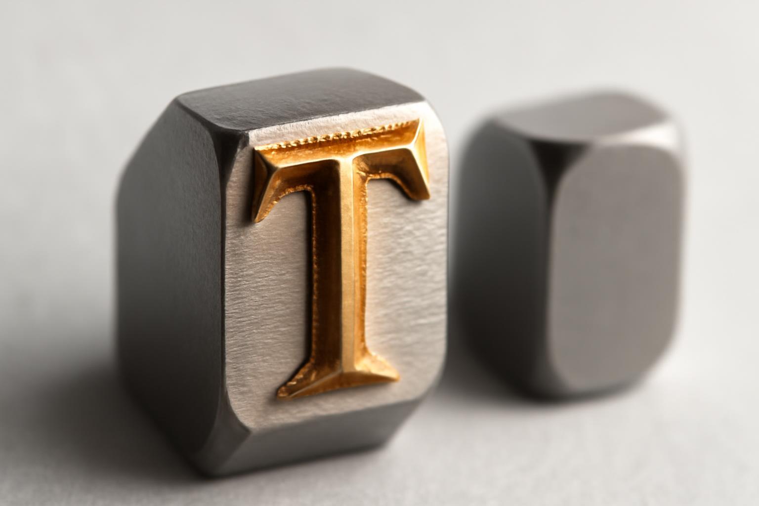
Why Didone, and not just any serif, became the language of luxury
The mistake most materials on this topic make is to treat serifs as a homogeneous category. Luxury houses almost never choose humanist antiqua or soft Old Style typefaces — they use a specific construction associated with the work of Giambattista Bodoni and Firmin Didot in the late eighteenth century. This is where the group name Didone comes from.
Didone has four recognizable features:
- extreme contrast: thick vertical strokes and almost hairline horizontal ones;
- narrow serifs without brackets (unbracketed) — the stroke joins the letter stem abruptly, without a smooth transition;
- vertical axis stress — the letter looks static, "plumb", rather than slanted, as in old humanist fonts;
- geometric accuracy of contours — a direct consequence of printing presses of the new generation at the end of the XVII century.
Didone appeared as a demonstration of technological superiority: new presses made it possible to print lines so thin that previously this had been physically impossible. The delicacy of the stroke literally cost money and the craftsman's skill. Aristocratic printing of the XVII century cemented Didone as a visual code of precision and dignity—well before the emergence of fashion houses in their present form.
Didone became established as an element of luxury aesthetics at the beginning of the XX century, including due to its use in magazines and glossy publications. In 1930-s, M.F. Agha, the art director, enhanced the effect with free white space around the letters — thus the aesthetic of 'cold luxury' was born, which today is easily recognizable in glossy publications and in half of the logos of the luxury segment.
How does Didone differ from classical notches in terms of impact on perception
Not all serif fonts work equally, and this is the main psychological difference that is rarely explained in detail.
| Type of engagement | Contrast of strokes | Associations | Examples |
|---|---|---|---|
| Old Style (Garamond, Caslon) | Low, smooth | Craft, heritage, warmth | Gucci (custom version based on Garamond/Granjon) |
| Transitional | Medium | Rationality, business reliability | Times New Roman, publishing brands |
| Didone | Extreme | Status, distance, cold luxury | Tiffany & Co, Vogue, Chanel |
High contrast in Didone is perceived by the brain as a signal of excess: a thin line does not have to carry the weight of the composition, which means the resource is spent not on function but on aesthetics. The same principle works with fragile porcelain or a delicate golden ornament — the less 'practical' the form, the higher the perceived value. A classic serif does not give such an effect: it is perceived as reliability and rootedness, but not as exclusivity.
The study by Juni & Gross confirmed this sensitivity at the emotional level: the same text typed in Times New Roman and in Arial was perceived differently by subjects — the serif version appeared more "angry and funny", although the content was identical. The reaction is unconscious, and it is precisely on this that the entire logic of applying glyphs in identity design is built.
Wave blanding 2018 year: how luxury almost lost its face
In 2018 year, several houses — Burberry, Balmain, Berluti — almost synchronously abandoned their historical serif logos in favor of minimalist grotesques. The logic was clear: grotesque was easier to read on small screens, looked modern, and scaled more simply for social networks. The result turned out the opposite of intended.
Logotypes have become almost indistinguishable from one another. The industry has adopted the term 'blanding' — from blend + branding — to describe the bleaching of identity through font unification. Brands have lost what visual semioticians call character — the recognizability of a letter's silhouette without reading the text. A client who for years recognized Burberry by its characteristic notch suddenly saw a sign that looked like a dozen fashion startups.
In 2023 year, Daniel Lee returned to Burberry a historical logo of 1901 year, stylistically close to Bodoni — that is, to the very Didone canon. The market reaction was telling: not outrage, but relief. The audience did not appreciate the 'bold step' from five years ago — it demanded the return of the lost heritage. The case became a signal for the entire industry: Dior, Saint Laurent and more niche houses such as Ushatava in 2022–2023 years strengthened or returned the hallmarks in their identity, correctly reading the market — today serif works as a marker of authenticity against deindividualized digital aesthetics.
How the constancy of the logo becomes brand equity
Tiffany & Co. has not changed its Didone logo for over a century — it appeared at the beginning of the XX century and remains virtually untouched. This is not conservatism for the sake of conservatism. Every year, without changes, adds a layer of associations: advertising, movies, store windows, packaging. At some point, the very form of the letter begins to evoke an image of luxury regardless of the box color, the material of the display case, or the specific product on the shelf.
Chanel and Hermès operate under the same model. Changing the logo for a luxury house is not a redesign, but a break in the chain of associations that have accumulated over decades. A grotesque can be refreshed once every three years without loss, because it has no accumulated cultural weight. It is easier to lose a Didone logo than to create one: serious houses change it extremely rarely and almost always through a return to a historical variant, rather than through the invention of something new.
Where does the error lie when working with graduations in practice
The main trap is to think that the formula 'tick = premiumness' works automatically, outside the context of execution. It doesn't. Research shows that serif text is often perceived as more credible and formal, but the effect is subconscious and fragile: it is broken by careless kerning, random font choice without connection to the brand's history, and incorrect stroke proportions.
A telling counterexample is Zara. The brand adjusted the letter spacing in its logo, which influenced the perception of its identity. This demonstrates the importance of typographic micro-details. It proves: the psychological weight of typography lives not only in the shape of the letter, but also in micro-details — tracking, proportions, stroke density. A serif without proper kerning will not deliver a premium effect, whereas a grotesque with ideal spacing can feel more expensive than a poorly set serif.
Practical takeaway for those choosing a font for a logo: serif is not a guarantee of status, but a tool with a history. Before using Didone in a landing page or packaging, it's worth understanding where the specific letterform came from and what it already means in the cultural code of your audience — otherwise, it will end up not as luxury, but as a suit that doesn't fit.
Recent articles

MegaFon, BMW, VTB and more 240+ companies. See how it looks in the showcase reel:


Our branding agency is approached to order:
Branding agency services












