Main and additional brand font: why two levels are needed

Why one font with different variations is not enough
The issue is not about the thickness of the letters, but about what the font was originally designed for. Display fonts are created for large sizes — 24px and above: they have expressive contrasts of strokes, sharp serifs, or unusual proportions that are perceived as the brand's character on a cover, in a logo, on a poster. Text fonts are designed for small point sizes — 14–18px on different devices: wide spacing inside letters, calm rhythm, neutral proportions so the eye does not stumble on long paragraphs.
This is not different renderings of one idea, but different engineering tasks. A display font with its delicate elements at 14px becomes a mess on a smartphone screen. A text font enlarged to header size looks flat and does not create the necessary emotional emphasis. Therefore, having ten weights in one family changes nothing: it addresses the question of hierarchy by saturation, but does not solve the question of functional specialization.
Case: how Hermitage separated emotion and convenience
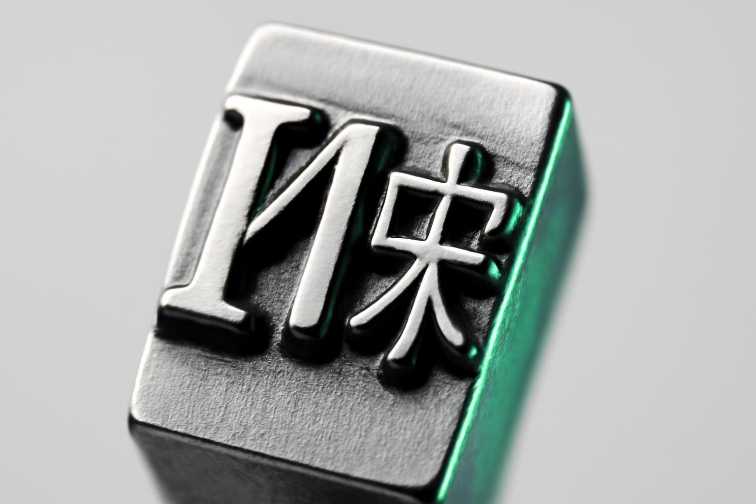
The State Hermitage has encountered a classic problem of museum branding: a font is needed that conveys solemnity and history on posters and in hall decorations, and at the same time a font that reads well in a mobile app and on the ticket website. The solution is not a compromise, but the creation of two versions of one custom font: Hermitage Celestial, a majestic serif with pronounced serifs for emotional perception, and Hermitage Grotesque, a neutral grotesque for interfaces and long texts.
This is a telling example of how a two-tiered system solves a functional, not aesthetic, task: the gap between the physical and digital brand is not closed by one universal font, but by a conscious division of roles while maintaining a unified stylistic DNA.
Where the main font is applied and where the additional font is used
Role division works not only in theory — it is tied to specific media and tasks.
| Medium / Task | Which font is used | Why |
|---|---|---|
| Logo, naming on packaging | Accent (display) | Character and instant recognizability are needed |
| Website headers, covers | Accent | Large font size allows the font details to be fully revealed |
| Main website text, articles | Functional (textual) | Comfortable reading at small size |
| Interfaces, buttons, forms | Functional | Neutrality does not distract from the action |
| Print brochures, catalogs | Both, but text-based — for the main block | Printing requires high character density on the page |
| Email newsletters, presentations | System font substitute (for example, Tahoma) | Guaranteed support on all recipient devices |
This is exactly how pairs are constructed at UC Santa Barbara (Avenir + Produkt) and Cambridge (Feijoa + Open Sans): one font holds the brand emotion in headers, the second — a dense text flow. ISPsystem uses a similar logic: Rawline for headers and Golos Text for the main text, and where branded fonts are technically unavailable — in emails, contracts, presentations — a system Tahoma is connected as a safe universal substitute.
How to choose contrast between two fonts
Weak contrast is a frequent reason why a font pair looks like an error in layout rather than a solution. If both fonts are grotesks of medium weight with similar proportions, the brain perceives the difference as randomness rather than a deliberate hierarchy. Working contrast is built on the level of classification, not weight: serif plus grotesk is a difference that the eye instantly and unambiguously reads.
- Combine different classifications: serif + sans-serif, or geometric grotesk + humanist grotesk with clearly different letter structures
- Check the pair side by side in a real layout, not in separate files — the contrast should be readable on one screen
- Avoid a pair of fonts with the same x-height and letter width — the difference should be noticeable without labels
- Do not mix more than two or three fonts in a system — each added font increases the risk of visual noise
The problem of fonts designed for print in a digital environment
A font that looks great in book or catalog typography often breaks on screen. The reason is the physics of the medium: print provides high resolution and allows fine serifs and hairline strokes to retain sharpness, whereas a screen, with insufficient resolution or small font size, 'eats' these thin elements. Hence unreadable letters, fused serifs, and loss of contrast between thick and thin strokes.
There is also the technical aspect: not all print fonts are well-hinted for rendering in a browser and have a full set of web formats (woff2). Here, the speed factor returns: according to Google data, 53% of users leave the page if it takes longer than three seconds to load. One universal font with a large number of variants often weighs more than two narrowly specialized files—one accent font, which is only connected where it is actually needed (headings), and a lightweight text font optimized for reading. A two-tier system does not complicate the technique in this sense, but rather lightens it: each file performs exactly its own function and does not carry unnecessary weight where it is not needed.
In summary: a system, not a decoration
Two fonts in a brand are not about variety for the sake of variety. This is a response to the fact that display and text typography solve fundamentally different tasks: one — emotion and recognizability, the other — reading speed and comfort during prolonged reading. A pair of fonts works if the contrast between them is perceived at the level of classification, not weight, and if for each medium — web, print, email — a technically adequate variant of the font is provided, right down to a system fallback where the brand font is not available.
Recent articles


MegaFon, BMW, VTB and more 240+ companies. See how it looks in the showcase reel:


Our branding agency is approached to order:
Branding agency services












