Lettermark logo: when to use letter abbreviations
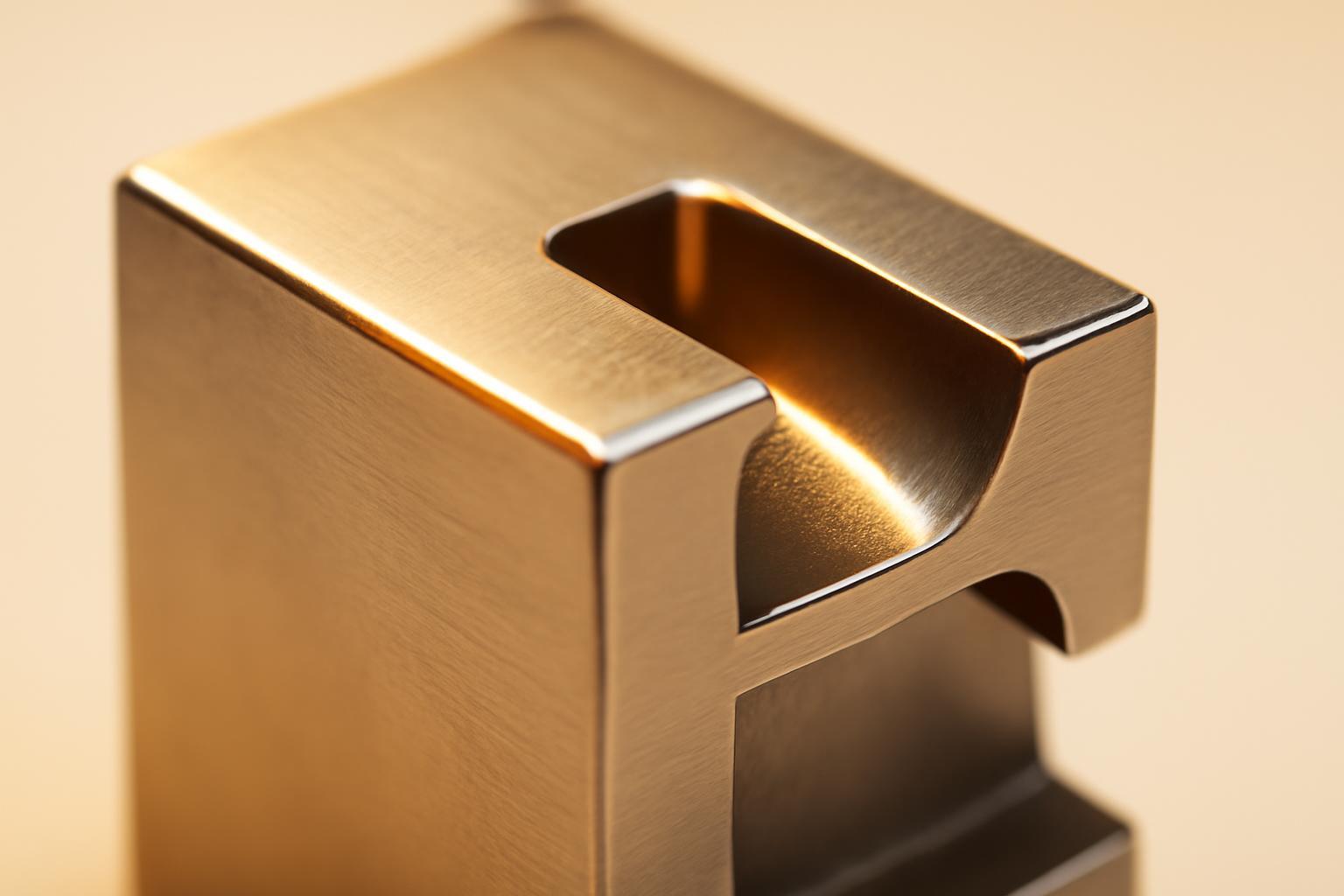
When lettermarks really win
International Business Machines became IBM not because the designer wanted conciseness, but because clients and journalists had already shortened the name long before Paul Rand's redesign in 1972 year. Eight horizontal stripes of that logo did not change for more than fifty years — a rare example of a lettermark that never needed updating because the solution was correct from the very beginning.
A letter logo is justified in several specific situations:
- the company name consists of three or more words and physically does not fit on a small carrier — packaging, favicon, app icon;
- the name sounds bad or is hard to read in other languages and alphabets, while the abbreviation is international;
- the audience is already using the abbreviation in spoken speech and correspondence — HBO, CNN have long lived as abbreviations in the language, not as expansions;
- the brand needs a compact secondary mark for digital interfaces while retaining the full logo for other media.
There is also a physiological argument: perception studies show that recognition of a short letter block takes on average about 400 milliseconds — significantly faster than reading a word. In conditions where the brand has a fraction of a second on a social media feed or in an app list, this is a noticeable advantage. But it only works with an already formed association.
Why should a startup rush to create a mark based only on letters
New Balance did not start with the NB monogram — the company used a combined logo with the full name and only in 2008 year, after decades of presence on the market, switched to a lettermark. Netflix came to a single letter N in the 2016 redesign — also not at the moment of launch, but when the brand was already firmly associated with the streaming service. Both cases are not a starting point, but a reward for recognition earned over the years.
For a new brand, a lettermark is a trap: the audience has no single hook to grasp with their eyes. Statistics confirms the caution of major players: about 37% of the most successful brands use lettermarks, while 60% use the full company name (wordmark). The difference shows that the lettermark path is more of an exception for those who have already passed the growth stage, rather than a universal starting template.
Requirements for readability and scalability
A lettermark lives and dies by its details: insufficient contrast, too thin strokes, or incorrect kerning kill it faster than a bad idea. Below are the minimum guidelines that appear in brandbooks of major companies, including Samsung's guidelines.
| Media | Minimum size | Risk of violation |
|---|---|---|
| Digital interfaces (favicon, app icon) | 8 px | letters merge into a blob, shape is lost |
| Print (business cards, packaging of small goods) | 5 mm | font serifs disappear, contour blurs |
Typographic errors that most often ruin a lettermark:
- using fonts with similar-shaped letters (E and F, O and D) without individual contour refinement;
- too thin serifs, disappearing when scaled down;
- uneven kerning between letters — visually, one of them appears to 'fall off' from the group;
- checking only in color, without testing in black-and-white version and in negative.
Legal traps during trademark registration
Here, a letter-based logo is more complex than a full-text one, and this is rarely explained. An abbreviation consisting of two to four letters has much higher probability of intersecting with already registered marks — the number of combinations of short letter sequences is physically limited, and patent offices regularly reject applications based on similarity to the degree of blending.
There is also a second, less obvious risk: visual separation of elements within the sign itself. If the letters are set in different fonts, placed on different lines, or visually separated from one another, Rospatent may perceive them not as a single trademark, but as a set of independent elements — exactly such logic formed the basis of the decision in the case of SIP-486/2025. Practical conclusion: the letter block must be read both design-wise and legally as a single inseparable construction, not as a collage of individual signs.
What is a lettermark and where does it fit among types of logos
A lettermark is a type of logo built on company initials or a letter acronym, usually consisting of two to four characters. It stands next to wordmark (full name) and graphic mark (pictogram without text) as one of the three basic approaches to logo creation.
| Logo type | What is it | When it works |
|---|---|---|
| Lettermark | Initials, 2–4 letters (IBM, HBO) | After recognizability, with a long name |
| Wordmark | Full name in brand font (Coca-Cola, Google) | At the start, when the name needs to be embedded in memory |
| Graphic symbol | Icon without text (Apple's apple, Nike's checkmark) | With very high recognizability, global scale |
These three types are not competitors, but stages of one path. A company rarely chooses a lettermark directly: first, the full name is established, and then, if the audience itself begins to shorten the brand in speech, a letter sign appears as a logical continuation, not a replacement.
How to make a decision: a short checklist
Before ordering a lettermark, it's fair to answer several questions — if at least two of the answers are 'no,' it's better to forgo a lettermark at the start.
- Does the company name consist of three words or more, or does it contain sounds that are difficult to pronounce for the target market?
- Are clients, partners, or the press already shortening the name in conversation without the company's prompting?
- Has the brand been on the market for several years and does it have recognition above the local level?
- Is there a budget for checking the abbreviation for patent cleanliness in the relevant Nice classes?
- Is the designer ready to test the letter block at the minimum size — 8 px in digital and 5 mm in print — before finalizing the layout?
If the answers are mainly 'yes' — the lettermark is justified and capable of working for decades, as in the case of IBM. If the company is just entering the market, it is wiser to start with a wordmark or a combined mark, and return to letters later — when the abbreviation becomes a fact of the language, not the designer's desire to save space on the business card.
Recent articles








MegaFon, BMW, VTB and more 240+ companies. See how it looks in the showcase reel:


Our branding agency is approached to order:
Branding agency services












