Combined logo: how to combine a sign and text

What distinguishes a combined logo from other types
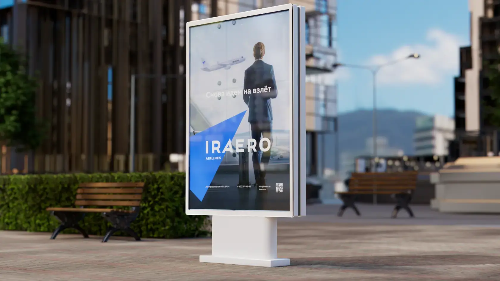
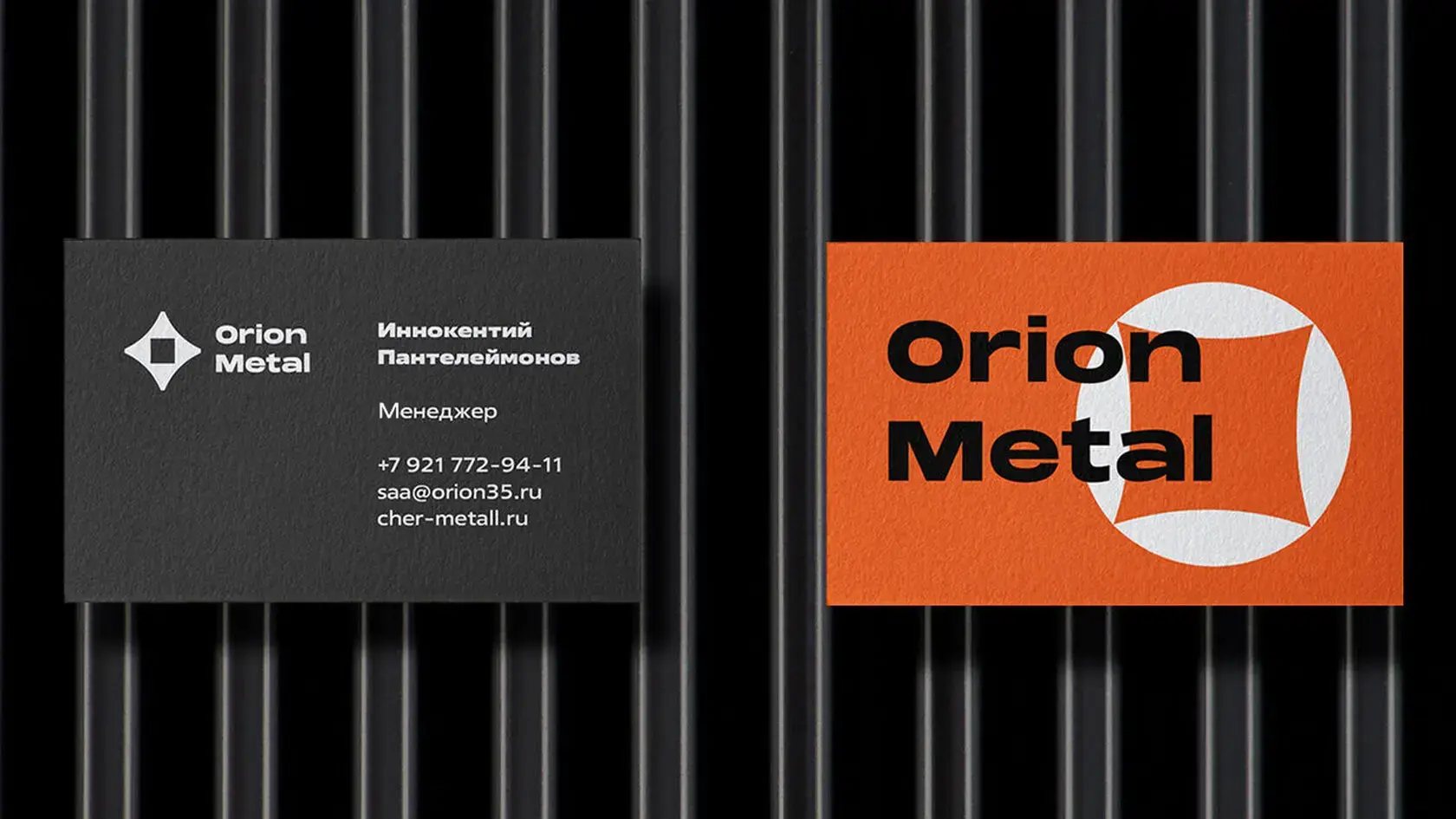
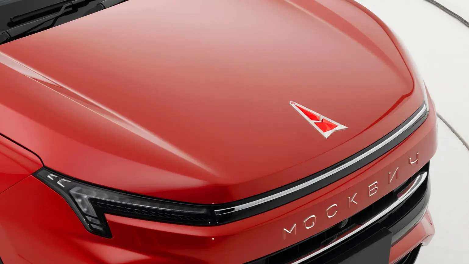
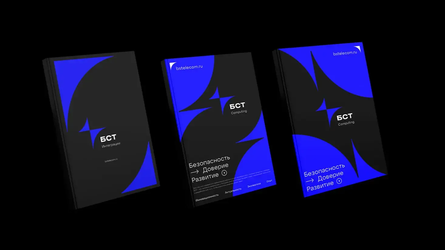
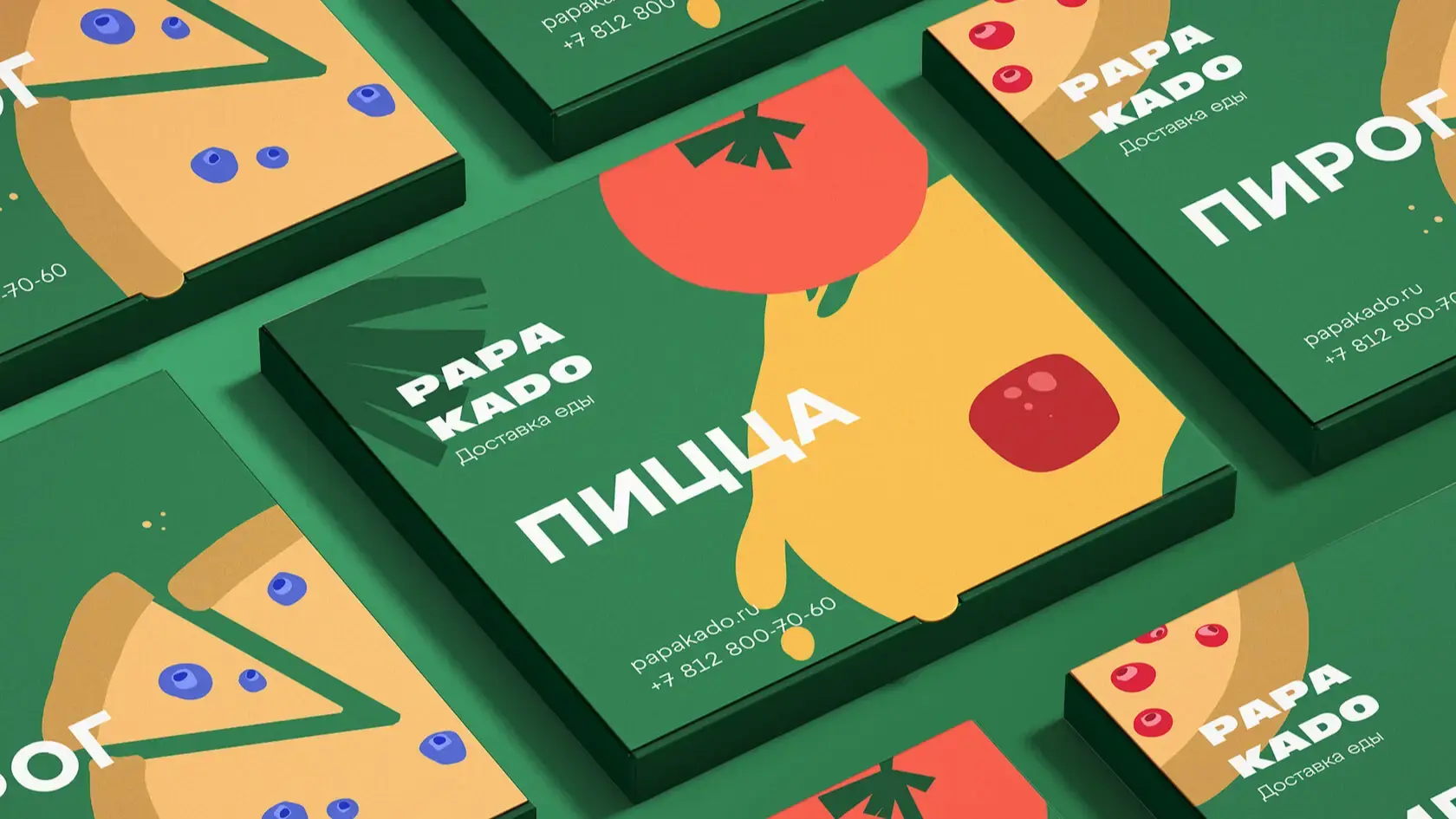
A combined logo is a combination of a graphic sign and a text part, where both elements work as a single system, not as two different designs placed side by side. According to LogoLounge, this structure is found in 40-45% of the analyzed logos, and according to broader commercial estimates, the share of combined formats reaches 70-80%. The reason is simple: the brain processes an image 60 000 times faster than text, and the sign grabs attention in a fraction of a second, while the text has time to explain what exactly you saw. One without the other works worse — a sign without a name remains anonymous for a long time, and a name without a sign is remembered for a longer time.
Three ways to arrange the sign and text
Layout is not an aesthetic choice, but an engineering task: it determines how well the logo will survive scaling, cropping, and adaptation for different media.
| Layout type | Feature | Flexibility |
|---|---|---|
| Horizontal (sign on the left, text on the right) | Classic — FedEx, McDonald's partially | High, easily cuts into elements for narrow formats |
| Vertical (symbol on top, text below) | More compact, fits well in a square — icons, avatars | Medium, requires adaptation for wide banners |
| Integrated (merged, symbol embedded in letters) | Example — old versions of Starbucks, where the text wrapped around the symbol | Low — hardly scales without losing details |
The integrated variant looks the most effective, but pays for it with a price: any change in proportions requires a complete reassembly of the composition, not just simple scaling.
Spacing between elements: as professionals calculate
Here begins what is rarely explained — specific metrics, not 'by eye to look harmonious'. Designers use several references:
- The distance between the mark and the text is usually taken equal to the width of one lowercase letter of the text part — this creates a visual pause without disrupting the composition;
- The protective field around the entire logo is calculated as the height of the graphic mark, half of that height, or the height of a lowercase letter — a specific rule is fixed in the brandbook and applied consistently across all layouts;
- The modular grid is built from the largest element: if the mark is a square 100×100 px, the spacing and text size are tied to this module, not chosen arbitrarily.
Without fixed metrics, each subsequent designer who will layout the logo on packaging or a website will set the distance by eye — and in a year the brand will have five versions of the same logo with different spacing between the mark and the text.
When a mark can live without text — and when it cannot
Separate use of the mark is justified if it was originally designed as a self-contained form — recognizable, without relying on text nearby. Nike succeeded with this: the checkmark became a standalone symbol long before it was used without the word Nike. For most young brands, such a move won't work — the mark without text becomes an abstract figure that says nothing to the audience until it gains its own recognition through years of use alongside the text.
A practical criterion is simple: if a mark was invented as a 'decorative frame around the first letter of the name', it does not work separately. If a mark has its own semantic load and could exist as a separate application icon — using it separately is possible from the first day.
Font as part of the composition, not an add-on to the mark
The mistake that is most commonly made — choosing a font after the mark is already ready. The correct order is the reverse: the line thickness of the font should correspond to the line thickness of the mark, not argue with it. If a mark is built on thin geometric lines, and the text is set in bold grotesque — the composition visually falls apart into two different logos simply placed next to each other.
Often, fonts are manually refined: the shapes of individual letters are modified, their angles rounded or sharpened, so that they echo the form of the logo. This is not decoration, but a way to glue two heterogeneous elements into a single visual object — that very effect that makes Coca-Cola or Starbucks whole compositions, not a set of random details.
Minimum size and legal risks of element separation
Readability on small media
The symbol must remain distinguishable when reduced to 16×16 pixels — the standard favicon size. This is a strict constraint: if the logo contains thin lines, small notches, or gradients, it will turn into a blur on a favicon. The rule is simple — if the logo is not readable at 16 px, it must be simplified until it becomes readable, and only then should the final version be approved.
Why separating elements is dangerous for registration
This is the moment about which hardly anyone writes: visual separation of the sign and text — different fonts, different sizes, placement on different lines — legally transforms a single logo into a set of individual elements. Rospatent in such cases analyzes each part separately, not the composition as a whole, and may refuse registration even with a completely unique concept. This is exactly what happened in the Grace family case — the visual break between the sign and the text led to the elements being considered in isolation, which weakened the applicant's position. The conclusion is simple: the tighter the sign and text are compositionally linked — by a common axis, a common module, a common color — the higher the chance of registering the logo as a single protected object, rather than as a random set of graphics and font.
Recent articles






MegaFon, BMW, VTB and more 240+ companies. See how it looks in the showcase reel:


Our branding agency is approached to order:
Branding agency services