Briefing for logo development: what a briefing should contain
Where the logo will live: media and sizes
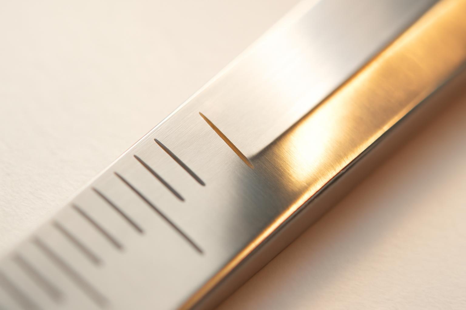
A designer cannot draw 'just a logo' — he draws a specific geometry that must withstand a certain scale range. If it is not specified in the briefing that the sign will be used on pens, chevrons, and metal engraving, there is a high probability of getting a version with small details, which is perfect on a website and useless everywhere except the website.
All real media should be listed in the briefing: website and apps, packaging, signage, transportation, employee uniforms, stationery, social media, print media, outdoor advertising. Next come specific sizes, not abstract 'small' and 'large'.
| Logo version | Minimum size | Typical application |
|---|---|---|
| Main (full) | from 32 mm in width | website, documents, print media |
| Shortened (without slogan/section of the name) | from 10 mm in width | app icons, social media, merchandise |
| Black-and-white for engraving/embroidery | from 1 cm | badges, chevrons, metal engraving |
If at least one of these scenarios is not stated in the brief at the start, the designer cannot physically test it — and the issue of readability will only arise at the production stage, when it will already be too late to make changes.
Why a new logo instead of a redesign
Half of the briefs that come to designers do not even answer the question 'why.' The client wants 'to make it look nice' — but this is not a task, but a desire, and you cannot work with that. The brief must fix a specific business reason:
- the company is entering a new market and the old sign does not match the positioning;
- the current logo is visually outdated, but the audience and product remain the same — then it's more about a redesign rather than a completely new sign from scratch;
- the business model changes (for example, from B2B to B2C), and the logo must work for new recognizability;
- a new product or line is launched, and a separate mark is needed that does not conflict with the parent brand.
The difference between a 'new logo' and a 'redesign' is fundamental: in the latter case, part of the recognizability capital is intentionally preserved, and the designer must know this in advance; otherwise, they will start from a clean slate where evolution of the form was needed.
Technical constraints, which are often forgotten
A good logo must look equally confident in four variants: color, black and white, on a light background, and inverted on a dark one. This is not a designer's wish, but a basic test for form strength — if the mark 'breaks' without color, then its entire expressiveness is based on fill, not form, and this is a weak point.
The second point that almost never appears in standard briefs is the safe zone. This is the minimum distance around the logo, free from text, other graphic elements, and layout trimming. The rule is simple: the field must be no less than the height of the company name letters. Without this requirement, the logo on a business card may closely neighbor the contact text, and on packaging, may touch the edge of the label.
If a brand already has a color system to which the logo must conform, this is also a technical constraint, not a creative wish, and it must be formulated as a hard condition, not as 'approximately such colors'.
Emotions and audience: specificity instead of demographics
A classic briefing mistake is describing the audience in terms of age and geography: "men 18–60 years old, moskviches." This tells a designer nothing about what kind of sign is needed. A working variant sounds different: "factory workers who, after their shift, go to a bar instead of going home, order beer for 300 rubles and watch football." From such a description, the tone, the roughness or softness of the forms, the acceptable irony or its complete absence become immediately clear.
The same applies to emotions. Instead of a general 'we want it to be reliable and modern,' it's useful to ask the client directly: what does he feel when looking at the logos of the three nearest competitors? Irritation from excessive strictness, envy of boldness, a feeling of 'cheapness'? This is fairer than a list of abstract adjectives, and almost always gives the designer more material than the brief's 'desired emotions' graph.
Who makes the decision and how many rounds of revisions
The project may stall not because of the design quality, but because the person making the decision is not the one with whom the brief was coordinated. Therefore, the document should clearly state:
- who finally approves the logo — one person or a collegiate body;
- whether the owner, who will appear only at the final stage with an unexpected veto, participates in the coordination;
- how many rounds of revisions are included in the contract and what happens if there are not enough of them;
- the time frames within which the client is obliged to provide feedback at each stage.
Without this clause, the brief looks complete, but the project still misses deadlines — simply because the decision is stuck at three levels of internal coordination, which the designer was unaware of.
Common mistakes when filling out the brief
The most harmful mistake is not empty fields, but overfilling them without purpose. A client who tries to control the process begins to dictate decisions where he should have described the task.
- The question 'what needs to be depicted on the logo?' is a bad question. It shifts the creative responsibility to the client and deprives the designer of the freedom to find the best form.
- A requirement for a specific font or icon without explanation of why exactly it is needed is the same as micro-management, which usually worsens the result.
- Vague formulations like «make it modern and stylish» is the opposite error, a complete lack of specificity.
- The absence of references — the brief must include 3–5 logos that are liked (not necessarily from the same industry), and 3–5 that are absolutely disliked, with an explanation of the reason in both cases.
- Ignoring the budget and timelines «for later» — these figures affect the depth of development and the number of iterations from the very beginning.
A proper brief describes the desired result and limitations, not a solution. The designer will figure out which font and form will convey the right emotion — if they are honestly explained for whom, why, and on which media this should work.
Recent articles








MegaFon, BMW, VTB and more 240+ companies. See how it looks in the showcase reel:


Our branding agency is approached to order:
Branding agency services












