Gold and silver in luxury branding
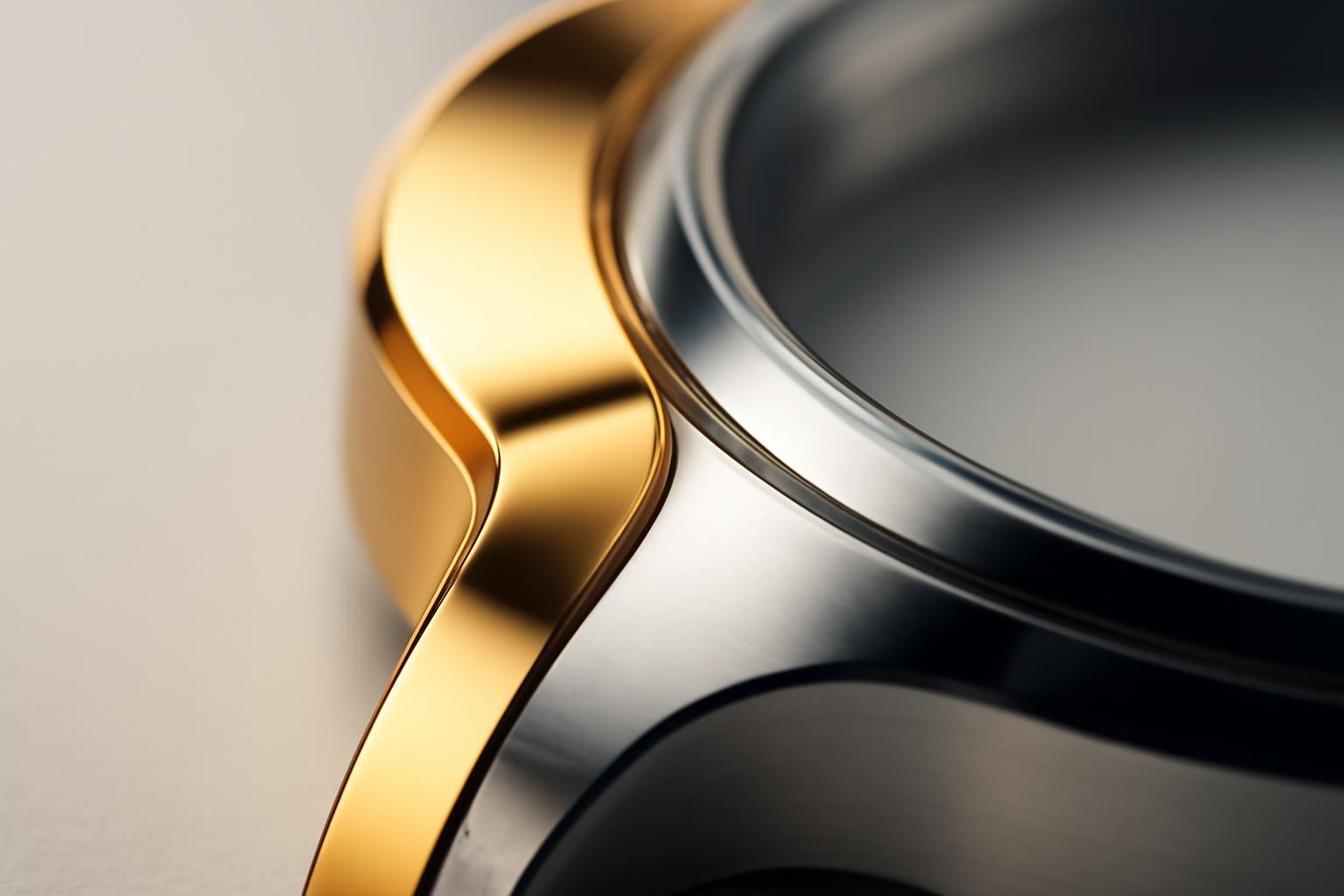
What actually distinguishes gold from silver at the perception level
Gold works through an archaic code: it is physically associated with the precious metal that people have converted into status and power for millennia. Consumer behavior studies record a specific effect — gold packaging increases the perceived value of a product by 15–25% regardless of the actual price of the item. The brain reacts to gold in a similar way to real wealth: the same reward centers are activated.
Silver is structured differently. It is the color of surgical instruments, aviation aluminum, and microchips. It is read not as "expensive," but as "precise" and "modern." Apple, Audi, and Tesla did not choose silver by accident — they needed a signal of technicity, not traditional wealth. Mercedes-Benz occupies an intermediate position: silver in their branding balances between the legacy of an engineering school and innovation, which is rarely achieved by other brands.
Practical rule: if a brand sells status, heritage, handmade work — gold. If it sells innovation, precision, future — silver. Mixing both signals in one logo almost always weakens positioning.
Color codes: what the industry uses and why this is not 'standard' gold
Digital gold and silver differ from what the subconscious considers 'real' metal. The standard hex code for gold #FFD700 (RGB 255-215-0) is a pure, almost multimedia shade that on screen looks more decorative than premium. Luxury brands almost never use it in pure form — too flat, too much like cheap foil.
| Shade | HEX | RGB | Association in branding |
|---|---|---|---|
| Classic gold (media) gold | #FFD700 | 255, 215, 0 | Too bright, rarely in luxury 'as is' |
| Silver (media) | #C0C0C0 | 192, 192, 192 | Technological, sterility, precision |
| Pink gold | #B76E79 | 183, 110, 121 | Warmth + premium, young audience |
| Everose (Rolex) | — | Alloy, not just color | 75% gold, copper, palladium, indium — triple-layer luxury |
CMYK versions of these colors in printing almost always mute the brightness: a clean digital palette looks vulgar on paper. That is why in luxury house guidelines you rarely encounter 'pure' codes — they set ranges, tonal gradients and mandatory adjacency with dark background.
How much metal can you afford: proportion rule
In regular design the rule 60-30-10 works. For metals it shifts: 70% base color, 20% secondary, and only 10% — the metallic accent. This is not an aesthetic whim, but a perception threshold: exceeding the metal proportion instantly shifts perception from 'luxury' to 'kitsch'. A gold package entirely looks cheaper than a black box with a thin gold stripe.
Louis Vuitton demonstrates this principle clearly: their signature combination of brown and gold is constructed so that gold remains an accent on a dominant neutral background. This is a strategic decision tailored for a specific audience — adults oriented towards comfort and stable choices, not flashy glitter.
Pink gold and platinum: why classicism is no longer alone
Classic yellow gold in 2025 year shares the youth luxury market with pink gold — a trend that gained widespread adoption after the iPhone 6S 2015 year. Pink gold (Pantone #B76E79) works at the intersection of two registers: it is warm, almost skin-toned in shade, and yet premium. It is the only metal that reads as both 'personal' and 'status' simultaneously, which is why brands targeting the 25–40 age group actively embrace it.
Platinum and palladium follow a different path — they compete not emotionally but technically. This rarity and the metal's inertness serve as an argument, not warmth of color. Rolex here demonstrates what seems to be the most thought-out approach in the industry: the company consciously combines yellow gold, white gold, and its own Everose alloy (75% gold, 20% copper, with additions of palladium and indium), creating a three-layer hierarchy of luxury within a single product line. This is not a color solution — it is a materials science strategy that competitors cannot literally copy.
Why the coating matters more than the color on the screen
This is where the story begins — something that is hardly mentioned in marketing materials: the perception of luxury is built not only visually but also tactually. PVD coating (physical vapor deposition, thickness 0,25–0,5 microns) is significantly more durable than galvanic plating of the same color: it exceeds in hardness by 2–3 times and shows markedly higher wear resistance. The difference is imperceptible in a catalog photo, but becomes obvious after six months of use — galvanic plating wears off, while PVD retains color and matte finish for years.
18-karat gold is a separate story: it is not a 'shade,' but the alloy composition (75% pure gold), which determines the weight, the metal's temperature to the touch, and how it ages over time. A brand may use the perfect hex code in its digital guideline, but if the physical coating of the product is a thin galvanic layer, the entire effect falls apart upon first touch. The luxury perception in 2020 is built on this combination: color creates the first impression, while the material confirms or destroys it upon contact.
How to choose a metallic finish for a specific category
There is no universal answer — the decision depends on the product category, price segment, and audience age. Below is a practical matrix to follow when selecting a palette.
| Category | Recommended metallic finish | Why |
|---|---|---|
| Premium fragrance | Gold / rose gold | Conveys emotion and status, tactile contact is minimal — risk of galvanic corrosion is lower |
| Watches | Everose, platinum, gold combinations | Direct physical contact with skin — the material must maintain quality for years |
| Jewelry | 18K gold, platinum, palladium | Durability and alloy composition — part of the product, not just the packaging |
| Premium electronics | Silver, PVD coating | Signal of precision and technicity, silver does not compete with 'wealth,' but enhances engineering |
The mistake that people make most often is choosing gold 'by default,' simply because it is the most obvious signal of luxury. For a technic brand, gold creates dissonance: the audience subconsciously reads it as an attempt to cover up the lack of innovation with external shine. And vice versa — silver in a fragrance brand for adult audiences is read as cold and dehumanized where emotion is needed.
Recent articles








MegaFon, BMW, VTB and more 240+ companies. See how it looks in the showcase reel:


Our branding agency is approached to order:
Branding agency services












