Seasonal and limited color variations of the brand
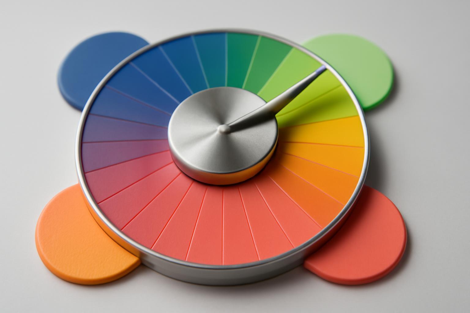
Rebranding or variation — where the boundary lies
The difference is not in the number of changed pixels, but in the logic. A wrong seasonal 'rebranding' changes what forms the silhouette of recognition: the logo, proportions, font, packaging composition. A professional color variation touches only the fill — the shape, composition, and typography remain in place. A customer must recognize the brand from 5-7 meters, even if the main color is replaced with the opposite one in the spectrum.
| Parameter | Incorrect seasonal rebranding | Professional color variation |
|---|---|---|
| What changes | Logo, font, composition, color | Only color — 1-3 accent |
| Recognition from a distance | Lost | Preserved |
| Connection to the main line | Reads as a new product | Reads as a limited edition of the same brand |
| Risk to the trademark | High — blurs the rights to the brand color | Low — the basic palette is protected |
| Example | Complete style change of packaging «for the season» | McDonald's: golden fry box for the World Cup 2026 instead of red, for the first time in the brand's entire history |
Why a color limit works better than a discount
A discount reduces margin and trains the buyer to wait for the next promotion. A color variation sells at full price and creates a status-driven reason to buy right now. Stanley released over 100 color variations of Quencher in 2023 year without a single sale — Pantone called this one of the most aggressive and successful palette shifts in consumer product history. Lamborghini went further: the Urus SE «Tettonero» capsule series is limited to 630 units, while 6 base body colors and 6 livery colors provide more than 70 personalization combinations — and each car is still instantly recognizable as a Lamborghini.
There is a nuance that is rarely mentioned: if a limited product is sold instantly and completely, repeat purchases drop — the buyer has received what they wanted and has switched. When access is distributed over time, for example, through a drop in the app, the effect of scarcity is mitigated, but loyalty grows: the psyche reacts not only to lack but also to the algorithm of access to the brand.
What Cannot Be Touched Ever
There is a rigid core of identity that remains unchanged under any seasonal variation:
- the form of the logo and the proportions of the mark;
- the font and its letterforms;
- the compositional grid of the packaging or interface;
- a minimum of one basic neutral color — background, substrate, text;
- the silhouette of the product or its packaging.
The working principle for color is "stable base plus seasonal accents": neutrals do not move, only 1-3 accent colors change. This is how the rotation works at Pinterest, which annually publishes a trend palette based on platform data — in 2024 year it was Desert Orange, Gummy Pink, Aqua Blue, Moss Green and Mocha Brown. This palette became a benchmark for brands when planning their own limited editions, because it is built on real audience behavior, not on a designer's taste.
How to Maintain Recognizability Between Releases
Recognition is maintained not by repeating one color, but by repeating the structure of color selection. If a brand has a rule — that the accent is always contrasted against a neutral base, the logo form is inverted in the black-and-white version against any background, and the packaging retains the same pattern of element placement — then the consumer recognizes the system, even without seeing the specific shade beforehand. This works like a language: the words change, but the grammar remains.
A separate complexity is legal. It is almost impossible to secure exclusive rights to a color as a trademark: Wildberries spent years registering fuchsia (filed an application in 2020, received registration in 2024) and achieved full success by registering two trademarks: monochrome and gradient. And examples where a color is truly protected and exclusively associated with a brand are few — Tiffany, Vanish. Therefore, recognition must be built not on a legal monopoly over a shade, but on the repetitiveness of the color application system.
Planning without physical season binding
The mistake of many global brands is the 'winter-summer' calendar, which does not work equally in the northern and southern hemispheres. The working approach is to bind the palette not to the season of the year, but to an event or information hook: a sports tournament, a platform trend, a cultural moment. McDonald's changed the color of the fry box for the World Cup, not for the season — the event is equally significant in Argentina and Norway. Pinterest bases its approach on user behavioral data over a year, not on natural cycles. This approach removes geographical binding and makes the limited series universal for global launch.
Common mistakes when launching a limited palette
- They change the entire color set at once instead of 1-3 accents — the brand stops being recognizable as 'that one'.
- They synchronize the release with the physical season, ignoring the difference between hemispheres and markets.
- They sell the limited edition instantly and entirely — losing repeat purchases that would have been possible with a distributed drop.
- They try to legally secure the color as the brand's sole asset, instead of building a system of application.
- They change the logo or composition 'in tune' with the season — this is no longer a variation, but a spontaneous rebrending that confuses the audience.
Recent articles








MegaFon, BMW, VTB and more 240+ companies. See how it looks in the showcase reel:


Our branding agency is approached to order:
Branding agency services












