Brand color naming: why give shades names
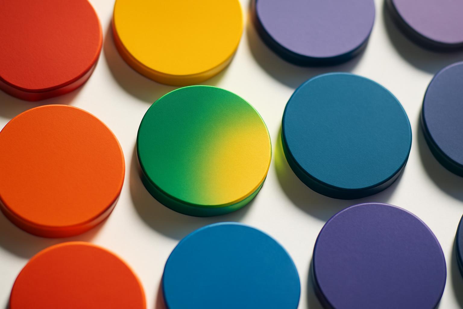
Code against name: what a brand loses without naming
Pantone, HEX and RGB — languages for typography and production. They are needed so that the color prints the same on packaging in Shanghai and on a website in Moscow. But the consumer does not think in codes. He thinks in images, and an image is created by a word.
Research by Rice University 2006 year directly confirmed this: the same shades, named with a simple word ('brown') and a 'full-bodied' name ('mokko'), received completely different evaluations from participants in the experiment. A product with a fantasy name was rated higher — buyers perceived it as higher quality, more thought out, worthy of trust. The color itself did not change physically. Only the word next to it changed.
- Code is technical memory of the system, name is emotional memory of a person.
- Code is not remembered outside the design department, name can become part of the brand's cultural code (like Tiffany Blue).
- Code cannot be protected as an asset, name can: Tiffany registered its blue as a trademark in 1998 year, Glossier — its Millennial Pink in 2020.
How different brands name colors: three naming schools
There is no ready-made universal recipe — there are several established approaches, and they fundamentally differ in the logic of name selection.
| Brand / system | Source of the name | Logic of the approach |
|---|---|---|
| Pantone | nature, food, minerals, geography, 'quirky imagination' of designers | cataloging: each of the 2500+ colors must have a unique, recognizable name — 'Caramel Cream', 'Popcorn', 'Adriatic Blue' |
| Farrow & Ball | historical places, natural phenomena, personal names of founders and friends | storytelling: each of the 132 names is a small story tied to the British identity of the brand (‘Stiffkey Blue’ — by the color of mud on a beach in Norfolk, ‘Nancy's Blushes’) |
| Glossier | generational cultural context, everyday lexicon | affiliation: the name should sound as if it were invented by the brand's audience itself, not by the marketing department — hence Millennial Pink |
The same logic applies to design systems. The agency Tados fundamentally rejects technical names such as blue01 or blue02 within its UI palettes, replacing them with 'ice-blue' and 'cornflower-blue'. The argument is simple: working with living names is more pleasant and enjoyable for the team, and such names are simply better remembered during workplace discussions — nobody confuses 'ice-blue' with a neighboring shade the way they confuse blue03 with blue04.
Does the name of the color influence the price a buyer is willing to pay
Yes, and this has been confirmed not only by marketing intuition. Besides the Rice University experiment, there is a financial study of banking branding that revealed an unexpected pattern: successful banks have brand names and logo colors that are congruent in perception in 70% of cases. For banks that did not survive in the market, this congruence was only 30%. The conclusion is harsh: the gap between how the name sounds and what the color communicates correlates with lower brand success in the market. A color name is not a decorative detail, but a part of the system that either strengthens the brand or quietly undermines it.
Color naming for different types of business is not the same task
The mistake of many guides is to recommend one universal naming principle for all. In practice, a luxury brand, a tech startup, and an eco-brand solve different tasks with this tool.
| Brand type | Name strategy | Example of logic |
|---|---|---|
| Luxury | exclusivity and authorship — the name should be unique, often personal | Christian Louboutin Red, Schiaparelli Shocking Pink — the color becomes the signature of a person |
| Mass market | recognizability and ease of pronunciation, without complex allusions | simple, understandable words from everyday vocabulary — 'sea wave', 'powder' |
| Tech | functional aesthetics with a hint of technicity, but not dry | 'ice-blue', 'cornflower-blue' instead of blue01 — a vivid name within a strict design system |
| Ektororg | a direct allusion to natural materials and processes | names from botany and mineralogy, emphasizing the natural origin of the hue |
Where color naming fails
A beautiful name without a strategy is just a decoration that is quickly forgotten or begins to work against the brand. Here are typical failures.
- The gap between the name and positioning. A tech brand with a hint of 'Grandma's Pie' creates a cognitive conflict — the buyer doesn't understand whether they're being taken seriously.
- Cultural blindness. A name that is harmless in one language or region may sound offensive or comical in another — before entering a new market, product names should be checked just as carefully as the product name itself.
- Excessive complexity. If a name is impossible to pronounce or remember on the first try, it fails to fulfill its function — and it has exactly one function: to stick in memory.
- Lack of palette systematics. When some shades are named after natural phenomena and some are named using technical codes, the palette looks unfinished and undermines the feeling of a cohesive brand.
A correctly chosen color with a poorly selected name loses half its effectiveness. A name is not a signature under the color, but a part of the mechanism that turns pigment into an active brand element.
Recent articles








MegaFon, BMW, VTB and more 240+ companies. See how it looks in the showcase reel:


Our branding agency is approached to order:
Branding agency services












