Color saturation and brightness: impact on the perception of premiumness
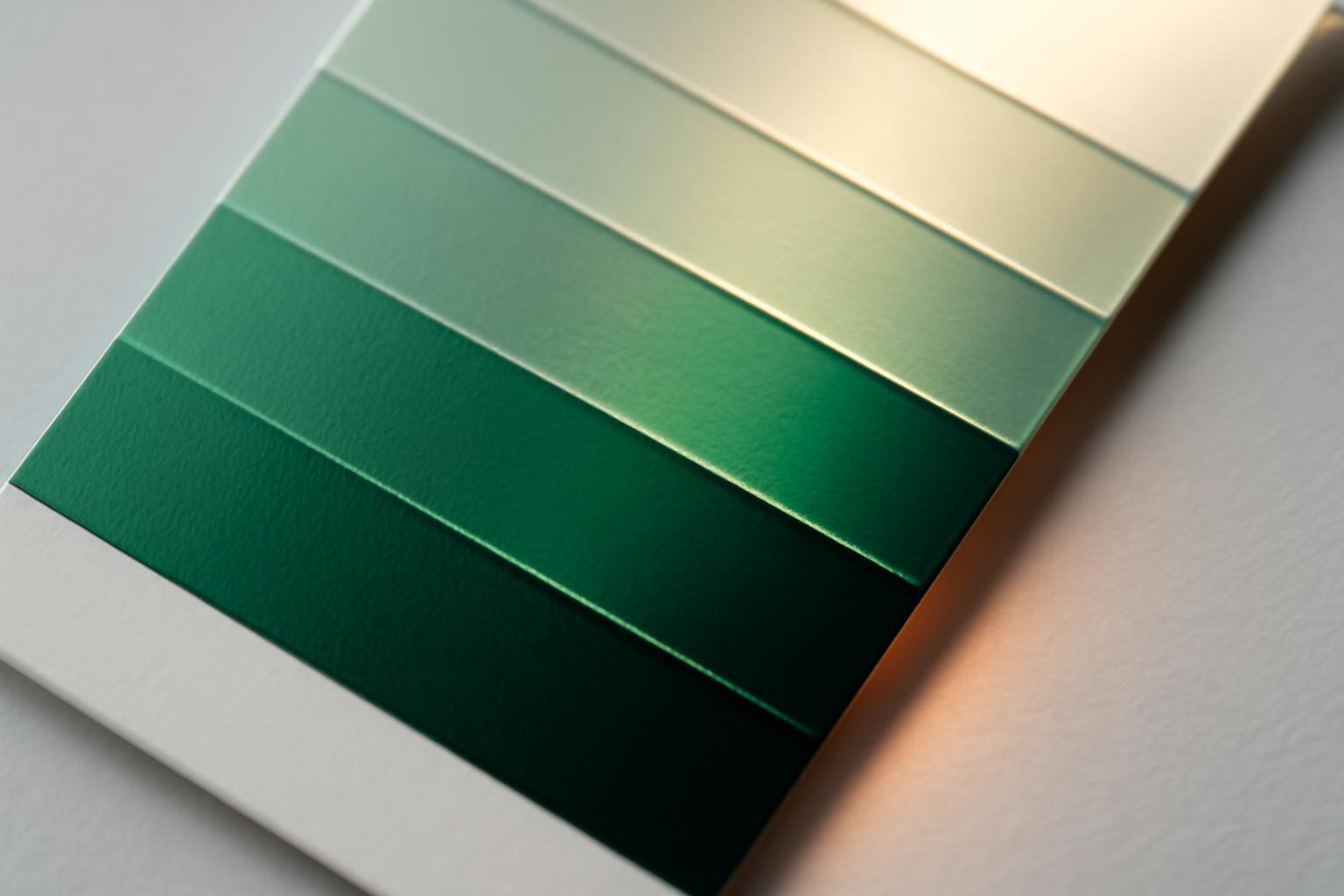
How to set saturation in practice: thresholds and figures
Work by the Journal of Consumer Research (2026 year, seven experiments) confirmed that low (vs. high) color saturation increases the perception of premiumness in luxury brands. The study shows a general pattern: the higher the saturation, the lower the perceived status. However, exact thresholds vary depending on the brand context, its positioning, and history.
| Saturation (HSB) | How it is perceived | Typical example |
|---|---|---|
| 0–20% | Luxury, heritage, restrained status | Hermès, Chanel, jewelry houses |
| 20–30% | Premium, but slightly more modern | Niche cosmetics, design hotels |
| 30–60% | Middle segment, 'solid' brand without pretensions to luxury | Mass-market clothing, household appliances |
| 60–90% | Mass market, energy, accessibility | Fast food, inexpensive electronics |
| 90%+ | Explicit mass market, "cheap brightness" | Children's products, sales |
This is not a strict law of physics, but a statistical regularity, yet it is stable enough to use it as a starting point when choosing the main brand color, rather than guessing by eye.
Dark, but saturated: the role of brightness separately from saturation
Here, two different parameters are often confused. Saturation is the 'purity' of the color, brightness/lightness is its lightness, proximity to white or black. A dark wine shade can be saturated in color but perceived as expensive — because low lightness alone works on premium perception, regardless of saturation.
The answer to the question 'can a dark but saturated color be premium?' is yes, and it often is exactly how the most convincing luxury palettes look: deep burgundy, dark emerald, anthracite blue. What doesn't work is saturation as such in dark tones, but rather light saturated colors — bright yellow, acid pink, clear blue. The problem is not with the purity of the color, but with its combination with high lightness.
When high saturation works for premium
The rule 'the quieter, the more expensive' breaks down for one group of brands — young, innovative ones, those who sell progress, not legacy. If a brand communicates innovation, the effect of low saturation is completely neutralized: the audience reads mutedness not as status, but as fatigue, lack of energy. Such brands need high saturation precisely to convey speed and novelty.
- Technological and DTC brands of the new generation — a saturated color is read as a 'breakthrough', not as cheapness.
- Youth-oriented directions of luxury houses — capsule collaborations consciously use brightness as a marker of departure from classicism.
- The condition is mandatory: the palette must remain limited — one or two saturated colors, not a chaotic set.
This exception only works with a narrow palette. A saturated color plus five other bright hues — is no longer innovation, but visual noise.
How to combine saturation and brightness in one palette
A ready sequence that closes the question of hierarchy:
- Choose a main color with saturation 10–25% and dark or medium-dark lightness — it carries the main semantic load.
- Limit the total number of colors to 3–4: each additional shade reduces the perceived prestige of the brand. Studies show that color complexity (the number and contrast of shades) negatively correlates with the perception of luxury.
- Add one accent color with higher saturation (30–40%), but use it selectively — as metal, not as background.
- Keep neutral colors — black, white, gray, gold, silver — as the unifying base, not as 'empty space'.
- Check the palette not by the color wheel, but by area: light saturated colors should be used pointillistically, as accents, and not as background elements, to preserve the feeling of luxury.
Why muted colors are read as expensive: the mechanics of perception
It's not about aesthetic taste, but about a specific association. A muted color reminds the brain of patina, fading, time — and time in the consumer's perception equals legacy and historical continuity. It is this mechanism, not abstract 'restraint,' that explains why the audience associates faded tones with status: a clean bright pigment looks fresh and industrial, while a muted one looks weathered by years.
Hence the connection with materiality, which is rarely explained explicitly. Natural luxury materials — worn leather, darkened silver, old wood, red wine — physically have exactly low saturation and low brightness. A color repeating this profile is subconsciously read as 'made from an expensive material,' even if it's a flat logo on a screen. Studies of retail spaces show: the more area in an interior is taken up by dark muted tones, the higher the subjective evaluation of the overall luxury of the space.
Hue, saturation, brightness: three parameters that are confused
In branding, they almost always speak of 'color' in one word, although behind it lie three independent parameters of the HSB model:
- Hue (tone) — the color itself: blue, red, green. It defines the emotional character, but hardly influences status per se.
- Saturation (saturation) — the purity of the color. This is the main lever of perceiving premium quality out of three.
- Brightness/Lightness (lightness) — proximity to white or black. Works independently from saturation: a dark saturated color and a light saturated color give completely different impressions.
The mistake of most guides is to discuss 'bright colors' as a single phenomenon, whereas bright yellow (high lightness, high saturation) and dark burgundy (low lightness, high saturation) belong to different perception leagues. To work accurately with premiumness, one needs to control two parameters separately, rather than using one intuitive scale of 'bright — dull'.
When restraint works against the brand
Low saturation is not a guarantee of success. A muted, 'faded' palette fails where a brand promises energy, speed, or accessibility, and visually conveys fatigue and closedness. Sports brands, children's products, services emphasizing convenience and speed lose trust if they apply the luxury formula 'black + gray + muted accent' — the audience reads this as slowness and high price, not status, if the brand lacks the corresponding history and price tag.
A similar mistake occurs with niche brands that copy the visual code of classic luxury — dark, muted tones — without the corresponding product and price. In this case, low saturation creates a gap in expectations: the buyer expects premium quality from the appearance and becomes disappointed upon encountering an ordinary product. The rule only works when the color is backed by real positioning, not borrowed aesthetics.
Recent articles








MegaFon, BMW, VTB and more 240+ companies. See how it looks in the showcase reel:


Our branding agency is approached to order:
Branding agency services












