Packaging color as a tool for shelf differentiation
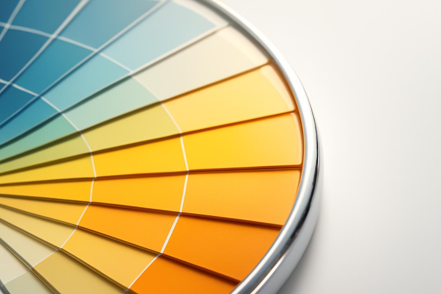
Contrast is deviation from the norm, not color loudness
Bright color and working contrast are different things. A bright-yellow sauce packaging on a shelf where 80% of competitors are also yellow won't stand out in any way — the eye perceives it as 'just another yellow'. But a calm, yet atypical shade for the category — for example, a muted graphite among acid-colored snack labels — is instantly recognized because it breaks the shelf's visual pattern.
The buyer has no time for analysis: on average, 0,67 seconds pass from the first glance at the packaging, then the gaze fixation lasts about 0,20 seconds, and during the entire shopping process, about six such fixations occur in three seconds. The brain in this window reacts not to color intensity, but to the difference between what was expected and what was seen. Therefore, the designer's task is not to 'make it brighter', but to find a gap in the category's color field and step into it.
The shelf is an ecosystem, not an empty background
Choosing the 'most different from all others' color is a common mistake. Packaging does not exist in a vacuum, but in a specific visual context: neighboring brands, shelf color, POS materials, even lighting in the department. A radically different color sometimes does indeed cut through shelf noise, but more often than not, it simply looks like a product from a different category, and the buyer's brain filters it out as irrelevant.
There is also a microfactor that is almost never discussed: the position of the packaging on the shelf affects the speed of color perception. Red and blue products are recognized faster if they are located to the left of the buyer's gaze, while green color in average is perceived worse than others — regardless of how 'lucky' it was chosen strategically. This means that the same design can work differently depending on the facings and shelf, and this should be taken into account when negotiating with the retailer about placement.
Why an unconventional color sometimes reduces sales
The popular idea of 'be as original as possible' is not confirmed by data. When packaging uses a color completely uncharacteristic for the category, consumer skepticism grows — according to researchers' calculations, interest in the product drops by 0,54 points (p
Here the difference between product categories works. For 'vice' products — tasty but not the most healthy — warm colors (red, orange) enhance the desire to buy because they are associated with intense taste and energy. For products sold through the health idea, cool tones work — blue, green. Moreover, the green color improves the perception of product usefulness even more than the actual composition — this should be kept in mind during re-design, not only the marketing department.
Hybrid strategy instead of radical color change
The most viable model confirmed by the study by Cardamone et al. in 2025 year using eye-tracking method is not complete departure from the norm and not complete compliance with it, but a combination of two colors with different tasks.
| The role of color | Task | Example of logic |
|---|---|---|
| Main (category) color | Communicates 'I am a product of this category', reduces trust | Red for sauce, green for eco-product |
| Additional (differentiating) | Creates a visual anchor, breaks the shelf pattern | Neon accent, atypical shade on the logo or lid |
Such a combination attracts attention more than a fully typical packaging, but does not cause rejection typical of a completely non-standard palette. This principle is evident in the Poppi packaging: flat color fields, a large logo, minimal graphics — the company has retained the recognizable 'soda' aesthetics, but added a bright differentiating accent that worked both on the shelf and in social networks. The result — the PepsiCo sale for 1,95 billion dollars.
Store lighting changes color more than it appears to the designer
The color confirmed on the monitor screen or even on a printed proof in the office often looks different under real store lighting. Fluorescent lamps give a cool, slightly greenish tint and 'eat away' the saturation of warm colors — red may look more orange, and pastel tones may fade. LED lighting, especially of a cool spectrum, enhances blue and white surfaces, but distorts the nuances of yellow and gold — the metallic finish on premium segment packaging may lose its 'expensive' look. Warm incandescent lamp light, on the contrary, adds yellowish tones and depth to packaging, but dims blue and violet shades.
From this practical conclusion, which is rarely stated: final color approval should be done not in a design studio, but in the trading hall, at the type of lighting that actually stands in the network. The same layout physically looks different in a discount store with cold LED and in a supermarket with warm accent lighting above the premium goods zone.
How to check the color solution before launch
- Place the packaging prototype among real competitors on a shelf analog, not on a white background
- Conduct an eye-tracking test or at least measure the time of first gaze fixation — the goal is to capture attention within the first 0,2–0,7 seconds
- Test perception under different types of lighting: fluorescent, LED, and warm — at least in two variants of the store
- Evaluate the reaction to color separately from the logo and text — sometimes it's not the color itself that works, but its combination with the package shape
- Compare the memorability metric after 'purchase' in the test — reference 79%, as in the Smurfit Kappa study
Testing costs money and time, but it is cheaper than a redesign after sales drop on the shelf. The color of the packaging is not about the designer's taste or about the trend for 'bold decisions', but about precise calculation: where the category's norm is, where the gap for differentiation is, and how both of these parameters behave under the specific light of a specific store.
Recent articles








MegaFon, BMW, VTB and more 240+ companies. See how it looks in the showcase reel:


Our branding agency is approached to order:
Branding agency services












