Black color in premium branding: codes of luxury
Why black, and not dark gray or dark blue
Dark blue reads as reliability, brown as tradition and earthly stability, burgundy as passion with a hint of aggression. Black has no shade at all — it is the absence of color, an absolute boundary. It is precisely this zero semantics that makes it a universal carrier of status: it does not tell a story, it cuts it short. Branding psychologists put it this way: black signals not wealth in itself, but control — over attention, over access, over the consumer's decision.
Historical context enhances the effect. In the sixteenth century, both dyes were expensive and rare. Black dye (inknut) required complex multi-step processes and import of raw materials from Eastern Europe and the Middle East, making it available only to affluent courts. Wearing perfectly black meant demonstrating that you had the resources to do something that was almost impossible to produce on a large scale. This memory is embedded in perception to this day, even though production has long become cheaper — the color remains a marker of effort invested, even if this is now an illusion.
How much does black cost: figures, not feelings
Packaging market research provides a concrete benchmark: the same product in black packaging consumers are willing to pay 20–30% more for than the same product in white packaging. The difference is not in quality — it is in the signal of quality. The brain interprets black as a marker of premium quality faster than it can engage rational price evaluation.
The second indicator relates not to an individual purchase, but to the volume of sales at the collection level. The trend of monochrome black in the fashion segment, which is gaining strength by 2026 year, is forecast to increase brand sales by 35%. This works not as a one-time trick, but as a systemic strategy: a brand that makes black a part of its entire identity — from logo to packaging and retail space interior — achieves a multiplicative effect, not just a one-time boost in conversion for a single SKU.
Case Study: Audi — black as part of a system, not an ornament
Audi is a good example of how black works not in isolation, but in combination. The brand uses it as one of three signature colors alongside white and red, and this is a deliberate role distribution: white maintains the cleanliness of German engineering aesthetics, red marks sportiness and energy, while black is responsible for status and professionalism.
In the 2022 redesign, this approach was taken to the extreme of minimalism — a subtle black outline around the brand rings. Not a fill, not a background, but literally a contour line. This is a fundamental move: the area of black decreased, but its semantic load increased — the outline creates a sense of premium aesthetics precisely through restraint, not scale of color presence. The lesson from this case is simple: in luxury branding, it's not the area of black that matters, but the precision of its dosage.
Gloss black and matte black are two different languages
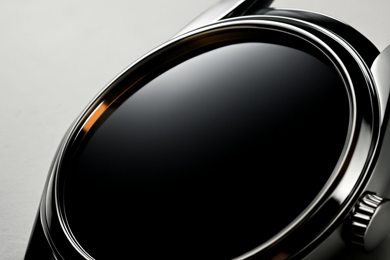
Here begins what is usually overlooked in color analyses: black is not equal to black. Glossy surfaces—lacquer, glass, polished metal—operate within the logic of Art Deco and classical luxury of the early Chanel type: they reflect light, create shine, appeal to theatricality and explicit demonstration of wealth. This is the black that wants to be looked at.
Matte black — the color of a different philosophy. It absorbs light instead of reflecting it, and is perceived as minimalism, self-sufficiency, and sometimes — an ecological stance. Apple has built devices of recent years on this, and many brands of sustainable fashion choose matte black packaging precisely for the feeling of 'quiet' luxury without excessive showiness. The difference is fundamental for positioning: gloss says 'I have it,' while matte says 'I don’t need to prove it.'
| Combination | Effect | Where applied |
|---|---|---|
| Black + gold | Maximum status demonstration, a feeling of heritage and ceremony | Jewelry luxury, elite alcohol, high-end perfumery |
| Black + silver | Technological sophistication, cold precision, modern status without 'old money' | Automotive industry, technology, next-generation watch brands |
| Black + white | Maximum contrast, a feeling of clarity and control, minimalism | Fashion retail, cosmetics, premium-class digital products |
The logic is the same in all three cases: black itself does not create luxury, it creates a background on which the second color is perceived more vividly. Gold on white is lost, on black — it is instantly readable. This works in boutique interiors as well: black walls and floors are not decoration, but a frame that makes the product on display look more expensive than it actually is.
Where black doesn’t work and why
The universality of black in luxury is a myth if it is taken outside this category. The color is physically perceived as cold, heavy, emotionally closed — exactly what cannot be allowed in certain spheres.
- Children's products — black is associated with maturity and danger, not with play and safety, which is what the target audience of parents expects.
- Medicine and pharmaceuticals — the color black is read as an alarm signal, not as trust; a patient needs an association with cleanliness and care, not with power.
- Mass-market food products — black packaging reduces the product's appeal at a subconscious level, unless this is a deliberate premium move (chocolate, elite alcohol).
- Fintech and banking products for the mass audience — an excess of black can be read as elitism, repelling the mass customer, if the brand does not initially build its strategy on exclusivity.
There is also an exception that breaks the pattern "black = expensive": Lush uses black packaging not for status, but for practical reasons — it allows using 100% recycled waste without sorting by color. This shows that the meaning of black depends on the brand context: the same visual code can convey not luxury, but ecological mindfulness — if the brand's overall communication works on this idea.
Recent articles








MegaFon, BMW, VTB and more 240+ companies. See how it looks in the showcase reel:


Our branding agency is approached to order:
Branding agency services












