Brand Identity Prism by Kapferer: application in practice
What is this model and how does it differ from analogs
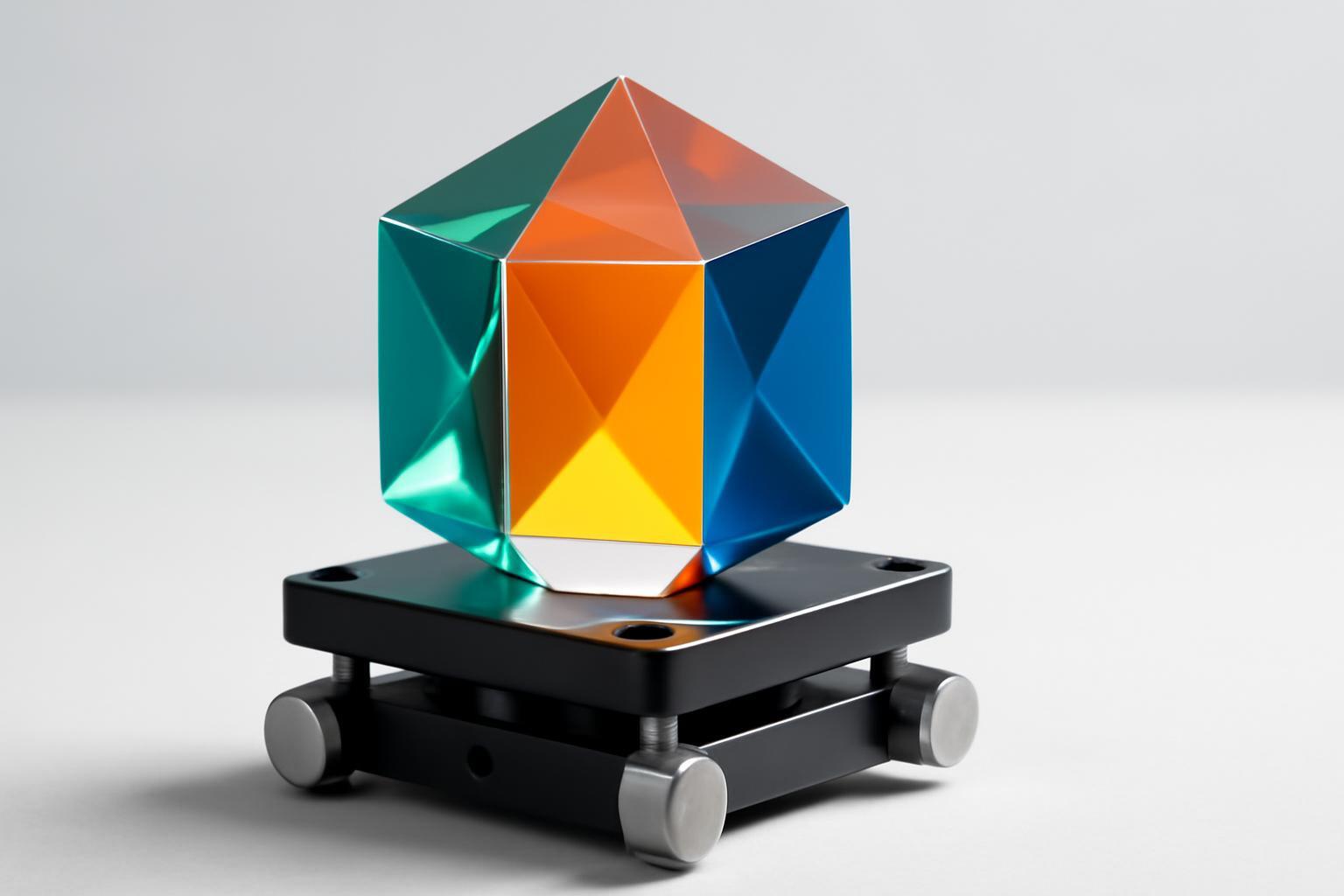
Kapferer described the prism in 1992 in the book "Strategic Brand Management", and developed the model in the second edition of "Strategic Brand Management" published in 1997. The construction is a hexagon at the intersection of two axes. Vertically: what the brand conveys (Sender), and what the consumer perceives (Receiver). Horizontally: external, visible manifestations (Externalized) and internal, hidden (Internalized).
- Physique - physical attributes: logo, packaging shape, color, notification sound, product silhouette.
- Personality - brand character, vocabulary in communication, tone in social networks and support responses.
- Culture - value system, country of origin, philosophy on which company decisions are based.
- Relationship - customer relationship model: mentor, equal friend, status partner, service staff.
- Reflection - stereotypical image of the buyer that the brand embeds in advertising.
- Self-Image - who the real customer feels they are when using the product from the inside.
The three external faces — Physique, Relationship, Reflection — form the first impression within seconds of contact. The three internal ones — Personality, Culture, Self-Image — sustain the brand at a distance when the competitor has already copied the packaging. David Aaker's identity is assembled flexibly, from 8–12 elements without strict geometry. For Kapferer — exactly six, with a rigid separation between sender and receiver. This is inconvenient if one needs to beautifully describe a brand for a presentation, but it is precisely this rigidity that turns the prism into a tool for identifying contradictions, not just a list of attributes.
How to fill the prism: a working process, not a brainstorm
Filling out six faces with the power of one brand team — an exercise for internal chat, not diagnostics. The model works only when the same questions are asked separately to the team and to real consumers, and then the answers are compared line by line.
| Face | Question to the brand team | Question to the consumer |
|---|---|---|
| Physique | What 3–5 physical features should be recognized in a second? | What comes to mind first when the brand is mentioned? |
| Personality | If the brand is a person, what is his character and way of speaking? | How would you describe this brand as a person? |
| Culture | What values and origin stand behind the product? | What philosophy does the brand convey, in your opinion? |
| Relationship | What type of relationship does the brand offer to the client — service, status, friendship? | How do you feel about interacting with the brand in practice? |
| Reflection | Who does the brand consider its 'face' in communication? | Who, in your opinion, is a typical buyer of this brand? |
| Self-Image | What should the client feel like when choosing the brand? | What do you feel about yourself while using the product? |
Example from a live case: Volvo in the Culture facet is formulated by the team as 'safety as engineering obsession', and in consumer surveys the same word often emerges — 'safe', but with a nuance of 'boring'. This coincidence in essence and slight divergence in tone — exactly the zone that the prism should catch.
Many consultants add a seventh, optional element — Brand Essence, the essence of the brand in 2–3 words at the center of the hexagon. Kapferer formally does not have it, but as a verification filter it is useful: if the face formulation does not work on the essence, the face is formulated off-target.
Prism as a diagnostic tool, not just a description
The real value of the model is revealed not at the stage of brand creation, but at the stage of its audit. Two prisms are filled out: identity prism — how the company sees itself, and image prism — how the brand is perceived by consumers and channel participants (dealers, retail, partners). Then the faces are compared pairwise, not based on a general impression.
Three types of discrepancies destroy the brand faster than others:
- Personality versus Culture — the tone of communication is friendly, but the corporate culture is closed: the client feels this on the second contact, not the first.
- Reflection versus Self-Image — in advertising, one customer portrait is targeted, but real clients identify themselves differently, which causes the campaign to 'miss the mark'.
- Physique versus Relationship — the visual redesign has been updated, but the model of interaction with the client (response speed, tone of support, service level) remains the same, and the new image looks cosmetic.
The least obvious but most dangerous pair is Culture and Self-Image. Company values and how the client feels about themselves using the product are rarely compared directly, although it is precisely the alignment in this pair that forms long-term loyalty, not a one-time purchase.
Metrics: how to measure the gap, not just record it in words
The audit is built as a comparison of ratings for each of the six faces from three sides: internal team, end consumers, channel participants. The practical scheme is a 1–10 scale for each face from each of the three sides, with the difference translated into percentage deviation from the average.
Working threshold: a difference of up to 30% between identity and image is normal perception noise, not a reason for panic. Anything above 30% is a signal of a real gap that is closed either by communication or by changing the product or service — and the latter option is almost always the right one, even if more expensive. Three metrics for tracking convergence over time:
- Repeat audit waves every 6–12 months using the same methodology, so the data is comparable.
- The share of faces with a difference above the threshold — the goal is to reduce this from wave to wave, not keep it static.
- Textual match of Self-Image formulations by clients with the Brand Essence formulation by the team — a qualitative indicator manually calculated through surveys, but it is precisely this that catches semantic drift before numbers do.
Typical mistakes when working with the prism
The most common mistake among small and medium-sized companies — 'lopsided prism'. Up to 90% of budget and time is spent on Physique — logo, website, packaging — while the other five faces are merely formalized, for a slide in a presentation. As a result, the brand is updated visually, but not essentially, and the client feels it faster than the team can enjoy the new design.
The second mistake is a pure identity-image gap: the company invents a desired identity detached from the current market perception and launches it without intermediate steps. The bridge from the current state to the target is not built, and the communication is read as deception rather than development. The working approach is to fill two prisms, current and target, and explicitly write down which faces change abruptly and which remain the anchor of trust during the transition period.
Kapferer vs Aaker vs de Chernatoni: when to choose what
| Criterion | Kapferer Prism | Aaker Identity System | de Chernatoni |
|---|---|---|---|
| Structure | 6 hard edges, sender/receiver | 8–12 flexible elements |
Recent articles



MegaFon, BMW, VTB and more 240+ companies. See how it looks in the showcase reel:


Our branding agency is approached to order:
Branding agency services












