Rebranding for airline Iraero
Custom development
Brand Platform
Logo
Corporate Identity
Identity
Packaging
Brandbook
Airline «IrAero» originates from Eastern Siberia 25 years and connects remote corners of Russia and the world, providing a full range of services for organizing passenger and cargo charter air transportation.
About the client
Request
Rebranding attracts new clients and strengthens trust of existing ones
The company was faced with the task of conducting a rebranding. The main goal was to reimagine the brand's visual identity. It was important to bring it in line with modern market requirements, reflecting the key values of IRAERO — safety, comfort, and care for clients.
Our tasks within the rebranding:
- Update the logo and corporate identity, while maintaining continuity;
- “Refresh” the company's image, adding dynamics;
- Avoid sharp changes that would drastically alter how clients and partners perceive the brand.
The updated identity should improve the company's perception and strengthen its market position, highlighting its uniqueness and attractiveness to passengers.
Features of the task
Incorporate current elements into the brand that emphasize innovation and dynamism of the industry.
Update the visual style while preserving key brand aspects.
Reflect the geographical origin of Eastern Siberia and the company's dedication to its roots.
The rebranding concept for IRAERO is aimed at creating a dynamic and memorable image. Its basis is a versatile triangle — a symbol of speed (the wing and tail of an airplane) and, at the same time, reliability, confidence, and friendliness. This symbol is simple to use and associative, creating a solid foundation for the development of the identity.
Solution
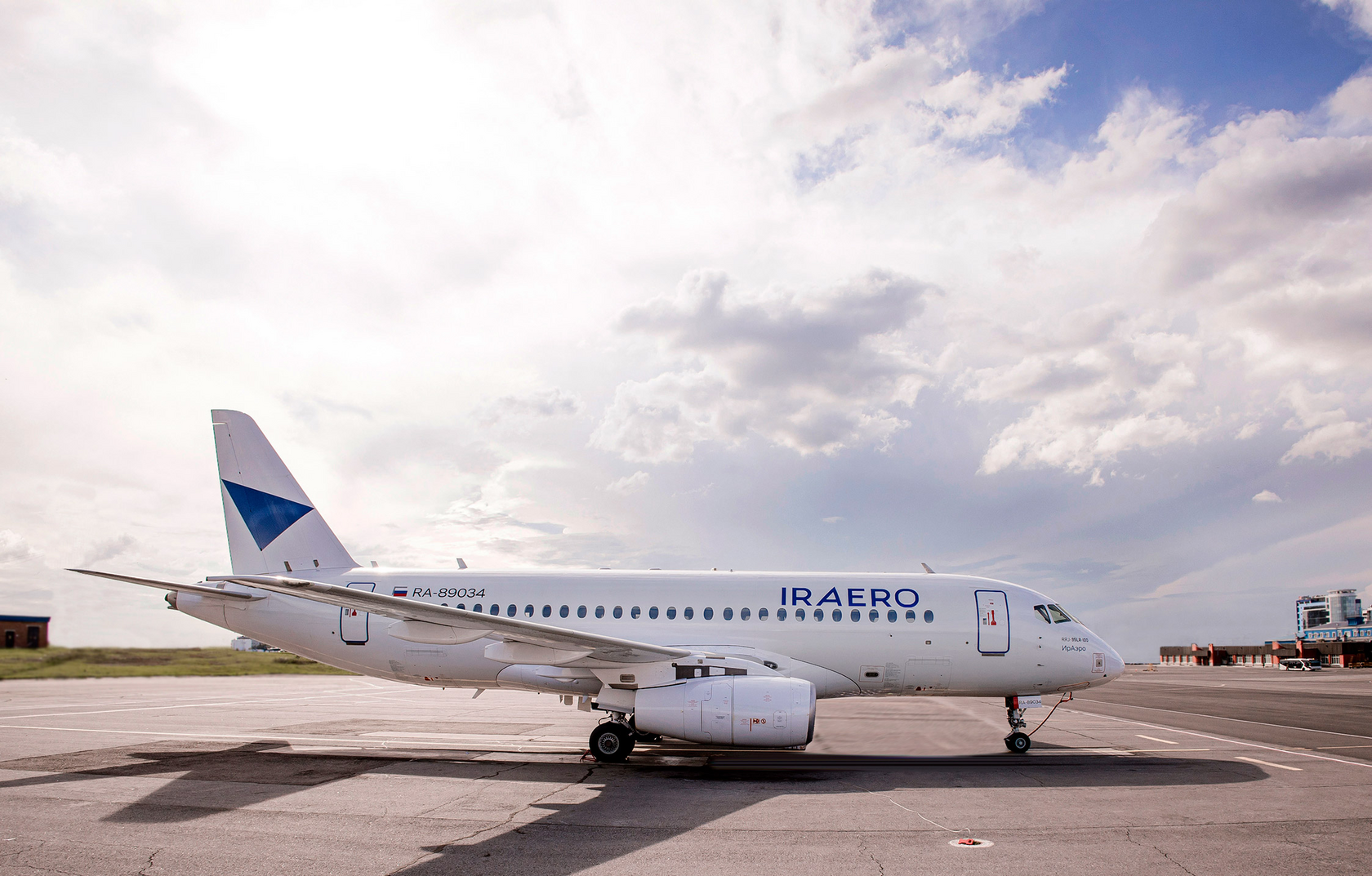

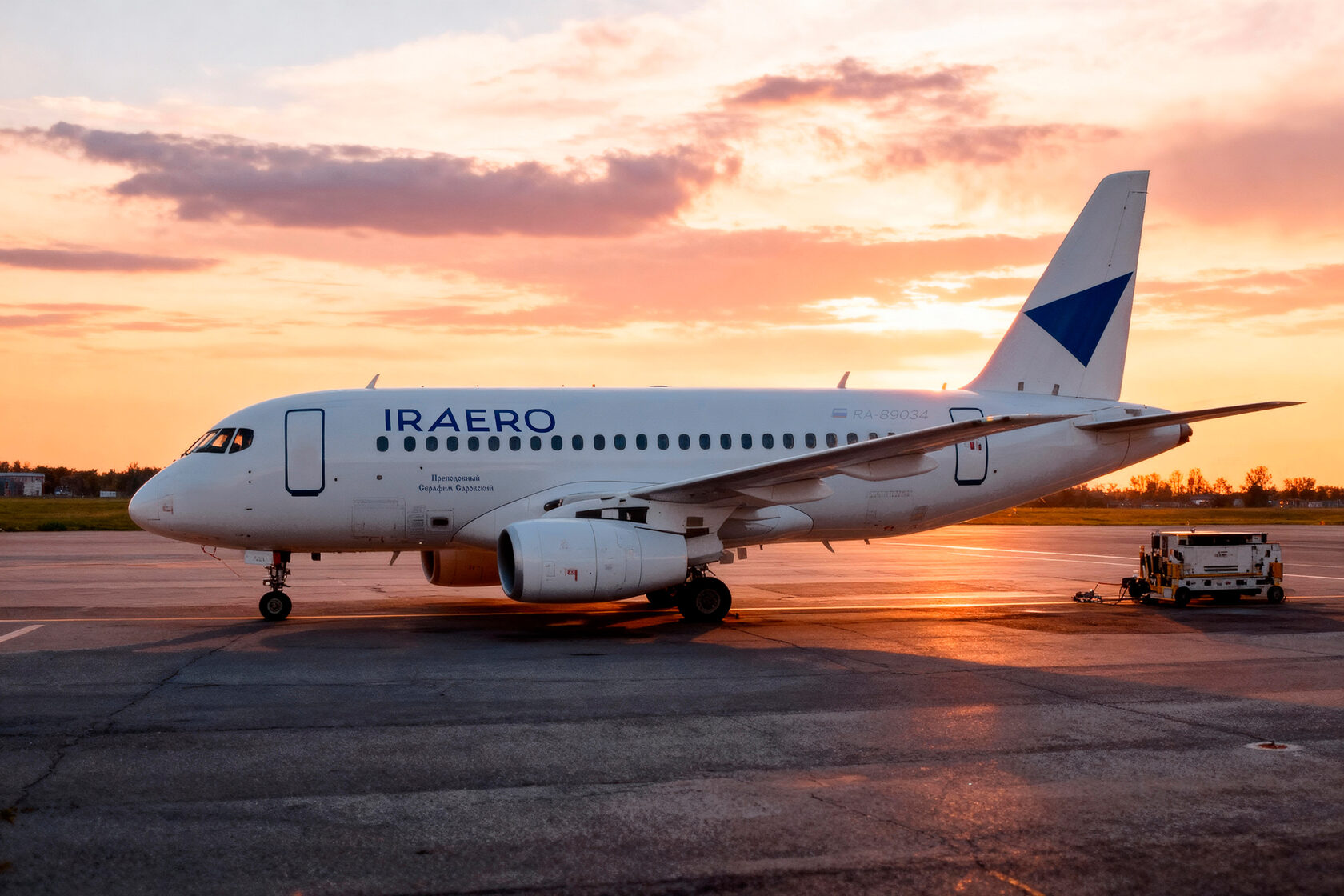

The aircraft in life


An asymmetric letter A resonates with the triangular symbol and creates an illusion of motion.
Wide proportions — confidence, practicality.
Spacious letter spacing adds 'air' and reminds one of classical typography.
Large rounded forms — sincerity, friendliness, the archetype of 'the glorious little one'.
Developed by
Aleksandra Korolkova


Was
Became
For the airline, the main physical carrier is the aircraft. After the concept was approved, several aircraft of IRAERO were immediately equipped with new livery, demonstrating the updated graphics.
The feature of the concept is that the identity is 'alive', and the symbol is capable of changing its form while preserving the triangular basis. This makes the image flexible and modern, allowing it to adapt to different contexts and platforms. The gradient in the symbol and the font block — a manifestation of volume and multidimensionality.
Despite the variability of the graphic elements, the recognizability of the symbol is preserved. Direct associations — the arrow symbol, which, like the company IRAERO, can move in any direction.
The developed pattern is based on a concise logo that guides the gaze and attention, organizing space and content on physical carriers, thereby increasing their functionality.
The pattern is applied by embossing or lacquering. Triangular elements executed in these techniques alternate with unprocessed triangles, creating an interesting tactile texture. This approach enhances the visual impression and adds a sense of depth.
Packaging
Within the framework of the corporate style usage guidelines, we developed the design of print materials and merchandise, as well as recommendations for social media company formatting. Every element—from corporate stationery and business cards to steward badges—demonstrates commitment to the main idea and mission of IRAERO. To simplify printing and ensure stylistic consistency, we used a single tone of blue that creates a clear association with the brand. We took into account the capabilities of high-quality color reproduction on different materials: ceramics, textiles, plastic.
Special attention was paid to the design of airline tickets and packaging for food and beverages on board, which serve as important touchpoints with customers.
Corporate merchandise serves as an identification element, increases brand recognition among customers and partners, and contributes to team cohesion growth.

The company has received an updated brand platform and a guideline for using identification elements across all communication channels.
IRAERO AIRLINES, for the first time in its entire history, decided to undertake a large-scale rebranding, as a result of which:
Every element of the corporate identity meets the requirements of relevance, consistency and is designed for a long lifecycle.
IRAERO AIRLINES, for the first time in its entire history, decided to undertake a large-scale rebranding, as a result of which:
- the company has acquired a new stylish look associated with comfort, freedom and security;
- it was possible to enrich the brand positioning with new meanings while preserving the continuity of experience and values.
Every element of the corporate identity meets the requirements of relevance, consistency and is designed for a long lifecycle.
Result
