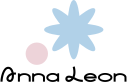
Logo and visual identity for a children's clothing brand
Anna Leon
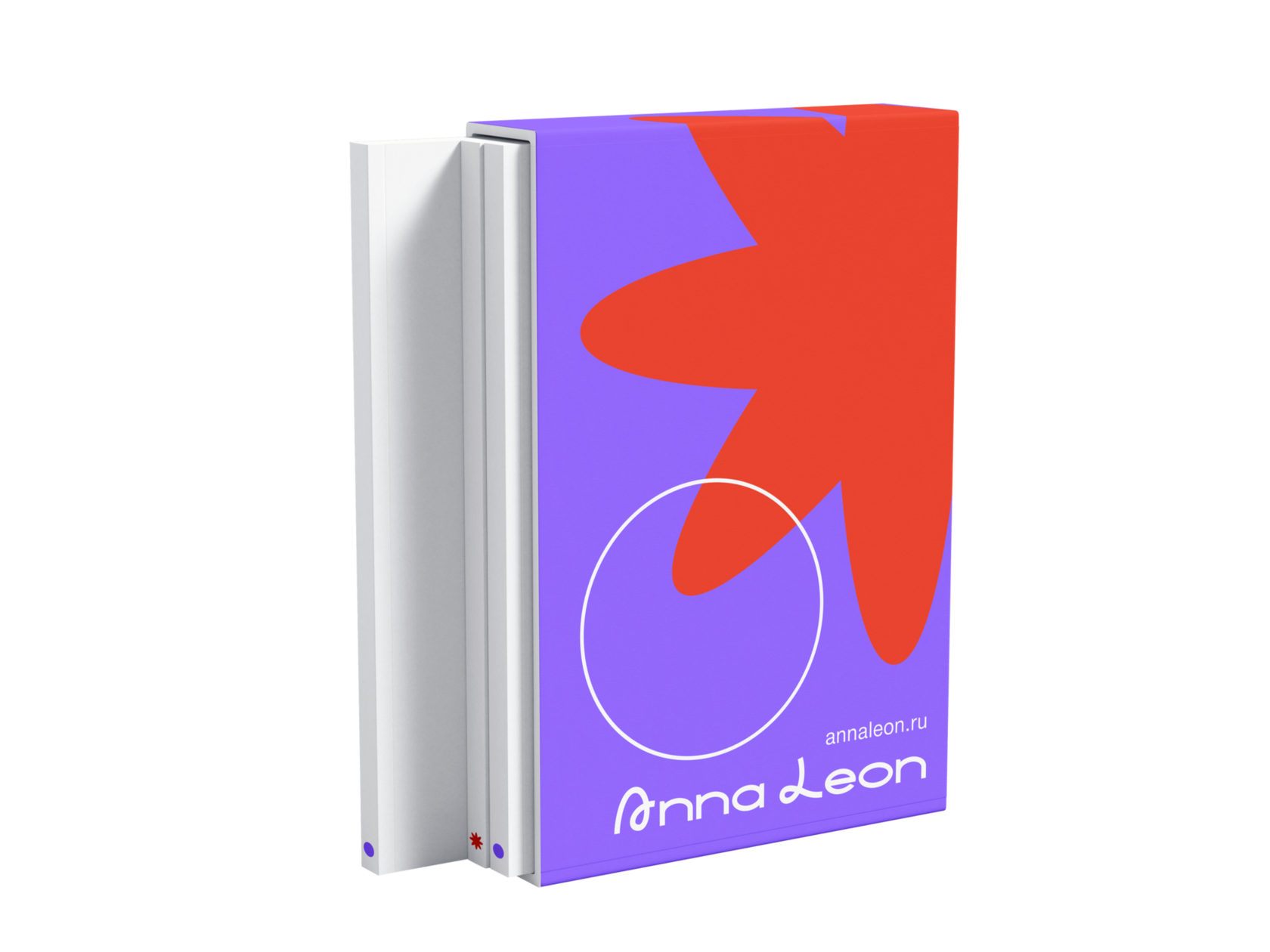
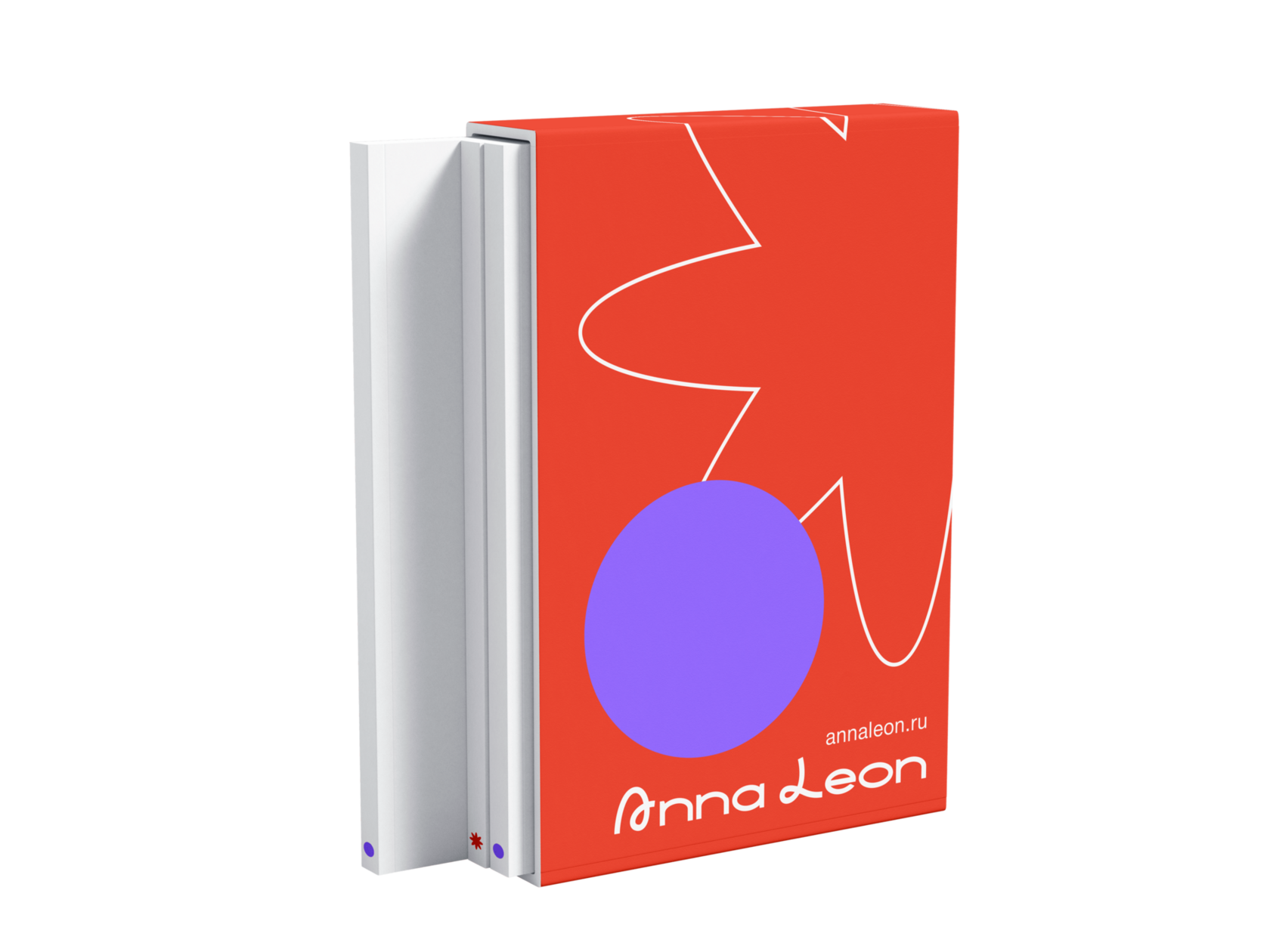
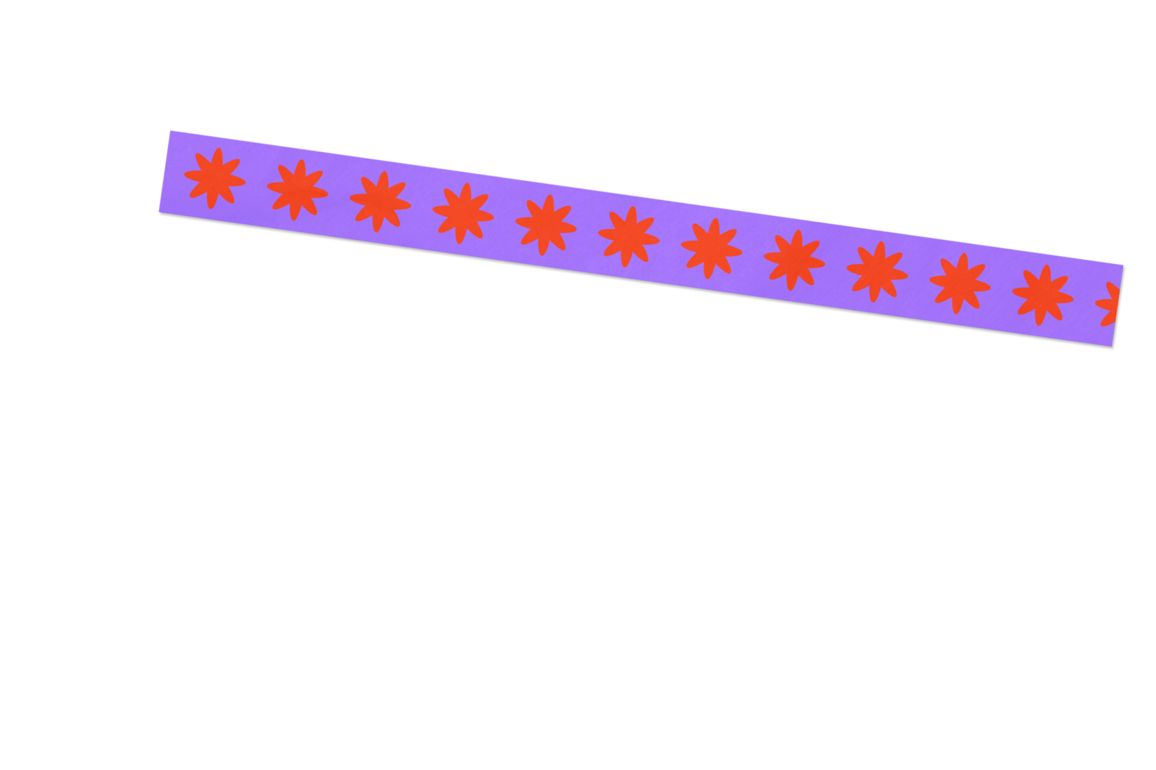
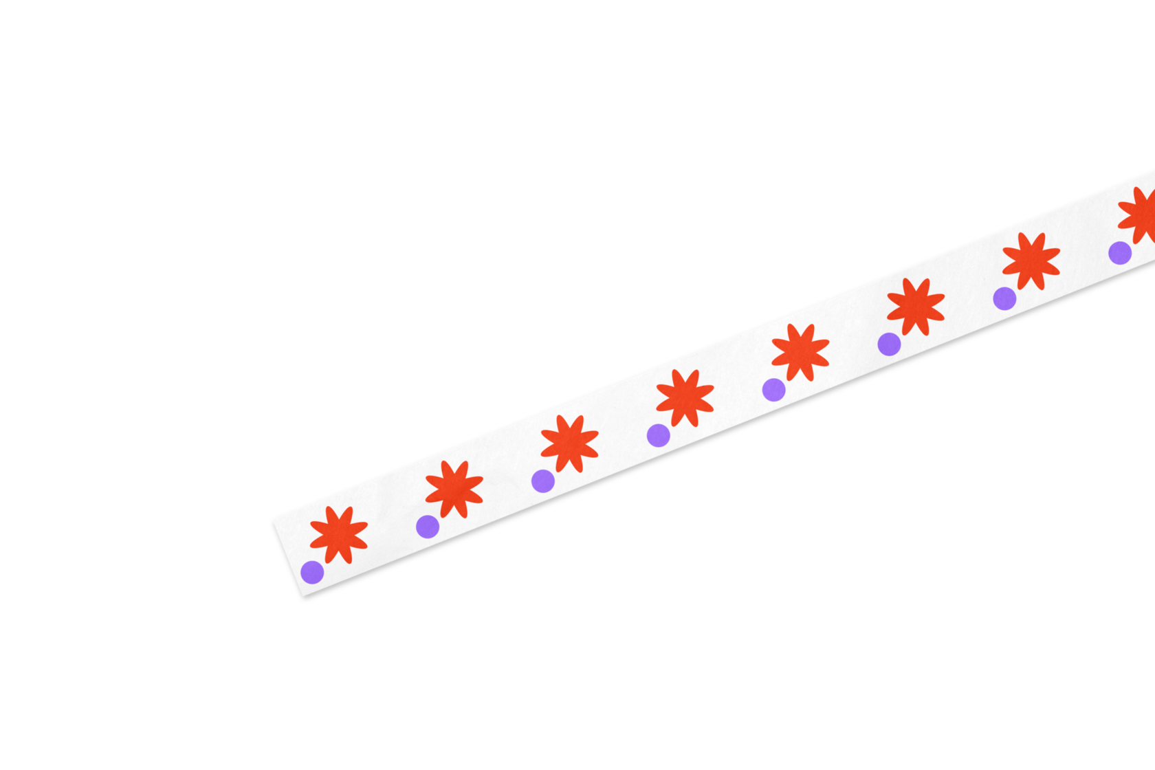
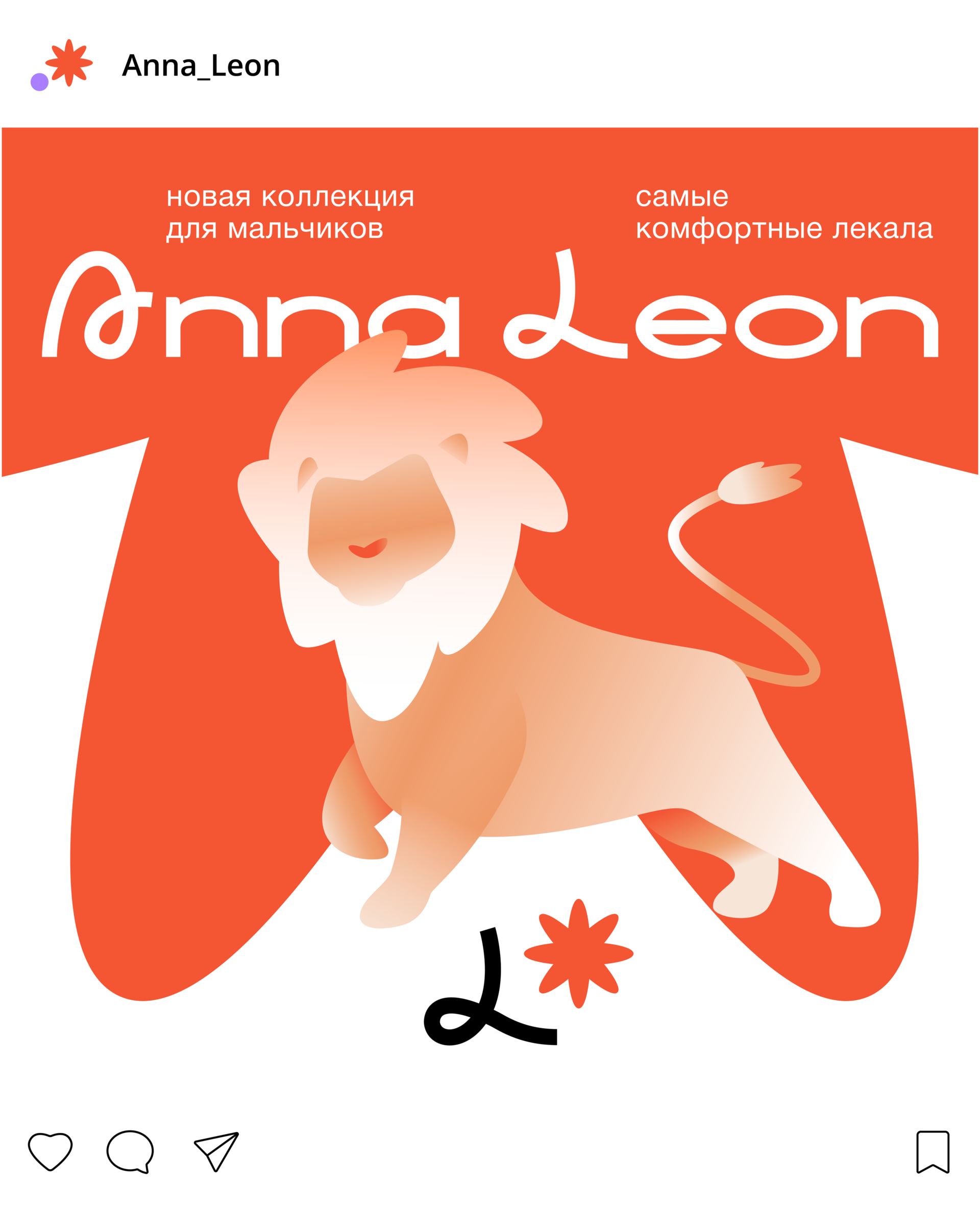
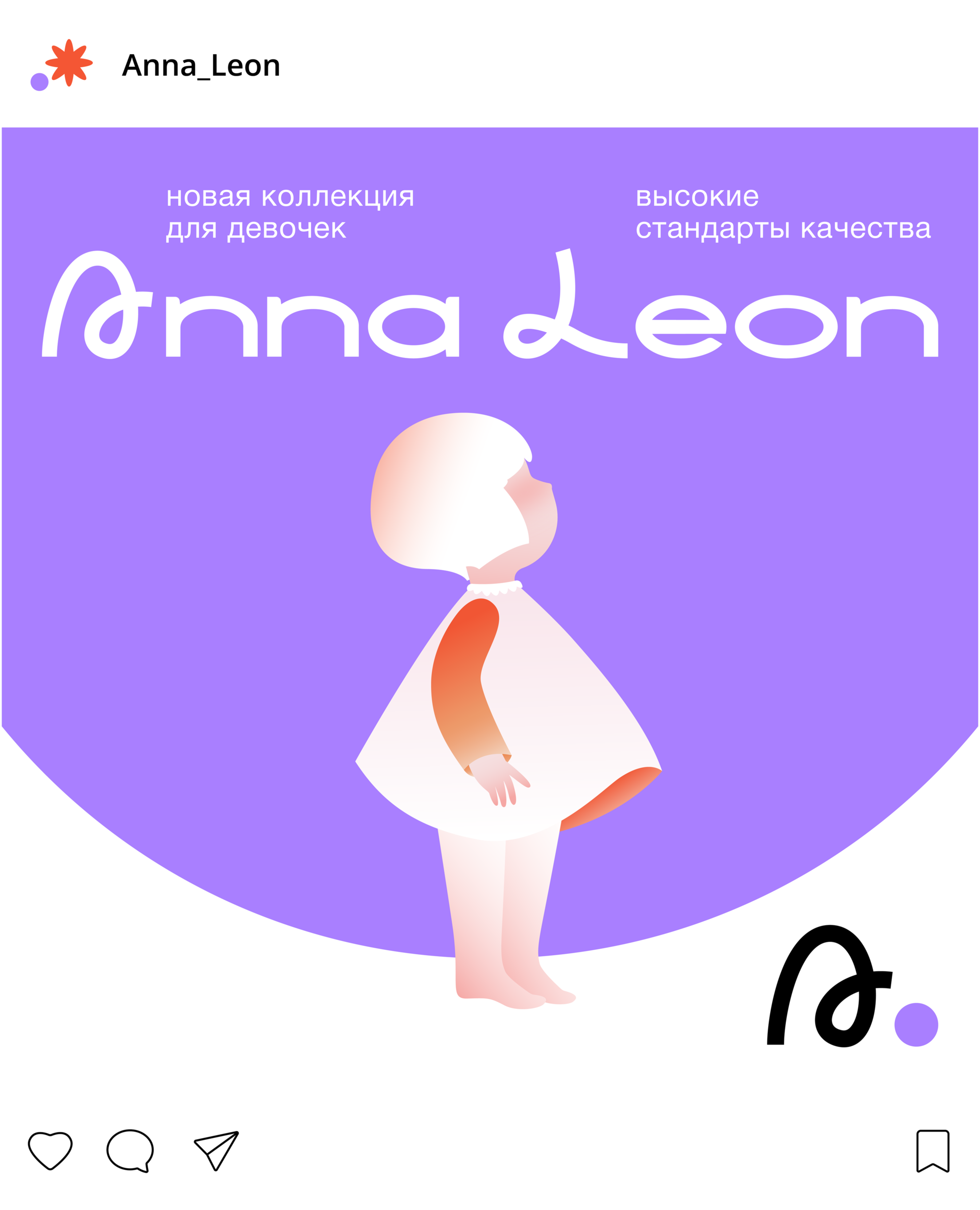
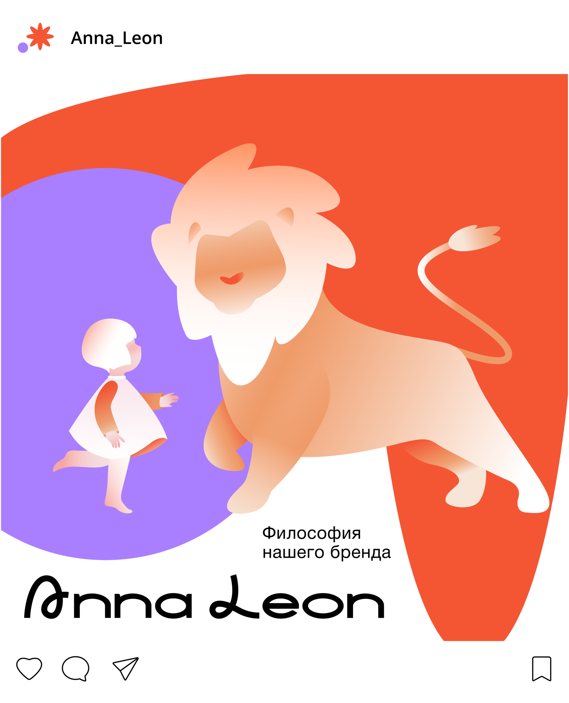
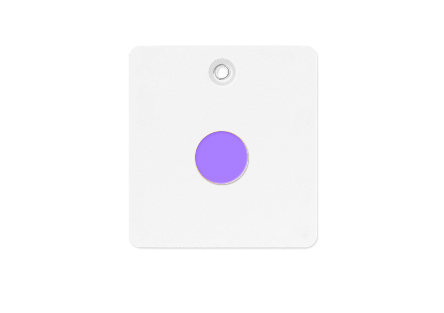
Anna Leon is a children's clothing brand where soft pastel aesthetics meet impeccable quality and attention to detail. The customer required a style that would reflect not only the touching tenderness of the collections, but also the philosophy of the brand - care, comfort and the special fairytale quality inherent in childhood. We created a soft and recognizable visual language, combining the lightness of pastel shades with playful graphics. The logo's rounded letters and delicate swirls convey the warmth and kindness of the brand, while thoughtful illustrations add a touch of magic. Particular attention was paid to typography - we chose a font that looks both modern and childishly cute. The ready-made style strengthened Anna Leon's positioning, working at all points of contact with parents - from labels and packaging to the website and social networks. This project shows how thoughtful design helps a children's clothing brand speak the language of its customers, emphasizing its uniqueness and value.
What is included in the development of a corporate identity:
- Logo
- Color coding
- Fonts
- Modular system
- Graphic elements
- Image Styles
- Design of social media networks
- Branded media