Packaging rebranding: stages and pitfalls
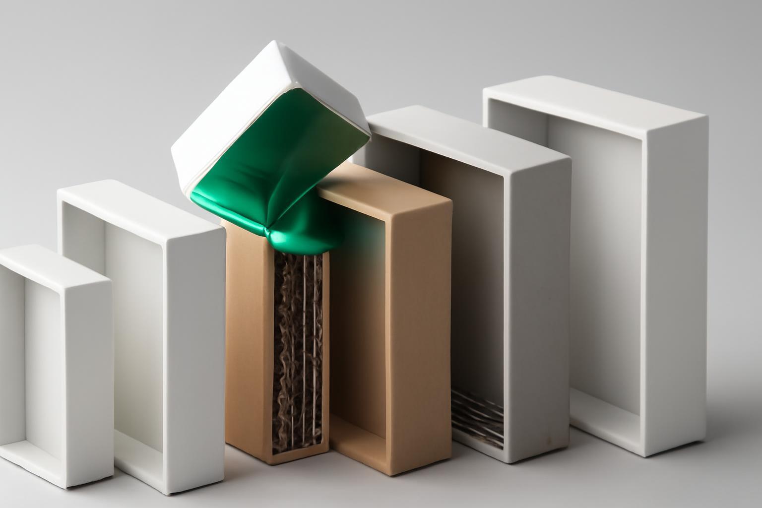
Visual anchors: why you can't touch them
A visual anchor is an element of packaging by which a buyer's brain instantly identifies a brand without conscious text reading: a characteristic bottle shape, a signature cap color, a character silhouette, or logo placement. This works at the level of peripheral vision — the buyer does not read the name, they "recognize the stain".
The problem is that designers often confuse a visual anchor with an outdated design element and change the anchor first — because it "looks outdated". That is exactly what Tropicana did in 2009 year, removing the orange with a straw from the packaging — a visual anchor that had existed since 1954 year. The outcome is well known: 20% drop in sales and tens of millions of dollars in losses over two months, after which the company reverted to the old design.
The rule is simple: an anchor can be stylized, simplified, slightly modified in proportions — but it cannot be completely removed within a single release. If an anchor is truly outdated and hinders brand growth, it is changed gradually, through several redesign cycles, rather than with a single decisive move.
What can be learned from the failures of Tropicana, Gap and Jaguar
These three cases are often cited separately, but together they form a diagnostic map of typical mistakes in rebranding.
- Tropicana (2009) — removed the visual anchor without testing on the target audience. The lesson: the anchor is more important than aesthetics, and research shows that 9 out of 10 packaging redesigns do not create a meaningful increase in sales, and approximately half of them may harm brand perception — that is, the chances of harming the product are higher than the chances of improving it.
- Gap (2010) — changed the logo without prior audience involvement and without a transition period. The reaction in social networks was so sharp that the company reverted to the old logo within a week. Lesson: phase out the old visual identity gradually so the audience has time to adapt.
- Jaguar (2025) — showed a radically new brand video without a single car in the frame. Sales in April dropped from 1961 car to 49 — a decrease of 97,5%. Lesson: rebranding the image without parallel product demonstration destroys the connection between the brand and what it sells.
The common denominator of all three stories is risk asymmetry. A seemingly minor cosmetic redesign can crash sales by 15–30%, and restoring recognition and trust takes not weeks but months. The benefit of a 'fresh look' rarely justifies this risk if the process is launched without insurance in the form of testing and a transition period.
How much it actually costs and how long it takes
The full packaging rebranding cycle — from briefing to production-ready files — takes on average 3–4 months. The breakdown by stages is usually as follows:
| Stage | Duration | What happens |
|---|---|---|
| Market and audience analytics | 4–6 weeks | Study of competitors, testing perception of the current packaging, searching for visual anchors |
| Concept Development | 3–4 weeks | 2–3 design variants for 2 SKU, evaluating compliance with production constraints |
| Prototyping and testing | 2–4 weeks | Printed samples, shelf tests, checking readability and audience reaction |
| Finalization and prepress | 2–3 weeks | Preparing files for a specific printing technology, coordinating with production |
Regarding funds, the situation looks like this: developing a concept (2–3 variants for 2 SKU) is a significant budget item; finalizing the layout requires additional investment, though specific figures vary depending on the contractor and region. But this is far from the entire budget: producing the packaging run usually costs 2–5 times more than the design itself. Companies often underestimate this part of the budget when planning a rebranding 'under a designer's bill,' not accounting for line retooling, new clichés for embossing, or an additional run for the transition period.
Production pitfalls that design blogs remain silent about
A beautiful layout in Illustrator and a working package on the production line — these are two different worlds, and the gap between them is the main reason why rebranding projects get delayed and exceed budget.
- Incompatibility with printing technology. Gradients and mid-tones that look great on screen may 'float' during flexo-printing on corrugated cardboard or may require additional Pantone colors that are not in the current color mixing line.
- Embossing and varnishing. Thin fonts and small logo details are often impossible to foil-stamp without losing readability — this is usually discovered during the trial run stage, when making changes costs both time and money.
- Packaging materials. Changing the material (for example, switching to biodegradable film) can alter the color reproduction of the design and require a full color recalibration.
- SKU inventory. Companies with 50–200 SKUs often fail to synchronously update the entire product line — some products remain with the old design in warehouses, which confuses customers and logistics at the same time.
- Regulatory requirements. Changing the font size of the ingredient list, barcode placement, or labeling may violate labeling requirements in a specific product category — this is usually discovered during the legal review stage, which is often placed at the end of the process rather than at the beginning.
All these risks are united by one thing: they cannot be closed by the creative designer's efforts alone. A specialist or contractor is needed who simultaneously understands packaging aesthetics and production constraints — printing technologies, material tolerances, labeling requirements. When choosing an executor, you should directly ask about experience in outputting layouts to print, not only look at portfolios with beautiful renders.
Layout approval: why the process takes 24 days and how to speed it up
The average cycle of approving new packaging within the company takes 24 days and involves 6–8 stakeholders: marketing, sales, lawyers, production, sometimes regional representations. Each adds their own correction, and without a structured approval process, the cycle easily stretches twice as long.
The difference in speed is telling: companies that conduct approvals through email correspondence spend an average of 32 day on approving one layout. Those who use structured workflow systems with clear roles and response timeframes for each participant complete the process in 18 days. The difference is nearly two weeks of pure time, which directly affects the production launch date and, accordingly, the entire project budget.
Practical conclusion: before starting design work, it is worth finalizing a list of approvers, their response timeframes, and the escalation process for disputed decisions — otherwise, the final design will be determined not by strategy, but by whoever last managed to insert a revision.
How to test the design before launching the production run
Given the Nielsen statistics — 5% successful redesigns versus 13% unsuccessful ones — skipping testing before production launch is betting against one's own money.
- Conduct a full-scale test: place the prototype among competitors and measure how quickly respondents find the product and recognize the brand.
- Check the readability of the visual anchor at a distance and at a glance — the interval of 0,3 seconds should be covered by the new design no worse than the old one.
- Conduct an A/B test of at least two to three concepts on the actual brand audience, not just on a focus group of designers.
- Test a trial run on real production equipment — colors and embossing on the screen and on the production line often differ more than it seems.
- Launching a transition period of 3–6 months with parallel sales of old and new packaging reduces the risk of sales loss by 5–15 percentage points compared to a sudden replacement.
It is precisely the transition period that is the most underestimated risk management tool. Companies that panic and remove the old packaging from shelves on the day of launching the new one repeat the mistake of Tropicana; those who give buyers time to adjust lose many times less.
Recent articles

MegaFon, BMW, VTB and more 240+ companies. See how it looks in the showcase reel:


Our branding agency is approached to order:
Branding agency services












