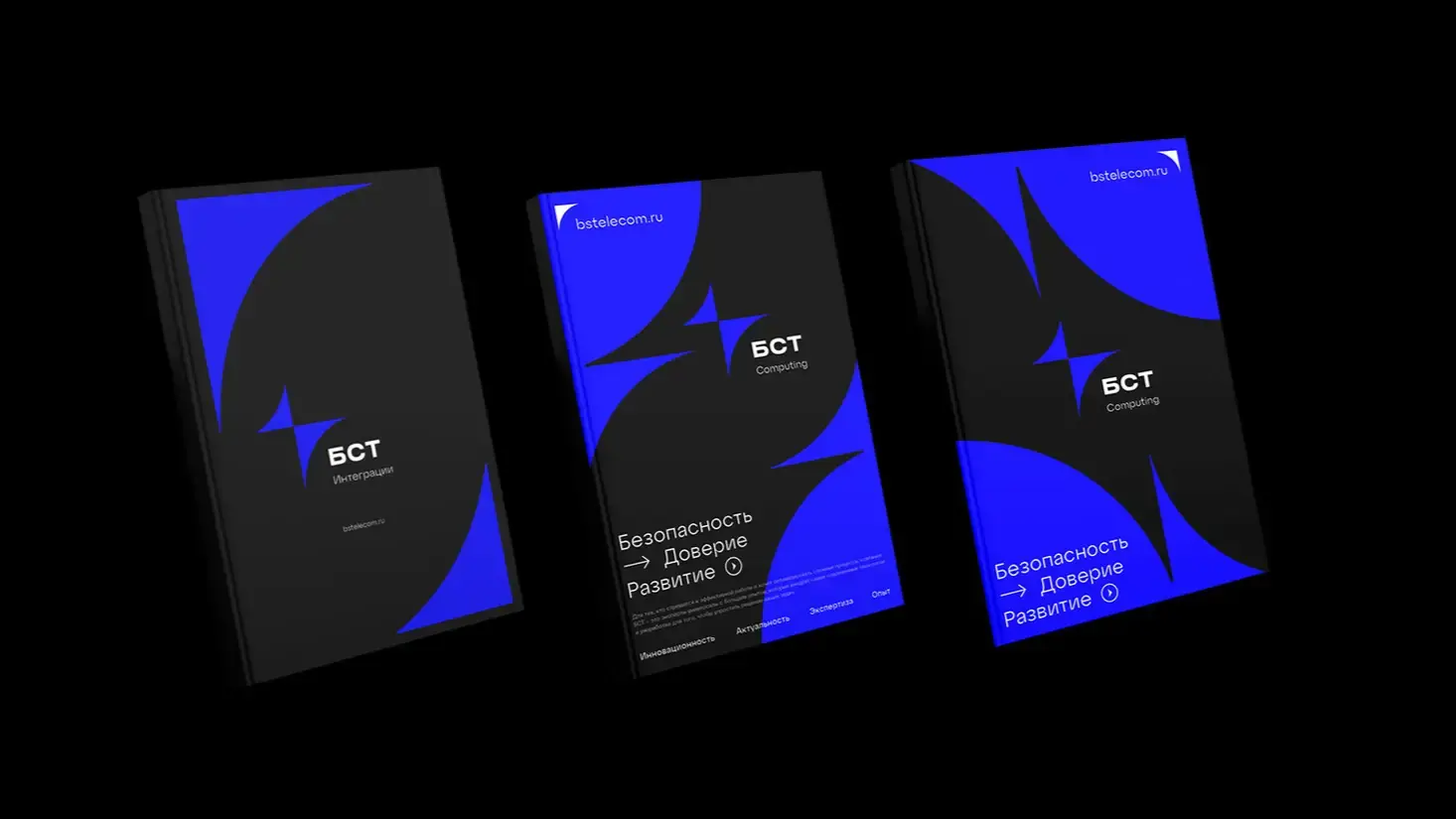
Modular grid in brand style

Why a system without a grid collapses faster than it seems
The problem usually doesn't show up immediately. For the first six months, the brand lives on layouts drawn up by the in-house designer, and everything looks decent. Then contractors are brought in, branches create local advertising, partners print joint materials — and it turns out that nobody has fixed a single language of proportions. The logo on a business card is larger than it should be, the safe area on a banner is eaten up by text, and the layout module on the website lives its own life, completely unrelated to print. A modular grid solves exactly this task: it sets the unit of measurement (a module, usually denoted as "x"), from which everything is built — from the height of a letter in the mark to the width of a column in a brochure.
How the logo grid is related to other media
The logic is simple: the module calculated for constructing the sign becomes the basic unit for all other elements of the identity. If the width of the key element of the logo equals, say, one module, then offsets, block sizes in layouts, column widths on the website, and header font sizes are calculated from it. This is exactly how the modular grid ceases to be a purely geometric schema for constructing the letter and becomes the architecture of the entire communication — something that classical articles about 'logo grid' miss.
Practically, this looks like this: the typographic grid of the page, the grid for printing layout, and the web layout grid are all multiples of the same module or its derivatives (half, quarter, two modules). Then, when a designer moves from a brochure to a landing page, they don't invent proportions — they simply scale the existing unit.
What size module to choose — formulas, not intuition
Here, proportional scaling from the base format is applied. In ITMO's practice, for the euroformat brochure, the module equals 12,375 mm — this is the result of dividing the sheet width by 8 vertical parts. For larger formats, another reference is used: the base module for A0 is 50 mm, for A4 it is 25 mm, meaning the module is scaled proportionally to the format, not selected anew each time.
| Format / medium | Base module | Calculation principle |
|---|---|---|
| A0 (posters, exterior) | 50 mm | format division into conditional parts |
| A4 (documents, print) | 25 mm | proportional to A0 |
| Euroformat brochure | 12,375 mm | sheet width / 8 |
| Premium brands (Apple and alike) | calculation based on the golden ratio | proportion 1:1,618 |
A separate story — the Fibonacci proportion. Apple and other premium brands build modular grids from the golden ratio 1:1,618 not for aesthetic reasons, but because it provides visual harmony across all media — from packaging to interface — without manual adjustment of each layout.
How to document the grid so that a designer is not needed every time
A brandbook with a picture of the grid and a caption 'module x' is useless if it lacks practical logic of application. Working documentation should address the question 'what to do', not just 'how it looks'.
- Fix the module value in millimeters and pixels (for digital media) — indicating which element of the logo it is derived from.
- Specify the safe zone: the minimum distance to the logo equals the height or width of the key element of the sign, or a fixed number of modules — in some systems this is 9 modules.
- Provide ready-made templates with an overlaid grid for each type of media: business card, presentation, social networks, outdoor advertising.
- Show examples of 'can' and 'cannot' — not abstractly, but on real company layouts.
- Indicate which blocks can be moved within the module, and which are fixed rigidly.
This is exactly how it works at Gromov Branding and MTS Web Services: the modular grid system is built right into the templates, and employees edit layouts themselves, without coordination with a designer for every little thing. This is not theoretical convenience — it is a direct time-saving for the design department and money saved on contractors.
When the grid is a necessity, and when it is an unnecessary layer of bureaucracy
Grid is justified if the brand has more than one person creating layouts, if there is a franchise network, partner materials, or a regular flow of content for different channels. In these cases, without clear modular logic, the system cannot be scaled without losing quality.
But if the brand is one owner, one designer, and ten layouts per year, a detailed modular grid with calculations down to the millimeter is overcomplication. It's simpler to keep several templates and common sense rather than spend the budget on developing a system that no one will use. A modular grid is needed where there is repetition and a distributed team — not as an obligatory branding ritual.
How the grid works for scaling the brand
Cases of DOM TECHNOSPY and X5 show this most accurately: modular identity there was built not for the sake of the logo, but for a system of adaptive templates — a constructor from which layouts are assembled for different products, sub-brands, and communication channels. A branch in another city, a new sub-brand, or a partner who needs joint promotion gets not an empty brandbook, but a ready set of modules from which the layout is assembled predictably and without distortion of the identity. This is the operational value of a modular grid — it turns the brand style from a static document into a working tool that scales with the business.
Recent articles








MegaFon, BMW, VTB and more 240+ companies. See how it looks in the showcase reel:


Our branding agency is approached to order:
Branding agency services