Logo composition: grid structure and golden ratio
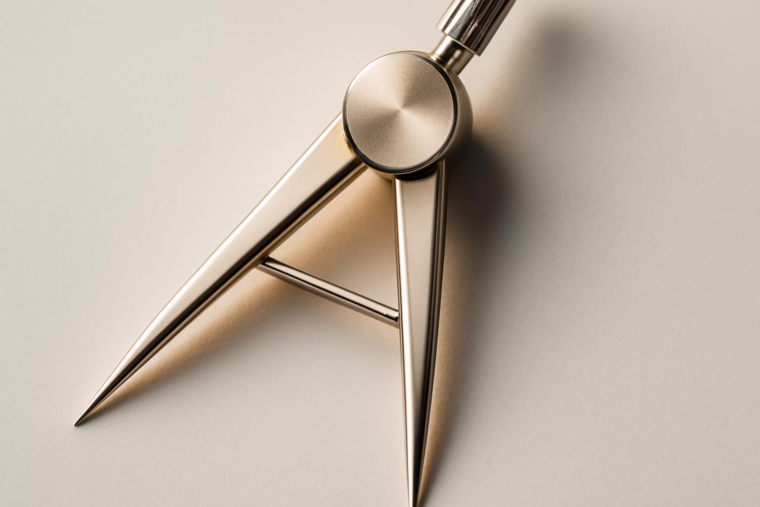
Where logo composition work begins
A designer rarely opens a program with a ready formula 1:1,618 in mind. First, an idea is born — a form, association, or brand metaphor. Only when the sketch is found and approved is the grid applied to it: it is not needed for generating the idea, but for checking and aligning what has already been conceived. Strict adherence to proportion from the first stroke usually results in a dull, mechanical outcome — the logo loses its individuality in an attempt to fit the formula.
- Concept sketch by hand or in vector, without binding to numbers.
- Choosing the basic shape — circle, square, or a combination of forms — based on the meaning and character of the brand.
- Overlaying a modular grid to check proportions, angles, and line thickness.
- Point correction via the golden ratio — where balance needs to be strengthened.
- Final check of the logo in reduction, in one color, and in the context of media.
Symmetry and asymmetry require different grids
A symmetrical sign is built on an axial grid: a central vertical or horizontal line, mirror modules, equal arc radii. Such a composition is perceived as reliable and calm — this is the choice of banks, insurance companies, and government structures. An asymmetrical composition is built differently: the grid sets not mirror symmetry but rhythm — shifted modules, different in size but connected by a single logic of proportions. Here the golden ratio works in its pure form: asymmetry in the arrangement of elements preserves internal symmetry through proportional relationships of sizes.
| Parameter | Symmetrical composition | Asymmetrical composition |
|---|---|---|
| Type of grid | Axial, mirror | Rhythmic, modular without axis |
| Role of the golden ratio | Checking proportions of modules relative to each other | Balancing the visual weight of elements of different sizes |
| The impression of the sign | Reliability, stability, conservatism | Dynamics, movement, modernity |
| Typical industries | Finance, public sector, jurisprudence | Technology, fashion, media |
When the grid hinders rather than helps
The grid is a working tool, not a dogma, and blind application of it can ruin the sign. A bad scenario looks like this: the designer fits the form to the grid, rather than the grid to the form, and a living curve becomes a faceless arc of the correct radius. Another mistake is to use the grid as the only criterion for evaluation: a sign may perfectly fit into the modules and still look bad at the scale of a business card or as an avatar in social networks.
- The grid is applied before the idea appears, not after — the result is dehumanized.
- Proportions are mathematically exact, but the sign is unreadable when reduced.
- Pursuing the 'ideal' golden ratio sacrifices the meaning of the form.
- The grid hides the real problem — a weak idea — rather than solving it.
A telling example is the Apple logo. It has no mathematical symmetry: Fibonacci circles of different radii are combined with arcs that are 'eyeballed' and clipped for the organic silhouette. If Jobs had demanded literal adherence to the spiral, the apple would have looked much more sterile.
How to check the harmony of a sign without fanaticism toward formulas
The golden ratio is only one of the criteria, and not the most decisive. The harmony of a sign is checked by a set of indicators that together provide an objective picture.
- The dominant sign coincides with the visual center—the point where the gaze falls first.
- The number of colors does not exceed 2-3, in rare cases—7; multi-colored signs are harder to remember and do not work well in monochrome.
- The sign is readable at 16×16 pixels—favicon does not turn into a mess.
- The thickness of lines and modules is visually balanced, there are no random 'heavy' or 'empty' zones.
- The form is recognized in a fraction of a second, without decoding.
What is a modular grid and the golden ratio in practice
Modular grid is a system of guides that divides the space of a sign into proportional modules and fixes active points — the intersections of lines where the gaze naturally lingers. It is at these intersections that the composition's dominants are placed. A classic example is the Toyota logo: three ovals are positioned at the intersections of a rectangular grid, and these points become the visual centers of the sign's perception.
There are three types of grids:
- Square/rectangular — modules are built on straight lines, suitable for strict, geometric signs.
- Circular — a grid based on circles and arcs, characteristic of organic, 'soft' forms.
- Combined (air) — the grid is barely noticeable, serving more as a guide than a rigid framework.
Golden ratio — a numerical ratio of 1:1,618 (the number Phi), related to the Fibonacci sequence: 1, 2, 3, 5, 8, 13. In working with a sign, it is not applied as a spiral, but rather as a method to check the proportion of sides, radii, and spacing between elements of an already completed composition.
Composition as part of the brand's visual language
Grid and proportions by themselves do not say anything about the brand — they are merely a technique. The decision about whether the logo will be symmetric or asymmetric, whether the module will be square or circular, must follow from the positioning, not from the desire to make it 'beautiful by formula'. A dynamic startup with an asymmetric logo transmits forward motion; a conservative bank with axial symmetry — stability. The composition of the logo is the first and most noticeable element of the brand's visual language, and it must work on meaning, with mathematics here serving as a check of the quality of execution, not as a source of ideas.
Recent articles








MegaFon, BMW, VTB and more 240+ companies. See how it looks in the showcase reel:


Our branding agency is approached to order:
Branding agency services












