Co-branding: rules for combining two logos
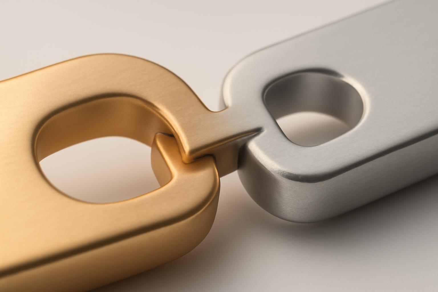
Five mistakes that kill co-branding at the start
The problem is almost never that the logos are bad in themselves. The problem is that they were placed next to each other without recalculating the visual logic.
- Equality in pixels instead of equality in weight. A bold font with a dense icon visually 'weighs' more than thin lettering of the same size — with equal width, one logo will appear about one and a half times larger.
- Ignoring the hierarchy of partnership. If one brand is leading and the other is invited, equal logos in terms of significance create confusion — it's unclear who is the main one, and this irritates the audience of both sides.
- Conflict of color temperatures. Cold blue next to warm orange without a transitional element competes for attention, especially on a neutral background.
- Lack of protective fields. Logos stick together or to the text, causing both to lose readability and look like one distorted symbol.
- Mechanical combination without a separator. Two logos placed right next to each other — the eye cannot understand where one brand ends and the other begins.
Horizontally or vertically: what determines the choice
This is not a matter of taste, but a matter of the carrier format and the nature of the signs themselves. Horizontal arrangement works when both logos are compact in height — a package, a site header, a banner. Vertical arrangement works when the logos are tall or when it is necessary to clearly show the hierarchy from top to bottom: an event organizer above a partner, a main brand above a local one.
| Criterion | Horizontal layout | Vertical layout |
|---|---|---|
| Media format | Wide: website, banner, packaging | Narrow: mobile screen, vertical packaging, stand |
| Partner Hierarchy | Weakly expressed, requires additional accent | Reads intuitively (top = main) |
| Logo proportions | Suitable for wide verbal signs | Suitable for compact logos and icons |
| Example of a rule | Airbus: 60:40 horizontally in favor of the leader | Joint events where the organizer is always on top |
Incidentally, the Airbus 60:40 proportion is a good reference not only for width but also for semantic emphasis: even a small asymmetry immediately signals who leads in the partnership and who joins in.
Contrast and readability: light background, colored background, photo
On a light background, problems are usually fewer — there you only need to align by weight and color. Difficulties begin on a colored background and in photographs.
- On a colored background, check both logos separately: if the background tone matches one of the signs, add a background panel or outline for only that one, not for both at once — otherwise the balance will be disrupted.
- Never place logos directly on an image in a photo without a badge or gradient background — the background changes in brightness in different areas of the frame, and the logo "floats".
- Always test both variants — the light and dark version of each logo — and choose the combination that works best for a specific background, rather than selecting one 'universal' pair.
Protective field and separator: where the boundary between brands lies
The minimum distance between two logos and from other elements of the layout is usually calculated not in absolute values, but in modules of the logo itself. The standard practice is a margin of no less than half the height of the wordmark on all sides. Red Hat goes further: their guideline requires that the logo must be separated from the partner visual element or empty space, and the minimum distance equals the height of the letter 'R' in their mark.
A separator is not a decorative detail, but a tool for managing hierarchy. A thin vertical line, a «×» sign, a dot, or simply an enlarged interval signals the eye: here are two different, independent brands that are collaborating, not merged into one. Without a separator, especially if the logo styles are similar, the viewer may perceive the pair as a single unsuccessful logo.
Case: how to coordinate logos with opposite character
The most common real problem is not 'two similar logos that don't match in size,' but 'two logos with opposite DNA' that need to be placed side by side without ruining either one. A minimalistic icon against a dense wordmark, a dark palette against a light one, a strict geometric font against a handwritten one — this is the classic case of co-branding.
A telling example is the collaboration between Nike and Tiffany & Co. for the Air Force 1 sneakers. Nike's signature black color for the checkmark, and Tiffany's recognizable turquoise, which is practically the brand's second logo. Instead of fighting over color dominance, designers repainted Nike's checkmark in Tiffany's turquoise — preserving the shape of the Nike symbol but subordinating it to the partner's palette. This is not a compromise of '50 on 50', but a conscious decision: the form from one brand, the color from another, and both are instantly recognizable.
Another approach demonstrates the case of REON and Wellmix — there the logos were not visually mixed, but aligned by structure and the internal logic of the sign construction: the same principle of element arrangement, comparable line density, but at the same time each brand retained its character and color identity. This is a working technique for situations when mixing colors is not possible (strict brand book), but aligning the logos by feeling is still necessary — then the alignment is done through compositional logic, not through direct borrowing of elements.
Practical conclusion: if logos conflict stylistically, do not try to make them 'identical.' Choose one axis of alignment—color, shape, or structural composition—and adjust only one parameter according to it, leaving the rest unchanged. Full harmonization usually kills the recognizability of one of the brands, while partial harmonization preserves both.
If there are more than two partners
With three or more logos, the scheme changes: the separator sign is no longer used, because it visually overloads the composition. Instead, the logos are arranged at equal intervals, and the safety field is maintained for each sign individually — according to its own proportions, not according to a common template. In such a situation, hierarchy is not set by dividers, but by the order of arrangement: the first one from the left or from the top is perceived as the main one, even without special visual accents.
Recent articles








MegaFon, BMW, VTB and more 240+ companies. See how it looks in the showcase reel:


Our branding agency is approached to order:
Branding agency services












