Corporate patterns and textures: principles of construction
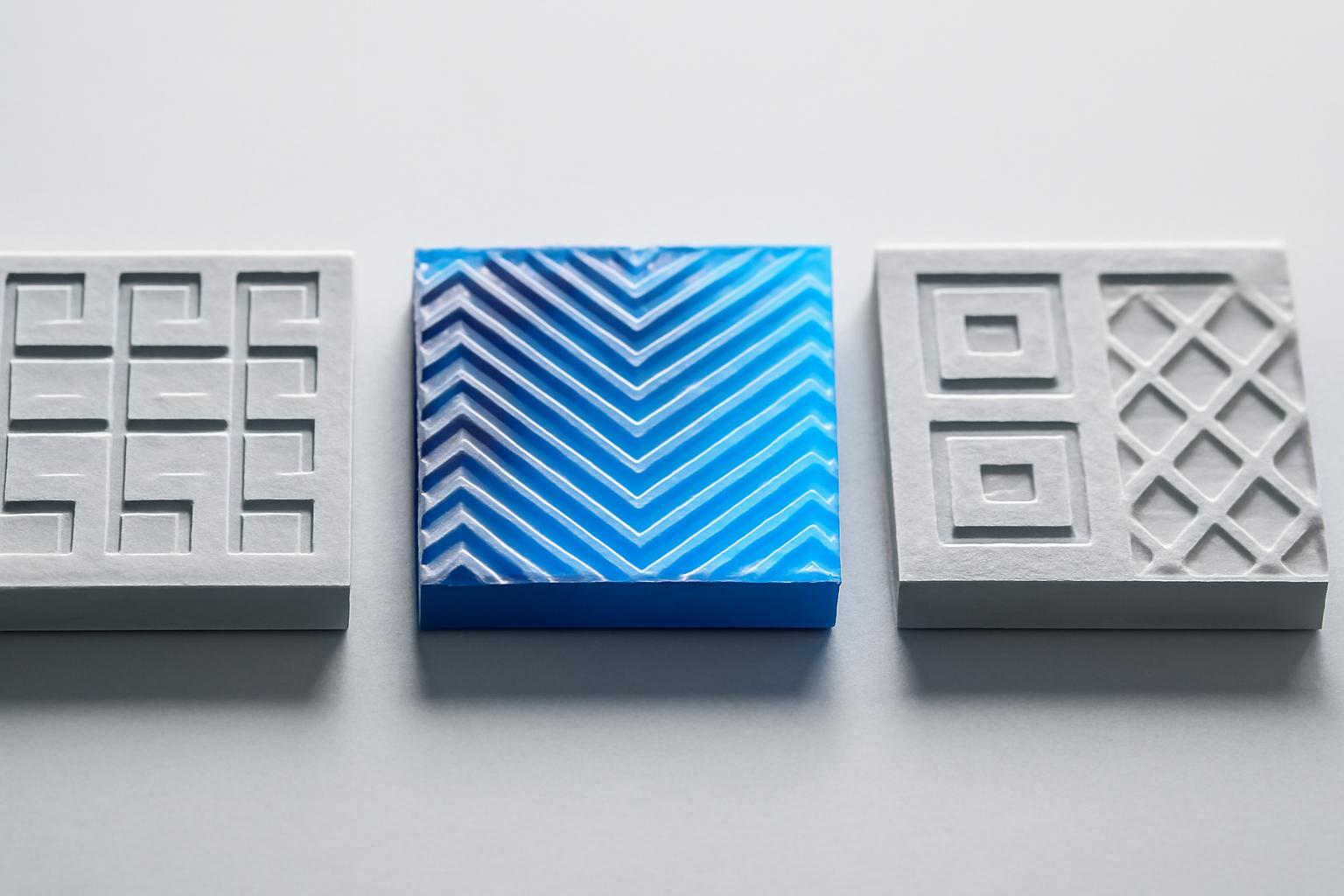
Pattern or texture: what you are actually working with
The first question you should ask yourself before development is what you actually need. A pattern is a regular structure with elements arranged at equal intervals, a repeating design that is always seamless and always visual. Texture is the imitation of a natural or material surface: wood, stone, paper, fabric. It can be tactile, that is, physically perceptible on packaging, or visual — an illusion of a surface that you simply draw.
| Criterion | Pattern | Texture |
|---|---|---|
| Nature | Regular structure, rhythm | Material or surface imitation |
| Perception | Visual only | Visual or tactile |
| Task | Identification, recognizability at a distance | Sense of materiality, atmosphere |
| When to choose | A corporate 'imprint' that is recognizable without a logo | To convey the character of the product (naturalness, premium quality, tactility) |
The choice depends on the strategy. If a brand needs instant recognizability in a stream—like the Burberry cell, which is read without a single logo on the packaging—then a pattern is needed. If the task is to convey the feeling of the material, as with SLPK and their voluminous 3D-texture symbolizing wood fibers and paper flexibility, then a texture or hybrid—pattern with textural transitions—works.
Five principles without which a pattern does not work
Once the concept is chosen, the question arises: 'How to make sure this does not turn into wallpaper.' Here, five principles work, and they are universal for any brand category.
- Consistency — a pattern must be a logical continuation of the visual system, not a separate ornament. It is built from the same forms as the logo, font, or iconography, not invented from scratch.
- Simplicity — the pattern structure should be simpler than the task it solves. The fewer elements in the module, the more stable the system is when scaling.
- Functionality — is more important than aesthetics. The pattern should work under text, under a photograph, on packaging next to a barcode — not clutter the space, but support it.
- Adaptability — the pattern must work in print, on the website, in a mobile app, and in animation without losing its character.
- Testability — before the pattern goes into the style guide, it needs to be tested on real media and real users: do they recognize the fragment, do they confuse it with a competitor’s.
A good test for concept robustness: show a person one fragment of the pattern — one line, one element, a quarter of the module. If they still recognize the brand, the system is built correctly. VK builds its pattern on fragments of its logo — recognizability is preserved even when only a piece of a letter is visible.
Modular approach: one pattern variant is not enough
The mistake that almost everyone makes at the start — to develop one pattern in one scale and try to stretch it across all media. This doesn’t work. A working system assumes at least four versions of one pattern:
- Dense version — for small elements, business cards, icons, where high detail is needed on a small area.
- Sparse version — for large surfaces: packaging, outdoor advertising, office walls.
- Monochrome version — for one-color printing, engraving, embossing, where color is physically unavailable.
- Color version — for main media with full access to the brand palette.
Each version is not a scaling of one file, but a separate redraw of the module taking into account the density of elements. It is here that 'pattern holes' are most often born — the moment when the rhythm is disrupted when copying the module and gaps appear in the pattern or, conversely, merged spots.
How the pattern behaves on different media
Printing, screen, and mobile interface require a different approach to the same pattern. In printing, a pattern can be allowed to be more detailed—resolution and physical size of the material can handle it. On the web, a pattern must remain lightweight in file size and not create moiré when scaled on different screens. In mobile interfaces, a pattern almost always works as a fragment of the background or an accent detail, rather than as a full coverage— the screen is too small to show the rhythm in full.
Pyaterochka addresses this problem firmly in its brand guidelines: specific rules state where the entire pattern may be used and where only a fragment is allowed, the minimum permitted size of a pattern unit on packaging, and how the pattern works alongside price tags and promotional stickers. This removes the team's temptation to improvise.
Mistakes that kill a pattern before it reaches production
Most failures are repeated from brand to brand:
- Pattern holes — disruption of rhythm when repeating a module, when seams become visible to the eye.
- Over-detailing — a pattern that works well as a standalone illustration but turns into visual noise when repeated on a large area.
- Loss of recognizability at small scale — a pattern that looks great on a billboard but scatters into an 32×32 pixel icon.
- Mismatch with brand colors and brand character — when a pattern is developed 'by the designer's taste' rather than from the brief and strategy, it lives a separate life from the rest of the identity.
Each of these errors is checked in the same way — by testing on real materials before approval, not after printing the first batch of packaging.
Documentation in the brandbook: without this, the pattern will not survive
Even a perfectly designed pattern is useless if the team does not understand how to apply it. Guidelines should fix:
- All versions of the pattern (dense, sparse, monochrome, color) with indication of when to use each one.
- The minimum and maximum scale of application for each medium.
- Rules for combining with the logo, text, and photo content — what must remain 'breathing' space.
- Prohibited variants of use — examples of distortions, stretches, and incorrect color combinations.
- Source files of the module in vector with a fixed grid construction, not only ready raster fills.
Without this section, the pattern will inevitably begin to 'spread apart': one manager will stretch it to fit a banner, another will crop it awkwardly for an Instagram card, and by the end of the year the brand pattern will cease to be recognizable. Documentation is not a formality, but the only way to keep the system alive during transfers between contractors and internal teams.
Recent articles








MegaFon, BMW, VTB and more 240+ companies. See how it looks in the showcase reel:


Our branding agency is approached to order:
Branding agency services












