Pantone, CMYK, RGB, HEX color systems: where each one is needed
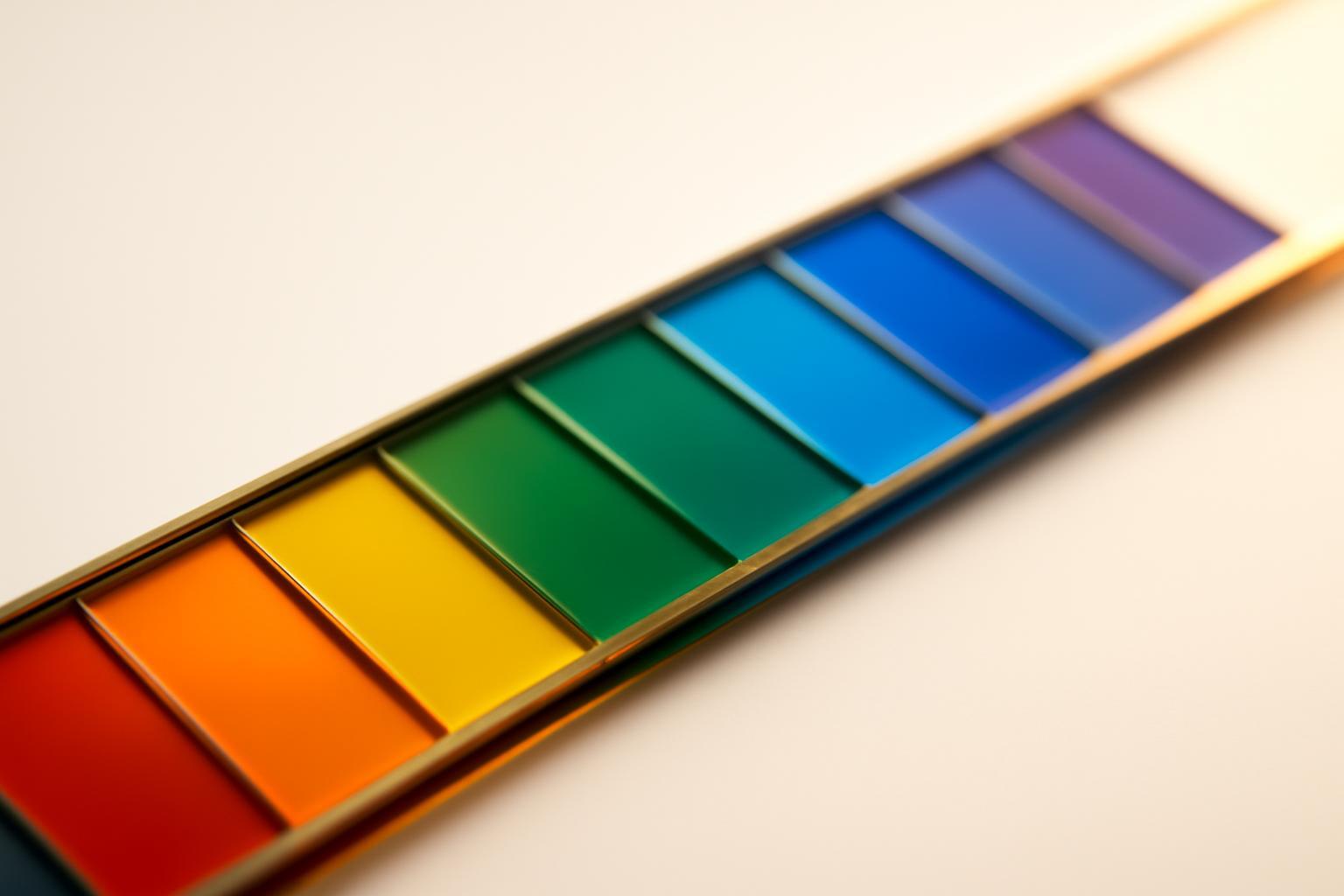
Light versus pigment: why this is not simply different file formats
RGB is an additive model: red, green, and blue light combine, and the more light, the closer to white. CMYK is a subtractive model: inks absorb part of the spectrum, and what remains is reflected into the eye. This means that a 'bright neon green' on screen physically cannot exist as a mixture of cyan, magenta, yellow, and black inks — such a pigment simply does not reflect the required portion of light. Hence, the loss of saturation by 25–30% for 'electronic' colors when converting RGB to CMYK is not a printer error, but a limit of chemistry of dyes.
Pantone solves the problem differently: it is not a mixing model, but a library of pre-mixed, ready-made colors with a fixed formula — in this system there are more than 10 000 named colors, and each has an exact recipe for mixing pigments. Therefore, Pantone is capable of reproducing shades unreachable for standard CMYK printing.
How much of the visible spectrum each system actually covers
| System | Coverage of visible spectrum | Nature of color |
|---|---|---|
| RGB (screen) | ~35% | emitted light |
| CMYK (offset) | ~25% | reflected light from the pigment |
| Pantone Solid Coated | ~50% | ready-mixed paint |
From this practical conclusion: if a brand color is chosen as a bright, saturated hue in RGB, there is a risk that in CMYK it cannot be reproduced at all without visual loss. Standard CMYK printing covers only about 55% of the Pantone palette with acceptable difference, extended CMYKOGV (Extended Gamut) palette raises this figure to ~90% — but such equipment is not available at every print shop.
When is which system needed in practice
- Pantone — brand color for logo, packaging, signage, textiles, reception desk painting in the office, promo merch from a third-party manufacturer. Everywhere where it's important that different contractors in different cities get identical results.
- CMYK — multicolor illustrations, photographs, brochures, catalogs, photo-printed packaging. Here it's not critical to hit a single pixel, but rather the overall harmony of the multicolor image is critical.
- RGB / HEX — website, app, presentation, social media, video, email newsletters. Any surface that glows rather than reflects paint.
A common mistake is choosing a brand color by only looking at the screen, in sRGB, without checking Pantone and CMYK. The result is predictable: the approved shade on print will never match what was seen on the monitor during approval.
Why HEX cannot simply be sent to the print shop
HEX is a light coordinate, not a paint recipe. The print shop cannot 'print HEX': they need either a Pantone number with a mixing formula, or a CMYK percentage for a specific print profile. Plus, the same Pantone number gives a different visual result on glossy paper (Coated, C) and on matte (Uncoated, U) — these are two different physical objects under one name.
Screens are not suitable as a source of truth for color at all. A telling example: a Pantone 1505 C photo taken on an iPhone and uploaded to Pantone Connect is recognized as 1585 C — with a color error ΔE00=6.3, which is already a noticeable difference visible to the naked eye. Camera, screen, lighting in the room — three sources of distortion, each of which accumulates.
The order of color selection and conversion
- To start with Pantone — select a physical sample from the catalog, not from the screen, in person under daylight.
- From Pantone to get the CMYK equivalent for a specific type of printing (offset, digital, wide format) — the values will differ from the 'standard' tabular ones.
- From Pantone or CMYK to get RGB/HEX as the closest visual approximation for the screen — with the understanding that there will be no exact match.
- Check both 'extreme' variants — printing on real paper (Coated and Uncoated) and rendering on a calibrated monitor — before declaring the color as brand-specific.
Moving in reverse order — from HEX to Pantone — almost always leads to disappointment: too bright or too cold a screen tone may not have an adequate printed equivalent at all.
What to document in the brandbook
Not every brand needs all four values for each color. If the business exists only in digital form — without offline locations, packaging, or signage — HEX and RGB are sufficient, and Pantone does not need to be specified at all. If a brand is going to be printed, on merchandise, or in outdoor advertising, a full set is required: Pantone as the reference, CMYK as the working value for the printer, HEX/RGB as the 'digital fallback' for the screen.
The hierarchy must be clearly defined: Pantone — the source of truth, CMYK and RGB — derived approximations. It is also important to specify where color tolerance is acceptable and where it is not: text on a website button will survive a slight shift in tone, but a hero illustration on a catalog cover or a store front will not. This is the difference between a 'checkbox' guide and a working tool that can be trusted for production.
Recent articles








MegaFon, BMW, VTB and more 240+ companies. See how it looks in the showcase reel:


Our branding agency is approached to order:
Branding agency services












