Visual triggers of recognition: color, shape, character — what really works
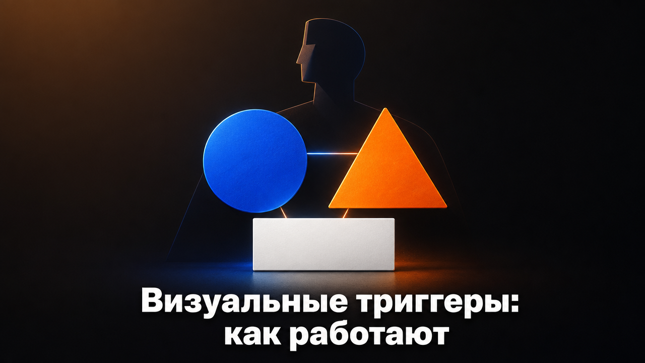
Visual triggers — color, shape, character — allow a client to recognize a brand in fractions of a second, even without a logo. In the article, we examine how the psychology of perception works, provide examples of global brands, and give a checklist for implementing visual triggers in company identity.
Direct answer: what are visual triggers and why do they work
Visual triggers are elements of identity that evoke a stable association with a brand without displaying the name or logo. The red color of Coca-Cola, the shape of Absolut bottles, the rabbit character of Energizer — all of these are triggers that the brain reads in fractions of a second. They work at the subconscious level: a person has not yet realized what they see, but already feels a sense of familiarity. The reason is the speed of visual information processing: the brain recognizes images significantly faster than text. When a client sees a familiar color or shape, they do not analyze — they immediately recall the brand and associated emotions. This saves time in decision-making and increases loyalty. The more triggers are used systematically, the faster recognition occurs: if color, packaging shape, and font work in a coordinated system, identification happens almost instantly, even before the name is read. For business, this means a specific risk: without clear visual triggers, a company loses the chance to be recognized in an overloaded information field. Competitors who have invested in identity gain an advantage even before a client reads the name. In a store shelf or social media feed, a brand has literally just a few seconds to capture attention — and without a built system of triggers, this time is simply not used.
Color as the main trigger: psychology and practice
Color is the fastest and strongest visual trigger. It acts on a subconscious level, bypassing rational evaluation. Red is associated with energy, passion, urgency; blue — with reliability, calm, professionalism; green — with nature, health, growth. Yellow is linked to optimism and warmth, while purple is associated with luxury and creativity. Consistent use of the same color across all media, from packaging to website, significantly increases the speed and accuracy of brand recognition by the audience. For example, airline Iraero, after rebranding, received a blue-cyan palette associated with sky and safety. The agency Gromov Branding notes: after implementing the new identity, the airline's turnover increased by 1,8 billion rubles, and margin — by 112 million rubles. Color became one of the key triggers that distinguished the airline among competitors in a saturated market. A similar story is with the freight transportation company Swift: after developing an identity with a bright accent color, turnover increased by 1,9 billion rubles, and margin — by 160 million rubles. The choice of color should not be a subjective decision of the designer or the personal preference of the business owner. It is based on the psychology of the target audience, the competitive landscape of the niche, and the communication channels through which the brand meets the client. In the portfolio of Gromov Branding there are examples where the color palette was selected after in-depth interviews with clients — to ensure the trigger works specifically on the emotion needed for the business. For a logistics company, for example, shades that evoke trust and reliability were sought, while for a restaurant brand, colors that stimulate appetite were chosen.
Shape and composition: how geometry affects perception
The form of the logo, packaging, and font — is no less a powerful trigger than color. The brain associates geometry with specific qualities: rounded forms are perceived as friendly and safe, sharp angles — as dynamic, rectangles — as stable and reliable. Smooth lines are associated with softness and comfort, asymmetry — with innovations and forward movement. Modular systems and well-calculated proportions in the identity create a sense of integrity. When all carriers — from business card to website — use a single geometric logic, recognizability grows exponentially, not linearly. The logo for Swift is built on dynamic lines that convey speed and reliability at the same time. And in the project for Polar Airlines, the logo form alludes to the northern lights and arctic theme — thus a unique visual code is born that is hard to confuse with anything else. The form works even in a black-and-white version — and this is a good practical test. If the logo is recognizable without color, then the form as a trigger is properly developed. This is especially important for carriers where color is not available: receipts, faxes, some types of printing, black-and-white advertising in the press. Therefore, when developing an identity, it is worth specifically checking how the elements look in monochrome — many errors emerge precisely at this stage.
Characters and mascots: emotional attachment
A character, or mascot, is a trigger that creates an emotional connection with the audience. It humanizes the brand, making it closer and more memorable. Classic examples include the Energizer Bunny (energy, perseverance) and the Michelin Man (safety, care for the customer). Characters are especially effective in categories where emotion is important: food products, children's goods, entertainment. For B2C companies, a character works almost always: it attracts both children and adults, and easily becomes part of social networks and memes. For the B2B sector, characters are used less frequently—but with proper development, they can become a strong differentiator even in a restrained niche. The main condition is that the mascot's character must align with the brand's values and remain visually consistent across all media. If a brand is positioned as serious and technology-oriented, a cheerful animal character will likely look out of place—and will create dissonance rather than trust. A character must be definitely fixed in the brand book: poses, facial expressions, clothing, acceptable usage variants. Otherwise, the mascot will quickly 'spread out' across various channels in a distorted form, and the trigger will stop working for recognition. Ideally, several states of the character are developed—from formal to informal (for example, a presentation version and a stories version)—so that it looks natural in any context.
How to implement triggers in a brand: checklist
Visual triggers work only as part of a system. A one-off colour on a website or a random character created without a connection to strategy will not build a lasting association with a brand. Here is a step-by-step implementation checklist: - Choose 1–2 dominant colours. They will form the basis of the entire visual identity. The other colours are supporting colours; there should be no more than 2–3, to avoid diluting perception. - Define the key shape. This might be a logo, a pattern or a packaging shape. Record its proportions and modular grid to ensure consistency across every application, from business cards to banners. - Develop a character if needed. Do this only if it fits the brand’s tone and target audience. A character is usually unnecessary for formal B2B companies, but an abstract graphic element can perform the same function. - Document everything in the brandbook. Colour codes (Pantone, CMYK, RGB), rules for using the shape, character variants and prohibited combinations turn the brandbook into a document followed by all contractors, including external designers. - Test with the audience. Run a survey: show the elements without the name and measure how many people recognise the brand. If the result is noticeably below half of respondents, the triggers need refinement. Gromov Branding supports every stage, from strategy to brandbook, and guarantees trademark registration. If FIPS refuses registration, the agency develops a new logo at its own expense and pays for a repeat application. This approach reduces legal risks for the business and protects investment in visual triggers for years to come.
Measuring effectiveness: recognition metrics
Recognition is not an abstract feeling, but a measurable metric. You can evaluate it using several tools: Surveys. Show respondents elements of the identity without the brand name and ask which brand they associate them with. If more than half of the respondents correctly named the brand — the triggers are working. A/B tests. Compare CTR and conversion on pages with different variants of visual elements. The variant with a character may yield a greater response than the one without — but this should be verified on your own audience, not relying on general recommendations. Direct traffic share. If people type the brand name into the search bar directly, rather than coming through ads, it means the visual code was remembered. Repeat purchases. An increase in customer returns indirectly indicates brand memorability and loyalty. There is also a more general, indirect indicator — revenue growth after implementing the trigger system. In the Swift case, after rebranding, revenue increased by 1,9 billion rubles, and margin — by 160 million rubles; part of this result is linked to a cohesive visual system that made the brand recognizable in a competitive logistics niche. In the Iraero case, a similar trend: revenue growth of 1,8 billion rubles and margin by 112 million rubles after identity update. It is important to measure the "before" and "after" metrics to see the real contribution of visual triggers, rather than attributing all business growth to them. If the metrics do not move, the system requires refinement: perhaps the wrong color was chosen, the form is not readable, or the character does not resonate with the audience.
What is a visual trigger? An element of branding (color, shape, character) that evokes a brand association without displaying the brand name or logo. How many colors should a brand have? Ideally, 1–2 dominant and 2–3 auxiliary colors. More reduces memorability and complicates implementation across different media. Is a character necessary for B2B-company? Not necessarily, but it can work if the character reflects brand values and is used consistently. Often, B2B is sufficient with a strong color and form trigger, without a mascot. How often should visual triggers be updated? On average, once every 5–7 years, if the brand is not losing relevance. More frequently — only when repositioning or entering new markets, not just for the sake of updating. Can you use other people's colors? Technically, yes, but this reduces differentiation and may confuse customers. It's better to choose unique combinations that can be registered as trademarks. What is more important: color or shape? Both work together. Color is processed faster, while shape provides a more precise brand association. In a strong identity, they complement each other rather than compete. How do you know if a trigger works? Conduct a survey: show an element without the brand name — if more than half of respondents identify the brand, the trigger is effective. Want your brand to be recognizable at first glance — without the name or logo? Call 8 800 200-84-50 or write to hello@gromovbranding.ru: specialists from Gromov Branding will advise on visual triggers and help build a system that delivers measurable business results.
MegaFon, BMW, VTB and more 240+ companies. See how it looks in the showcase reel:


Through interviews, surveys and workshops, our branding agency identifies the true needs of the business, motivations and pain points. Based on this data, we determine the tools that will effectively solve your brand's tasks.
Our branding agency is approached to order:
Our branding agency is approached to order:
Branding agency services












